HGCA is a chartered accountancy studio that breaks the mould of traditional financial firms. They are human focused, modern in thinking, and deeply rooted in clarity and professionalism. Our role was to help them express that through a full rebrand, digital rollout, and creative direction that speaks directly to their values.
Branding
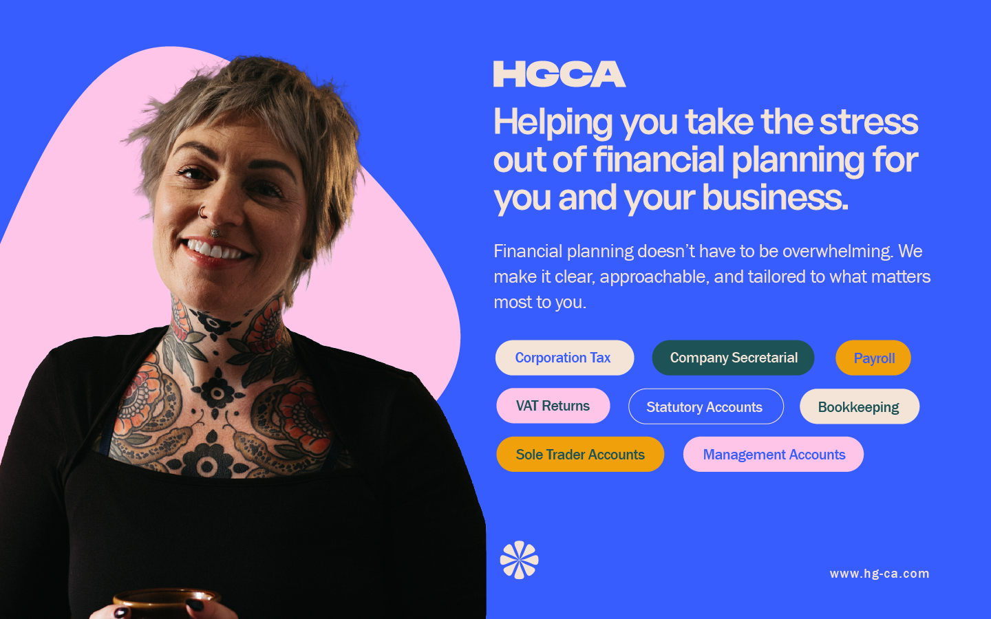
We built a visual language grounded in trust and warmth without losing professional edge. The identity balances strength and softness using clean geometry, bold typography, and a symbol based on motion and symmetry. The colour system combines confident blue with soft, human tones to create distinction and approachability. Across every asset, the brand communicates clarity, stability, and quiet confidence.
Creative
From signage to stationery and reports, we translated the brand across all key touchpoints. Every element reinforces the idea that accountancy can be clear, approachable, and stress free. Our art direction leaned into balance — vibrant but calm, structured but never cold. HGCA feels less like a finance firm and more like a trusted creative partner.
.avif)
.avif)
.avif)