Color is one of the most powerful tools in branding, playing a crucial role in how consumers perceive and connect with a business. Studies reveal that up to 90% of snap judgments about a product are based on color alone. Furthermore, 85% of customers identify color as a primary reason for choosing one brand over another, highlighting its influence on consumer decisions. This makes understanding how to choose brand colors a vital step in creating a memorable and effective brand identity. Your brand color palette is more than just decoration—it communicates your brand personality, evokes specific feelings, and builds emotional bonds with your audience. The right color choices can help your brand stand out in a crowded market and reinforce your brand stand, making it clear what your business represents.
In this ultimate guide, we’ll explore the essentials of color psychology in branding, practical steps to create the perfect color palette, and examples of brands that have mastered the art of color to increase brand recognition.
Why Brand Colors Matter
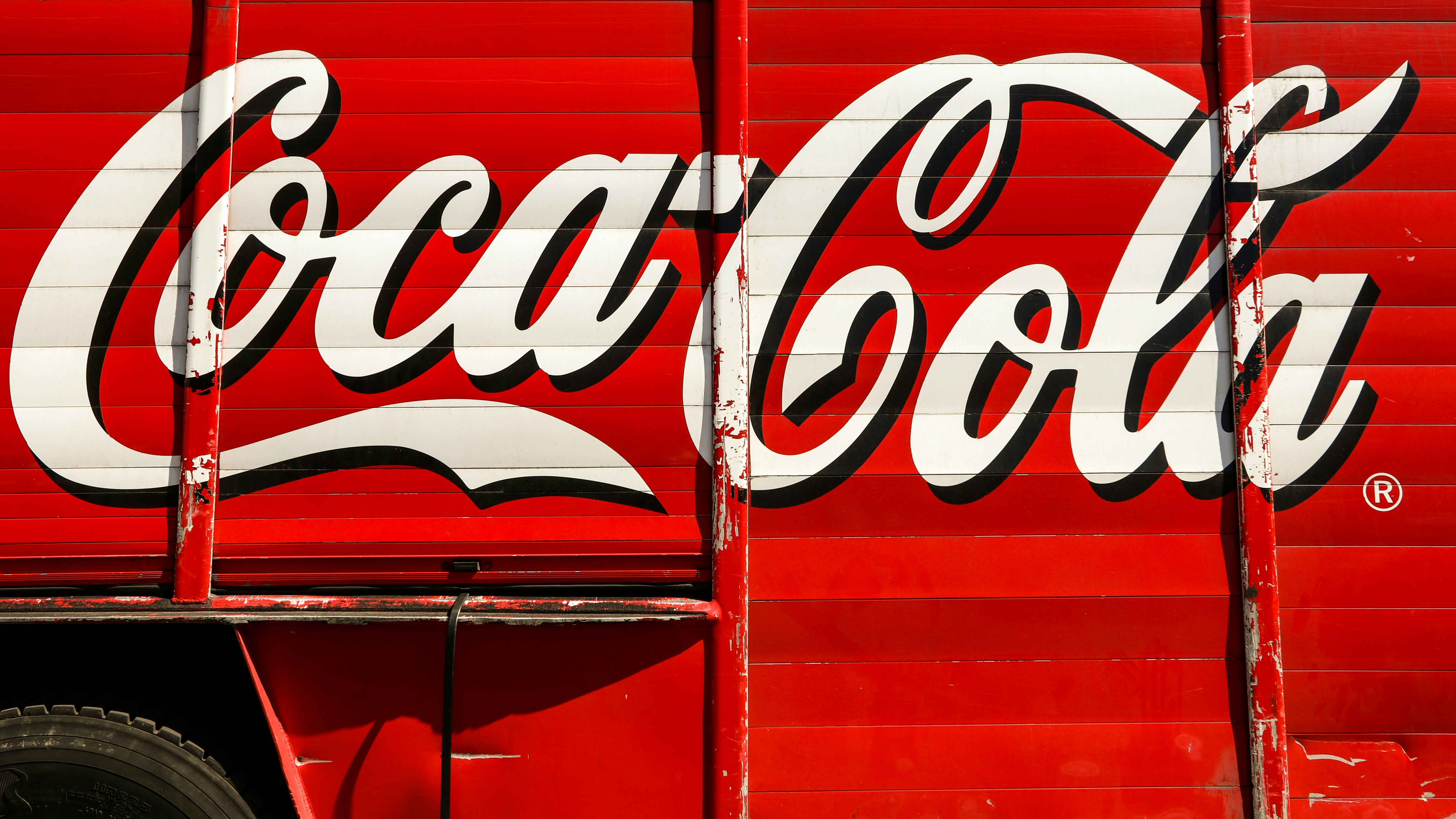
The colors you select for your brand have a profound impact on how your business is perceived and remembered, which is why your choice of brand colors truly matters. One of the primary reasons brand colors matter is recognition. For instance, think about iconic brands like Coca Cola with its bold red or Tiffany & Co.’s distinctive blue. These main colors instantly bring the brand to mind, demonstrating how a well-chosen color palette can help your business stand out in a crowded market.
Beyond recognition, colors also evoke emotions that influence consumer behavior. Whether it’s excitement, trust, or calmness, your brand color shows your audience what your business represents on a deeper level. For example, green is known for its calming and restful qualities, making it a preferred choice for brands associated with health and wellness. Additionally, having a consistent visual identity through your brand color palette ensures that your marketing assets—from websites to packaging—feel unified and professional, which increases brand recognition and builds trust over time. Making the right choice when selecting your brand colors is essential, as it affects how your brand is perceived and remembered.
Color Psychology in Branding
Understanding color psychology is essential when choosing colors for your brand. Different colors evoke emotions and emotional responses that can align with your brand’s values and brand personality. While cultural differences can affect color perception, some associations are widely recognized across markets: different hues and shades across the color spectrum can influence perception and reinforce a brand's values. However, research shows that personal preferences and experiences can muddy the perceptions of specific colors, making it important to consider your audience's unique context.
- Red: Symbolizes passion, urgency, and energy. Brands like Coca Cola and Netflix use red to create a sense of excitement and boldness.
- Orange: Represents creativity, warmth, and enthusiasm. Examples include Fanta and SoundCloud, which use orange to convey a friendly and energetic vibe.
- Yellow: Conveys optimism, clarity, and friendliness. Think of McDonald’s and Ikea, which use yellow to attract attention and create a positive impression.
- Green: Associated with growth, health, and sustainability. Brands like Whole Foods and Spotify leverage green to emphasize nature and wellness.
- Blue: Evokes trust, calm, and professionalism. Facebook and PayPal use blue to establish reliability and stability.
- Purple: Suggests luxury, creativity, and imagination. Cadbury and Twitch use purple to communicate sophistication and innovation.
- Black & White: Represent minimalism, timelessness, and sophistication, as seen in brands like Apple and Chanel.
- Brown: Associated with reliability, earthiness, and stability. Brands like UPS use brown to convey trustworthiness and groundedness, leveraging its unique place in branding to support a dependable brand personality.
- Pink: Conveys fun, youthfulness, and emotional appeal. Brands use pink to stand out, create recognition, and connect with audiences seeking a playful or vibrant image.
It’s important to note that color psychology in branding isn’t about rigid rules but about choosing the right color to align with your target audience and brand values. The power of color in branding is significant—choosing the right primary color can have a major impact on how your brand is perceived. Using the color wheel and color theory can help you find harmonious color combinations and complementary colors that enhance your brand story. Tools like color palette generators can simplify the process of creating a cohesive set of colors for branding purposes. Understanding the full color spectrum and selecting the right hue and shade for your brand are crucial steps in building a strong and memorable identity.
Brand Color Inspiration
Finding the right brand color inspiration is a vital first step in creating a brand identity that truly resonates with your target audience. The world is full of color inspiration—look to the vibrant hues of nature, the bold strokes in art, or even the latest cultural trends for ideas that can set your brand apart. Testing different palettes and gathering feedback is a key step in finalizing the colors for your brand. By exploring the color wheel and experimenting with different color combinations, you can craft a brand color palette that not only looks appealing but also evokes emotions and communicates your brand’s values.
For example, Coca-Cola’s iconic red and white color scheme is a masterclass in using color to create instant recognition and emotional connection. Their palette is more than just visually striking; it’s a reflection of the brand’s energetic and passionate personality. When creating your own palette, consider how different colors can evoke specific feelings in your audience—whether it’s the calming effect of blues, the optimism of yellows, or the creativity sparked by purples. While yellow is widely considered a cheerful hue, too much of it can invoke feelings of anger or frustration, so balance is key. Drawing color inspiration from the world around you and understanding the principles of color psychology will help you create a color scheme that leaves a lasting impression and sets your brand apart from the competition.
3 Steps to Choosing Your Brand Color Palette
1. Understand Your Audience
The first step in how to choose brand colors is gaining a clear understanding of your target audience. Factors such as age, culture, and industry shape how different colors are perceived. For example, younger consumers might be drawn to bold colors and bright, playful tones, while a more professional audience may prefer muted, sophisticated shades. Knowing your audience helps you select colors that resonate and create the emotional responses you desire.
2. Reflect Your Brand Values
Your brand color palette should be a visual representation of your brand’s values. If your business focuses on health or sustainability, green and earthy, natural tones are a perfect fit. A tech company might lean toward cool blues or futuristic gradients to convey innovation and trust. For brands aiming to portray luxury or creativity, purple or bold colors like deep blues and rich pinks can add a sense of sophistication and uniqueness. This step ensures your colors represent what your brand stands for as a whole and help you create a consistent story across all touchpoints.
3. Build a Flexible System
A strong brand color palette is versatile and works seamlessly across all platforms, from digital to print. When building your palette, consider including:
- Primary colors: These are your core brand identifiers, the colors most associated with your brand.
- Secondary colors: Accent colors that support your primary palette and add variety for campaigns or special promotions.
- Neutral colors: Shades like grey, beige, or off-white balance your palette and provide backgrounds or text contrast.
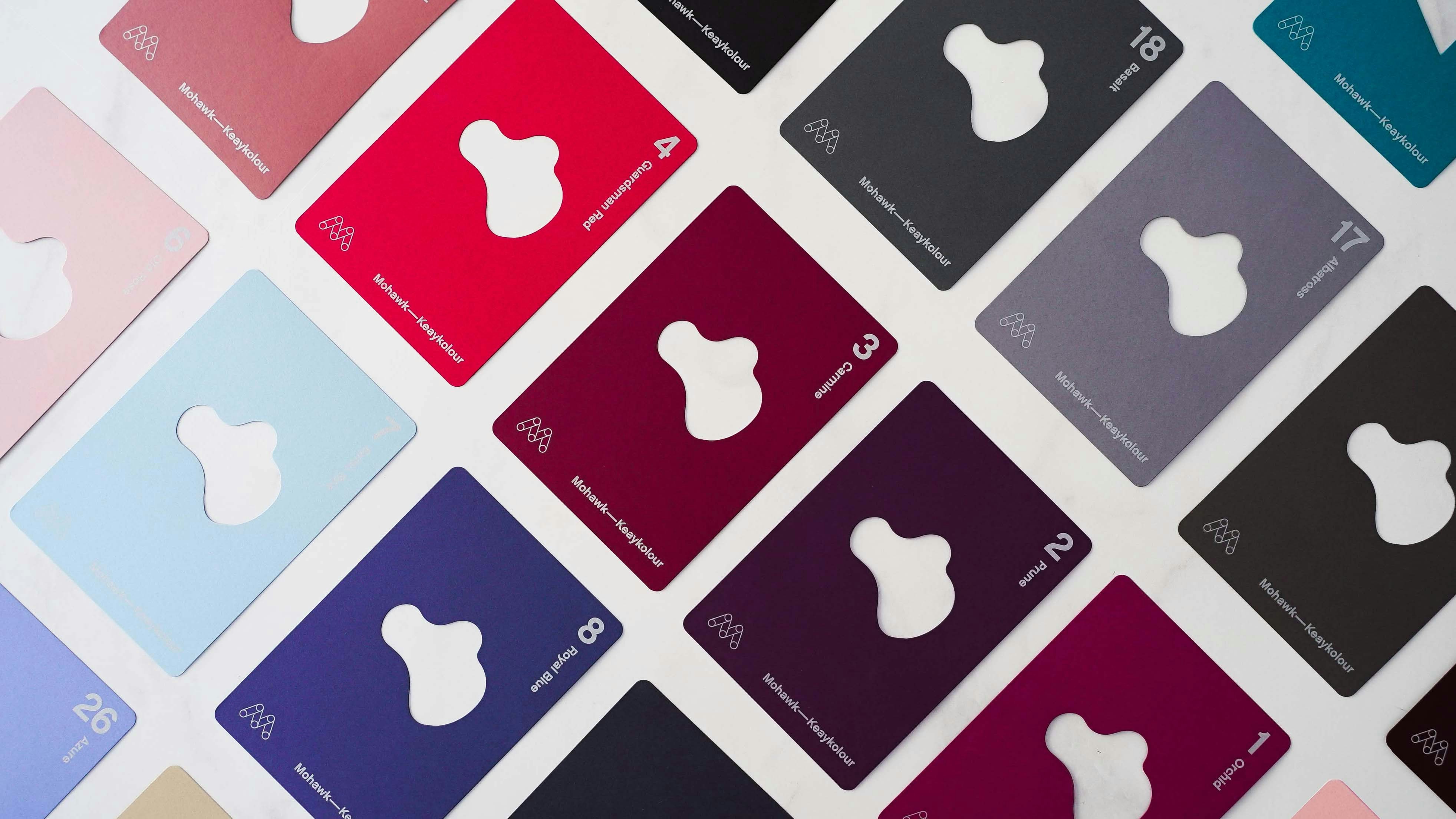
This flexible system ensures consistency while allowing room for creativity. Remember to define your colors with exact hex codes to maintain uniformity across all marketing assets and social media platforms. Additionally, create a brand style guide that specifies these exact color codes to ensure consistent usage across all touchpoints.
Taking a Closer Look at Brand Colors
Taking a closer look at brand colors means diving into the emotional responses and associations that different shades and hues can trigger in your audience. Color psychology teaches us that blue, for instance, is often linked to trust and stability, making it a popular choice for brands that want to create a sense of security and reliability. On the other hand, bold colors like orange and yellow are known for their ability to stimulate excitement, energy, and positivity—perfect for brands aiming to stand out and energize their audience.
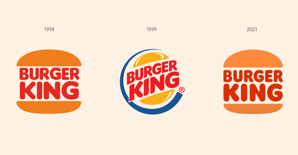
Consider Burger King as an example: their use of a bright, bold color scheme featuring red, yellow, and orange creates a fun, energetic atmosphere that appeals directly to their target audience. By analyzing the color palettes of successful brands and understanding the reasoning behind their choices, businesses can make informed decisions about their own brand color palette. Whether you’re drawn to cool blues, vibrant oranges, or a mix of different shades, taking a closer look at how these colors impact perception will help you create a palette that aligns with your brand’s personality and connects with your audience on a deeper level.
Brand Recognition and Color Psychology
Brand recognition and color psychology go hand in hand—studies show that consistent use of brand colors can increase brand recognition by up to 80%. When a brand uses its signature color palette across all marketing assets, from logos to websites and social media platforms, it creates a strong, unified visual identity that audiences remember. For example, Coca-Cola’s bold red is instantly recognizable worldwide and evokes feelings of excitement and energy, while blue is often chosen by financial institutions to convey trust and stability.
Green, on the other hand, is frequently used by brands that want to evoke a sense of nature, harmony, and growth. By aligning your brand colors with your brand’s values and message, and applying color psychology thoughtfully, you can create a lasting impression on your audience. Consistency across all touchpoints not only strengthens your visual identity but also helps your business stand out in a crowded marketplace, making it easier for potential customers to remember and choose your brand.
Color Trends and Forecasting
Staying ahead of color trends and forecasting is essential for brands that want to maintain a modern and relevant visual identity. By keeping an eye on which colors are gaining popularity—whether through cultural shifts, social movements, or technological advancements—businesses can ensure their brand color palette feels fresh and appealing to today’s consumers. Color forecasting experts, like those at Pantone, release annual predictions such as the Color of the Year, which often set the tone for design and branding trends across industries.
Incorporating trending colors into your palette doesn’t mean abandoning your core brand identity; instead, it’s about finding ways to refresh your look and connect with your audience in new ways. For example, a brand might introduce a new accent color inspired by current trends to keep their marketing assets feeling up-to-date and engaging. By understanding and leveraging color trends, businesses can create a modern tone for their brand and stay ahead of the competition.

.jpg)