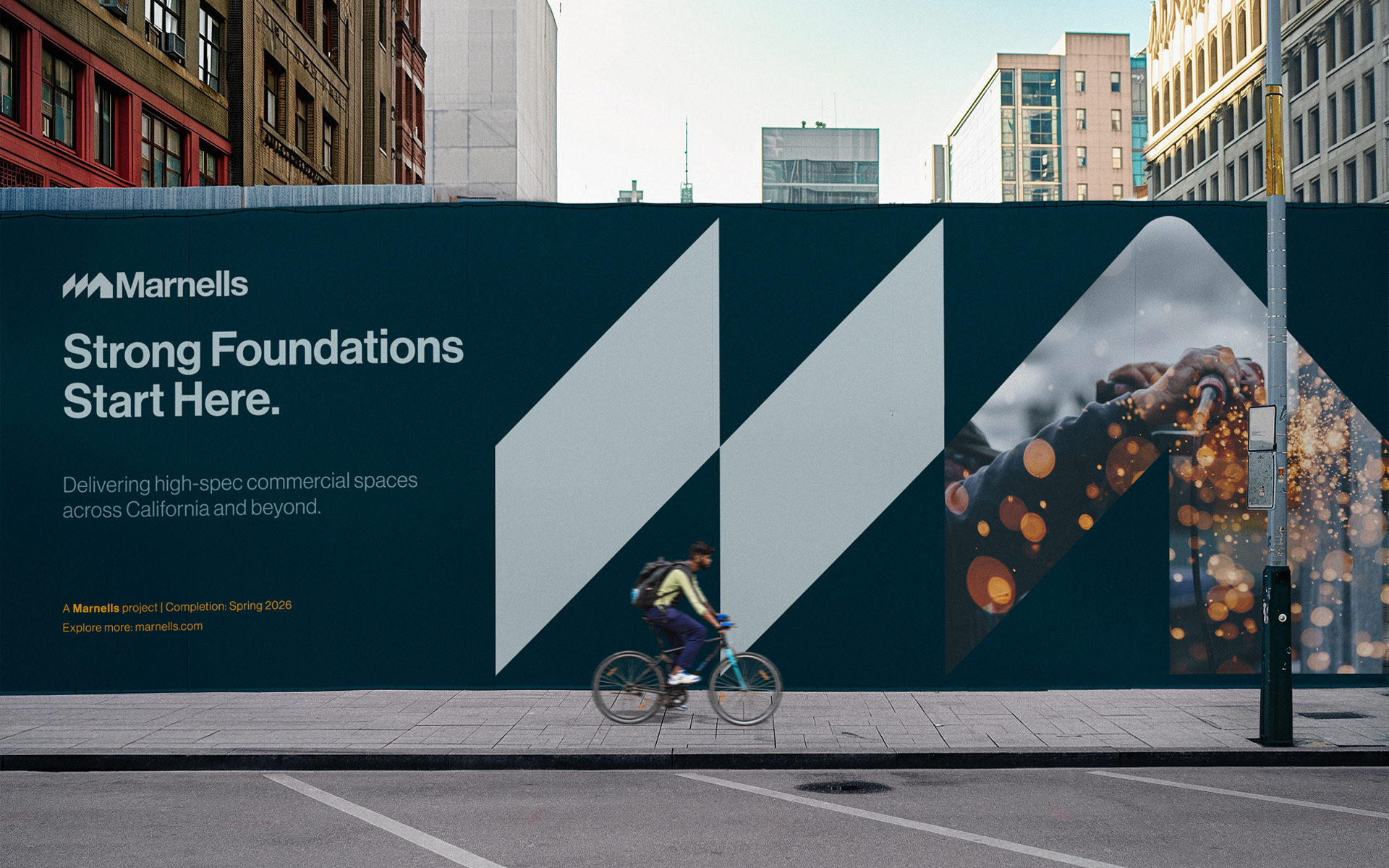
Brand identity and digital direction for a construction company with a reputation for quiet precision and long-term thinking.

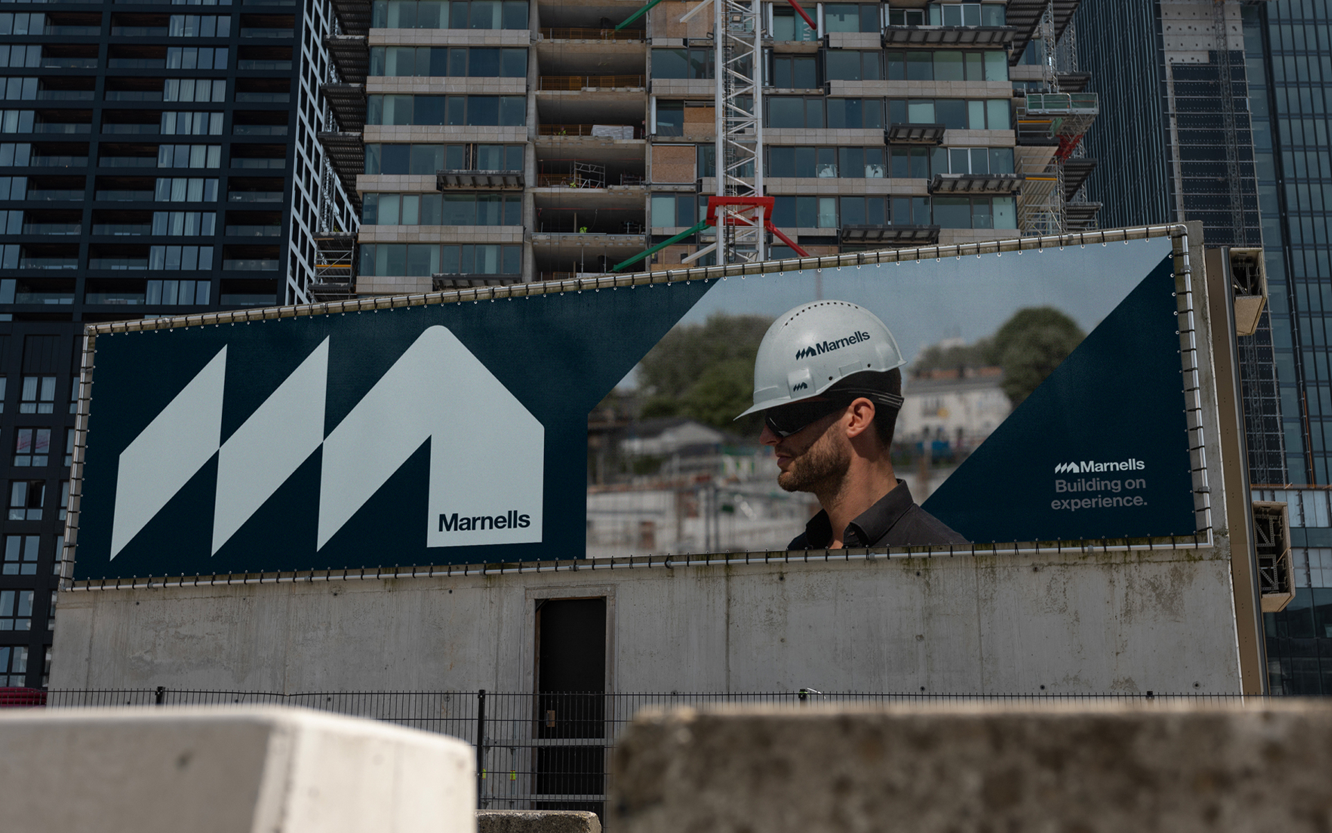
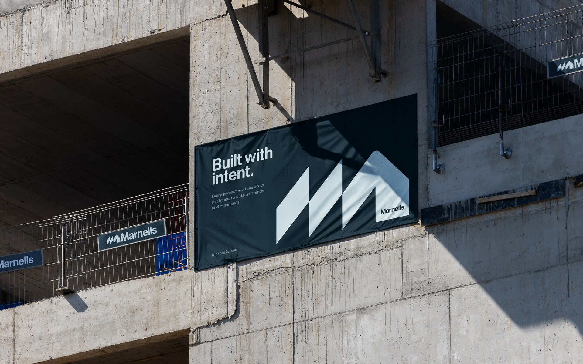
Marnalls built its reputation by doing things properly. Through careful work, clear communication, and long-term thinking, the company became known for delivering results that last. After decades in construction, they asked us to rework how the brand presents itself across visual, verbal, and digital channels.
This wasn't about reinvention. It was about refinement. We worked closely with the Marnalls team to understand the values behind how they build — not just structures, but relationships and decisions too. The brand needed a presence that reflects the same sense of consistency and calm.
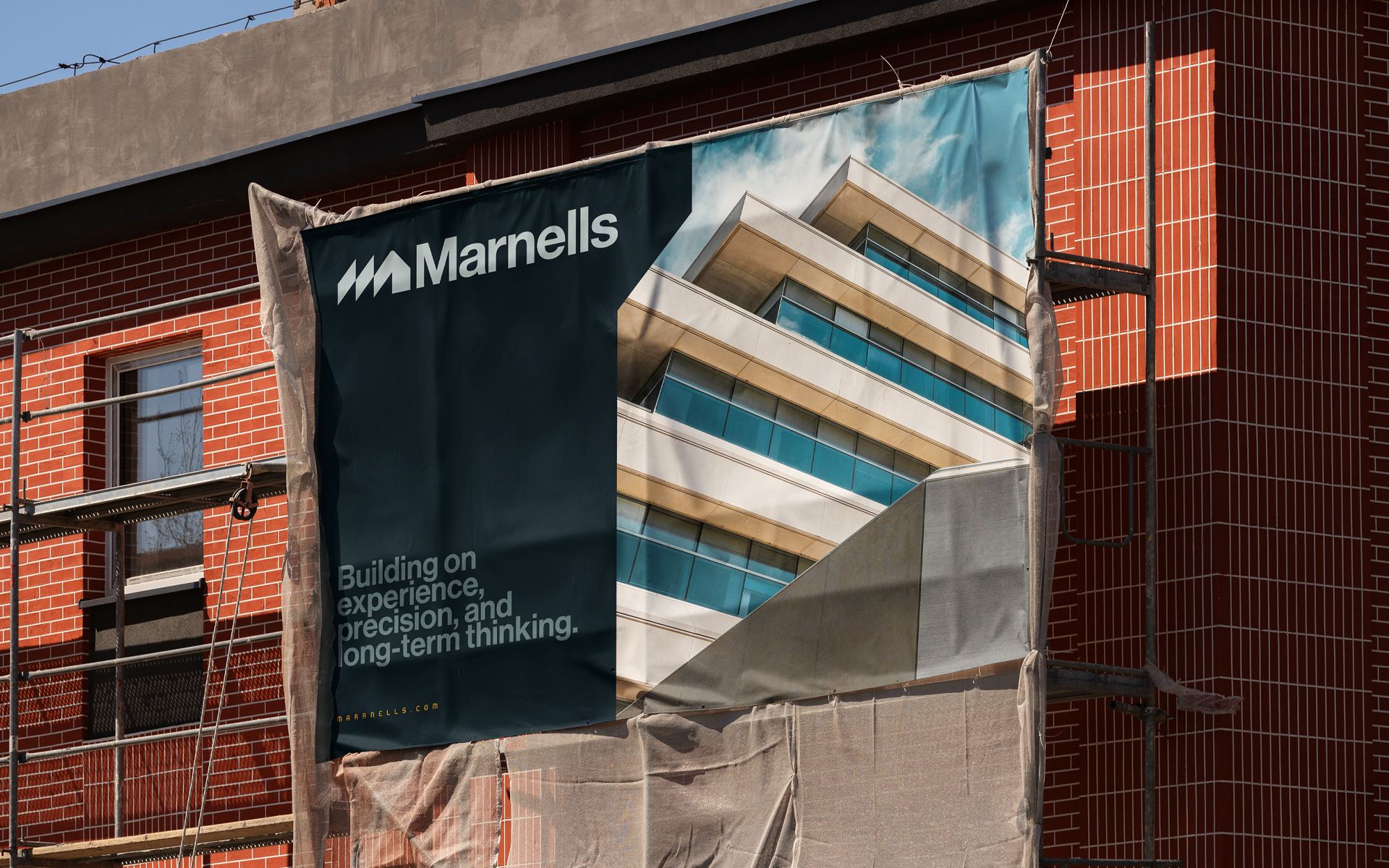
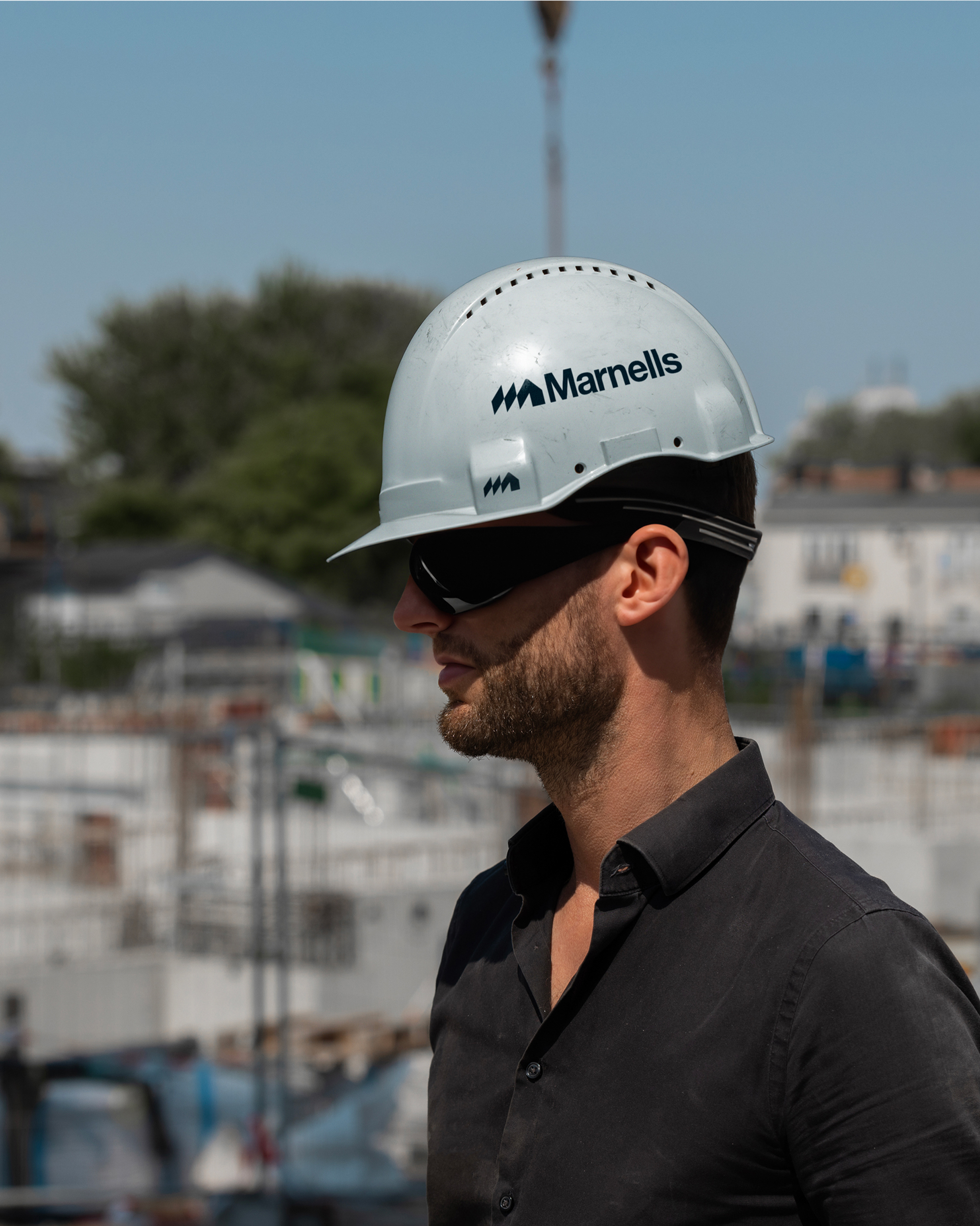
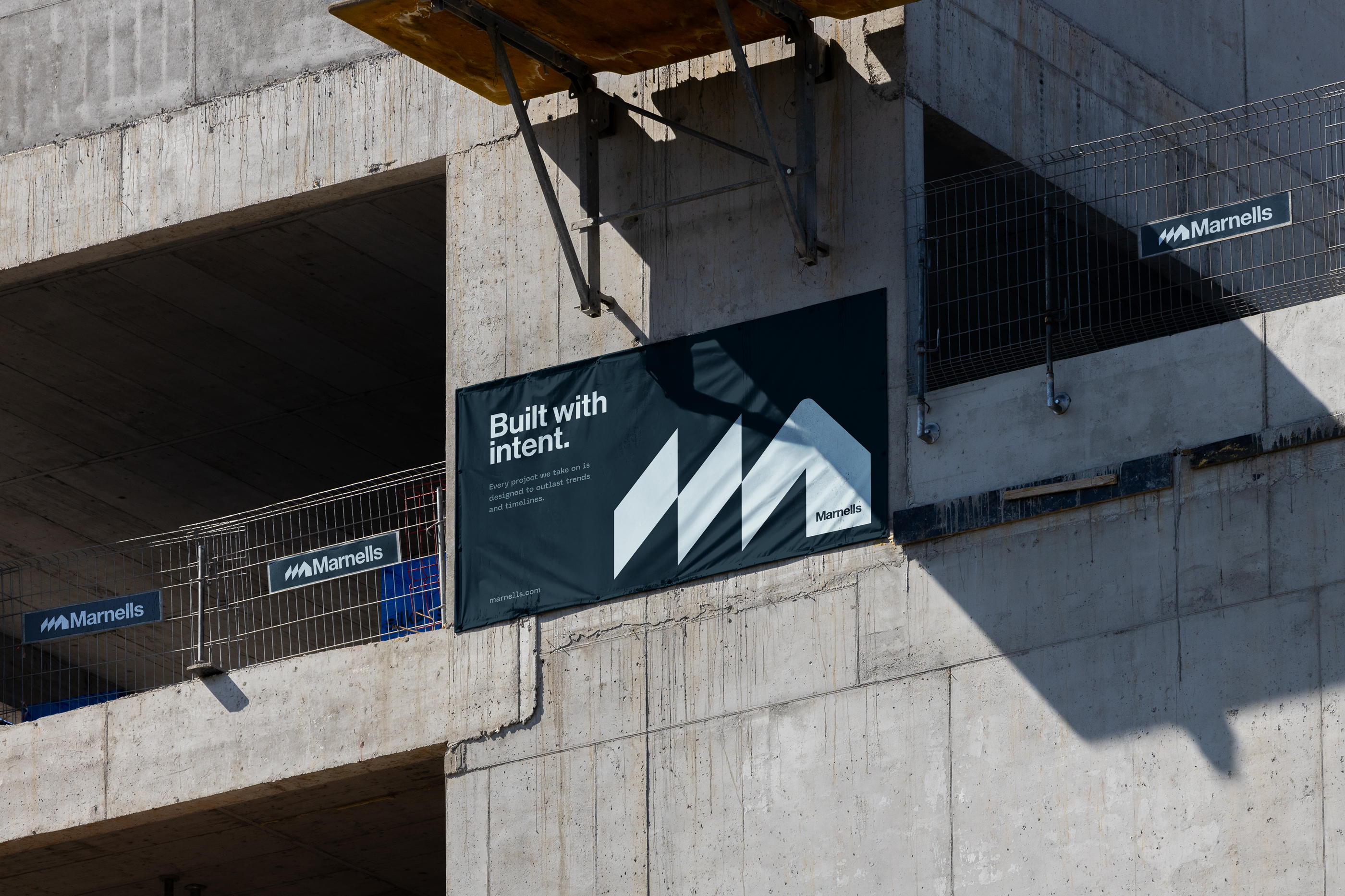
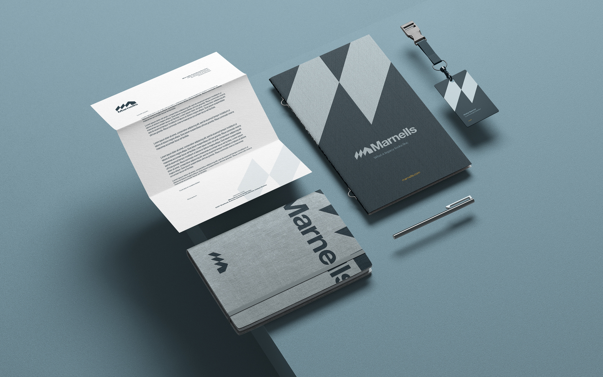
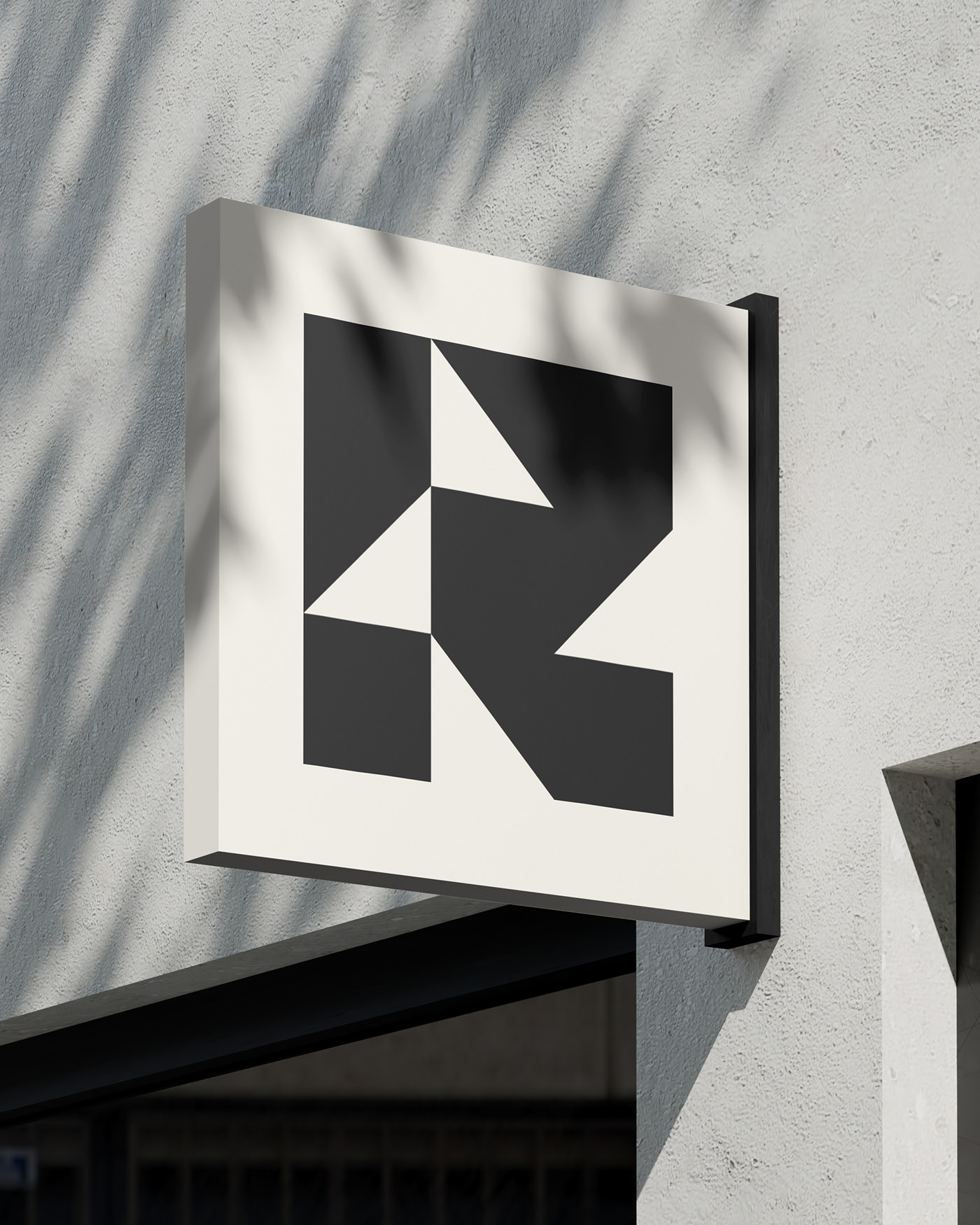
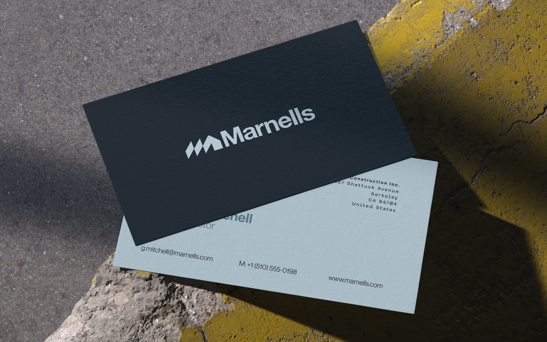
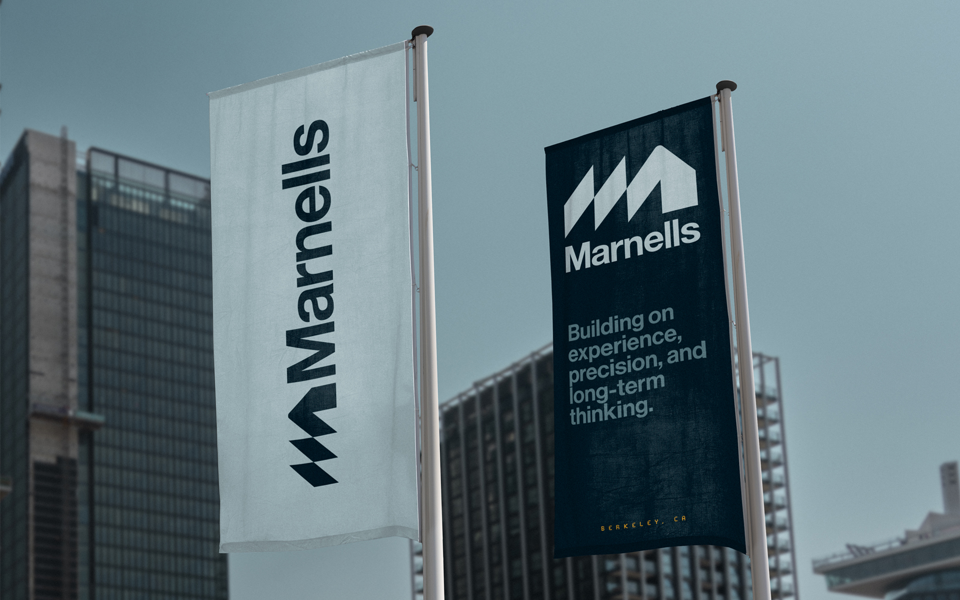
The new identity system balances structure and warmth. The logo is purposeful and grounded, shaped by clear geometry. Typography is practical and human. The colour palette takes cues from real materials: concrete, timber, steel, and sky. Every element reflects the way Marnalls works — steady, confident, and built to last.
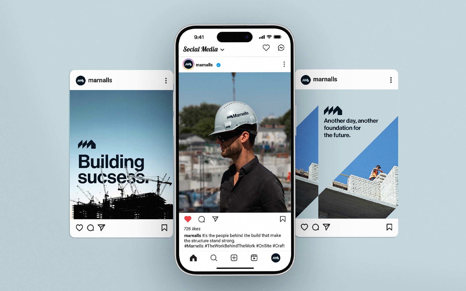
The website follows the same principles. Clean layouts, straightforward messaging, and a minimal palette let the work speak for itself. No noise. No filler. Just a quiet confidence that mirrors the company behind it.
A construction brand defined by trust and precision, now matched with an identity that reflects it with clarity.