Brand identity and digital platform for a modern property search engine connecting ambitious buyers with standout homes across the United States.

Bellavista was created for buyers who want more than search filters and standard listings. It’s built for people who are ready to move, who value design, and who want a better way to discover homes that reflect their lifestyle. The identity had to reflect this mindset — stylish without trend, refined without losing personality.
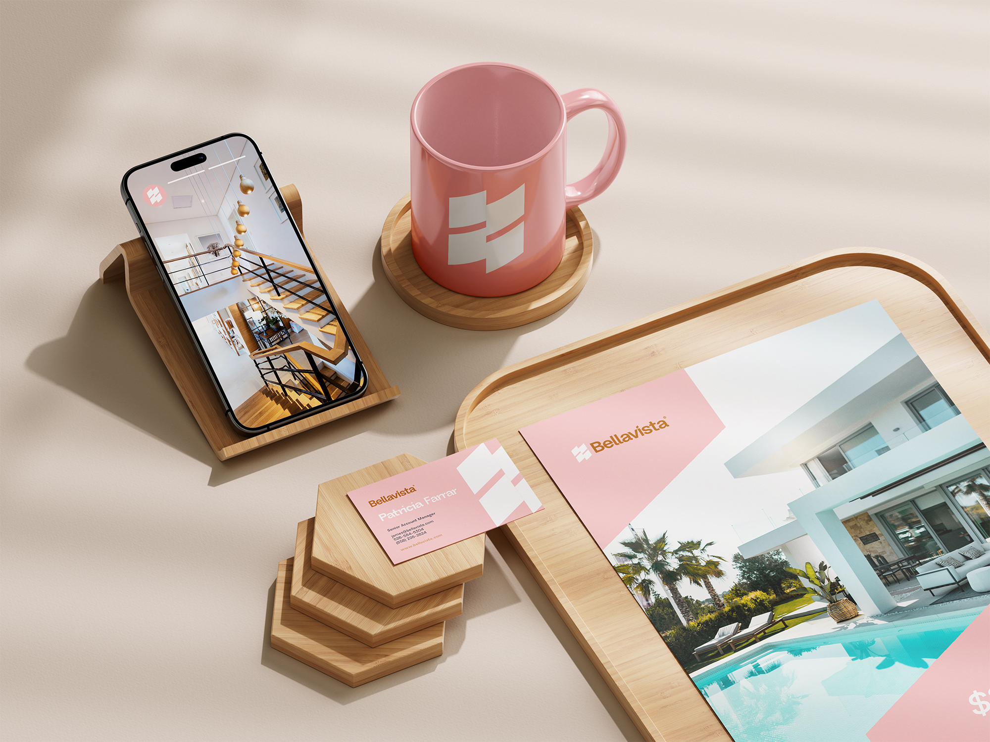
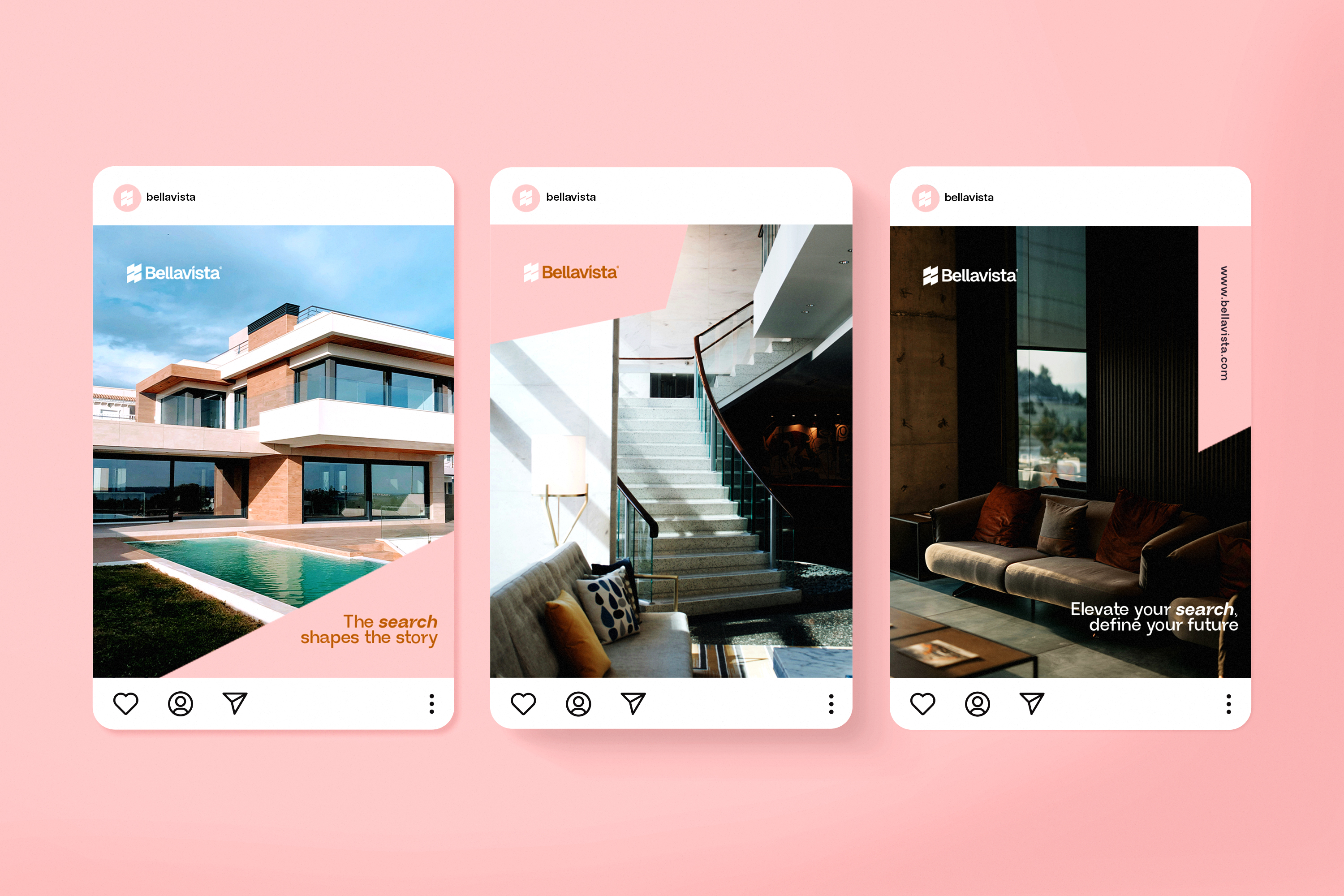
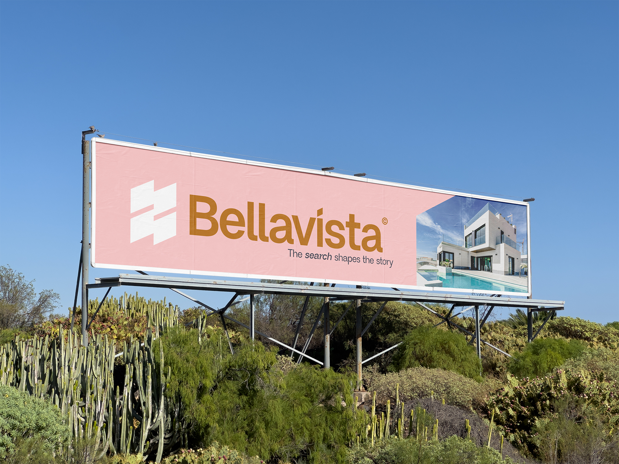
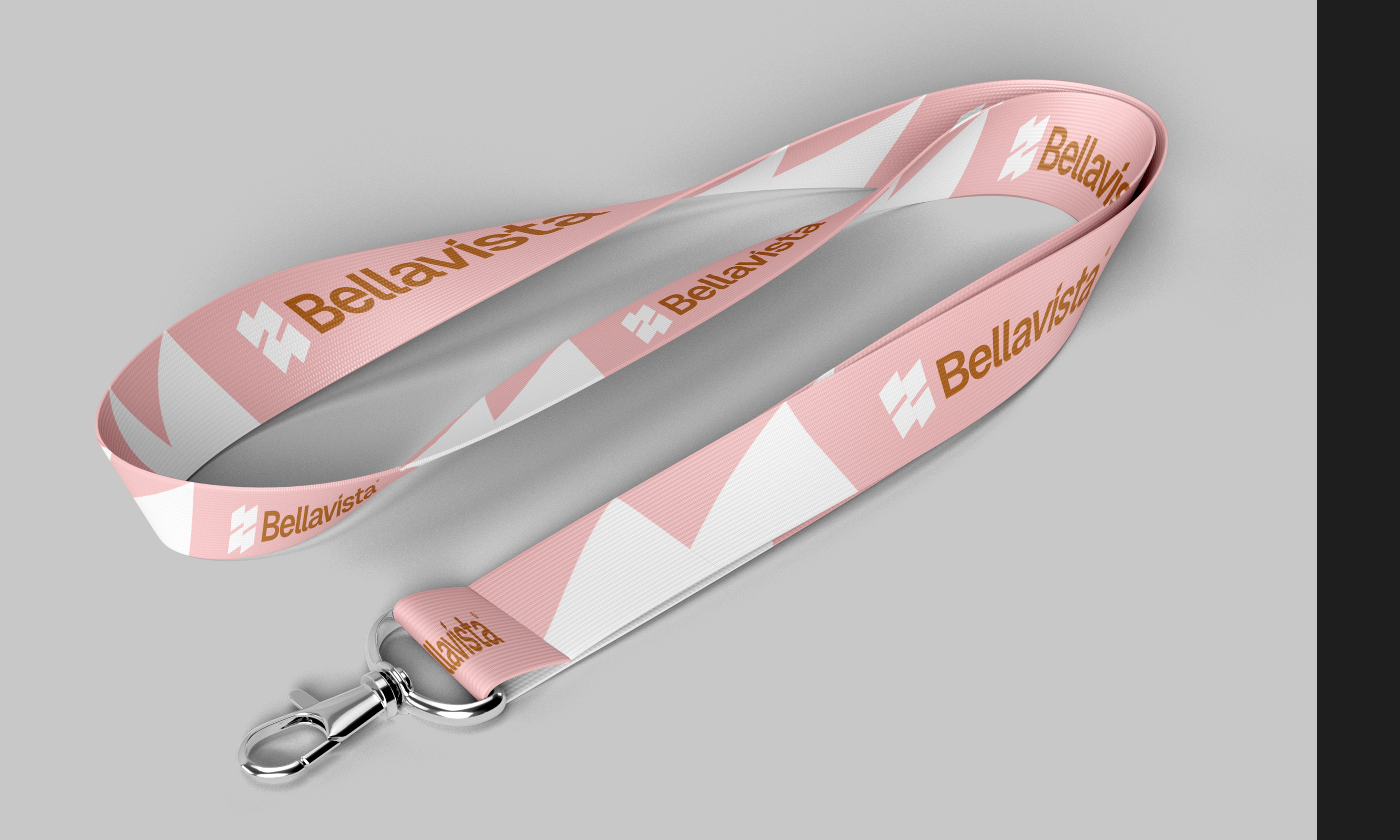
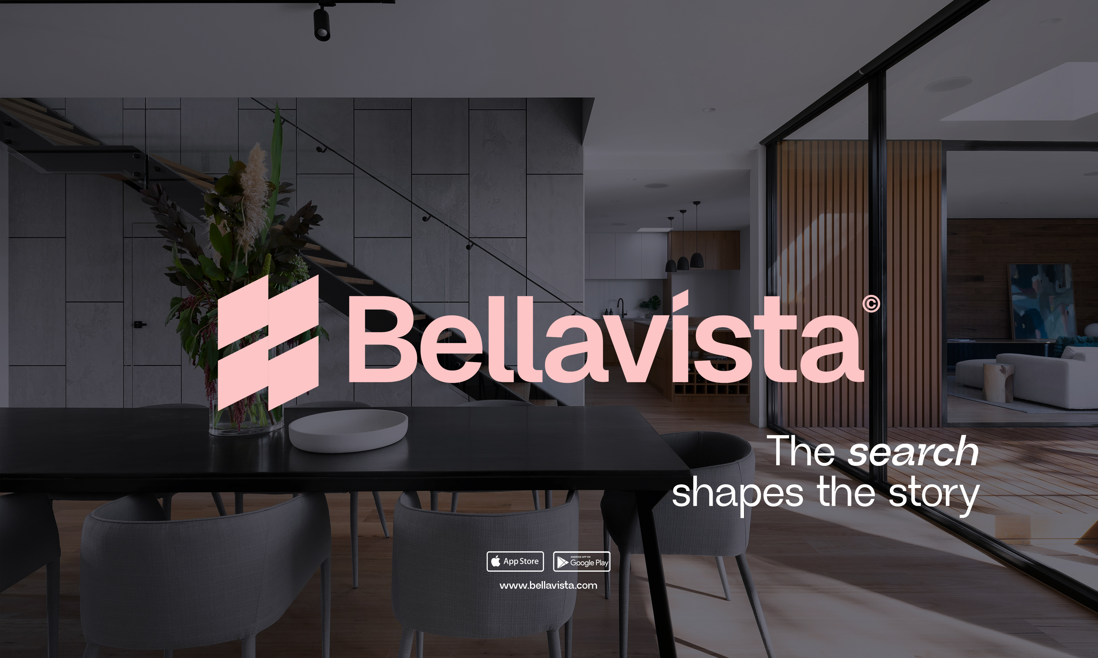
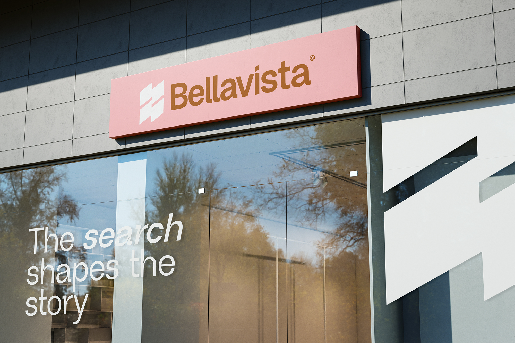
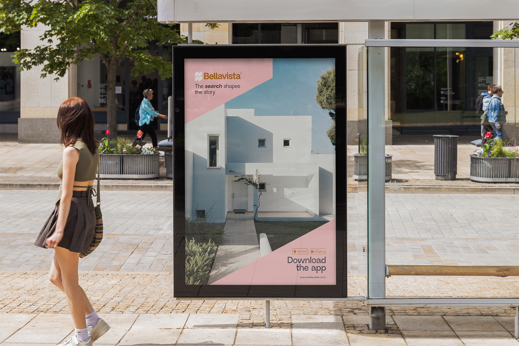
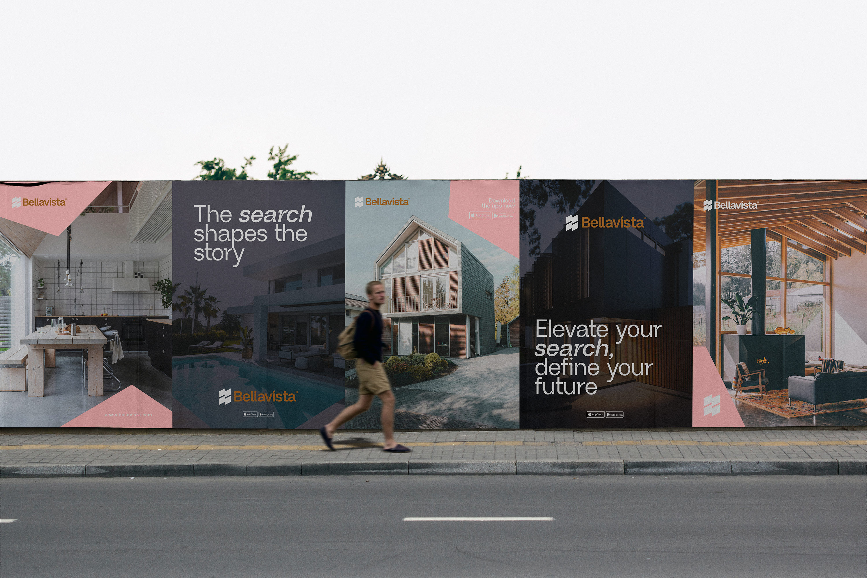
The logotype is confident and clear, designed for performance across digital and print. Typography is strong and editorial, giving the brand a sense of authority and ease. Colour plays a leading role. A combination of deep blue, soft pink, and warm gold brings warmth and contrast, helping the interface feel both polished and personal.
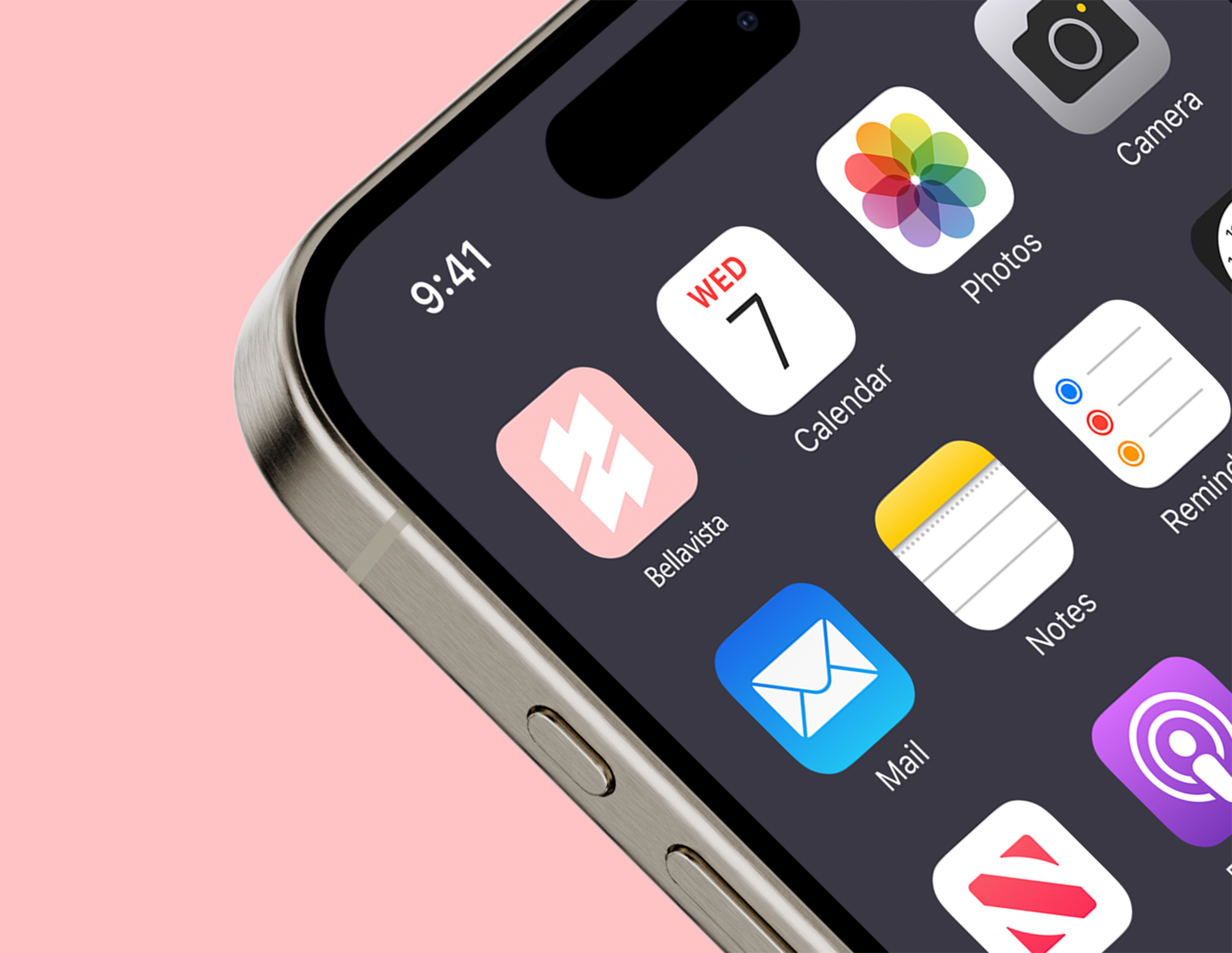
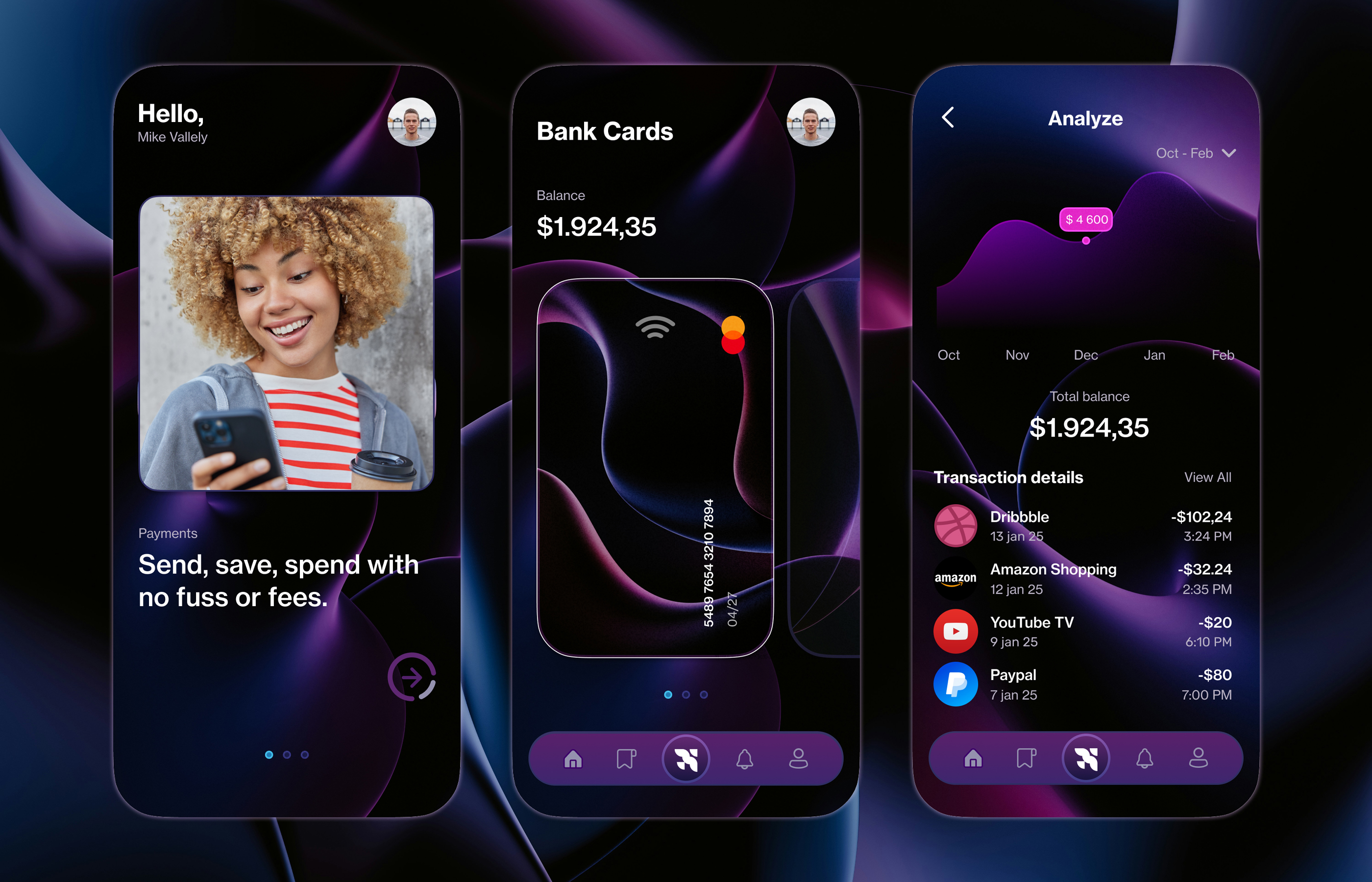
The digital platform is simple by design. Layouts are structured, listings are given space to breathe, and filters are intuitive. Brand language is direct and considered, avoiding jargon while still feeling premium. Iconography and UI elements are stripped back, keeping the experience as smooth and focused as possible.
Photography plays a key role in creating an emotional connection. We paired real, high-quality interior imagery with clear headlines and restrained detail to help users make confident choices.
Bellavista now launches with a brand that reflects its product. Sleek, human, and ready to guide a new generation of buyers.