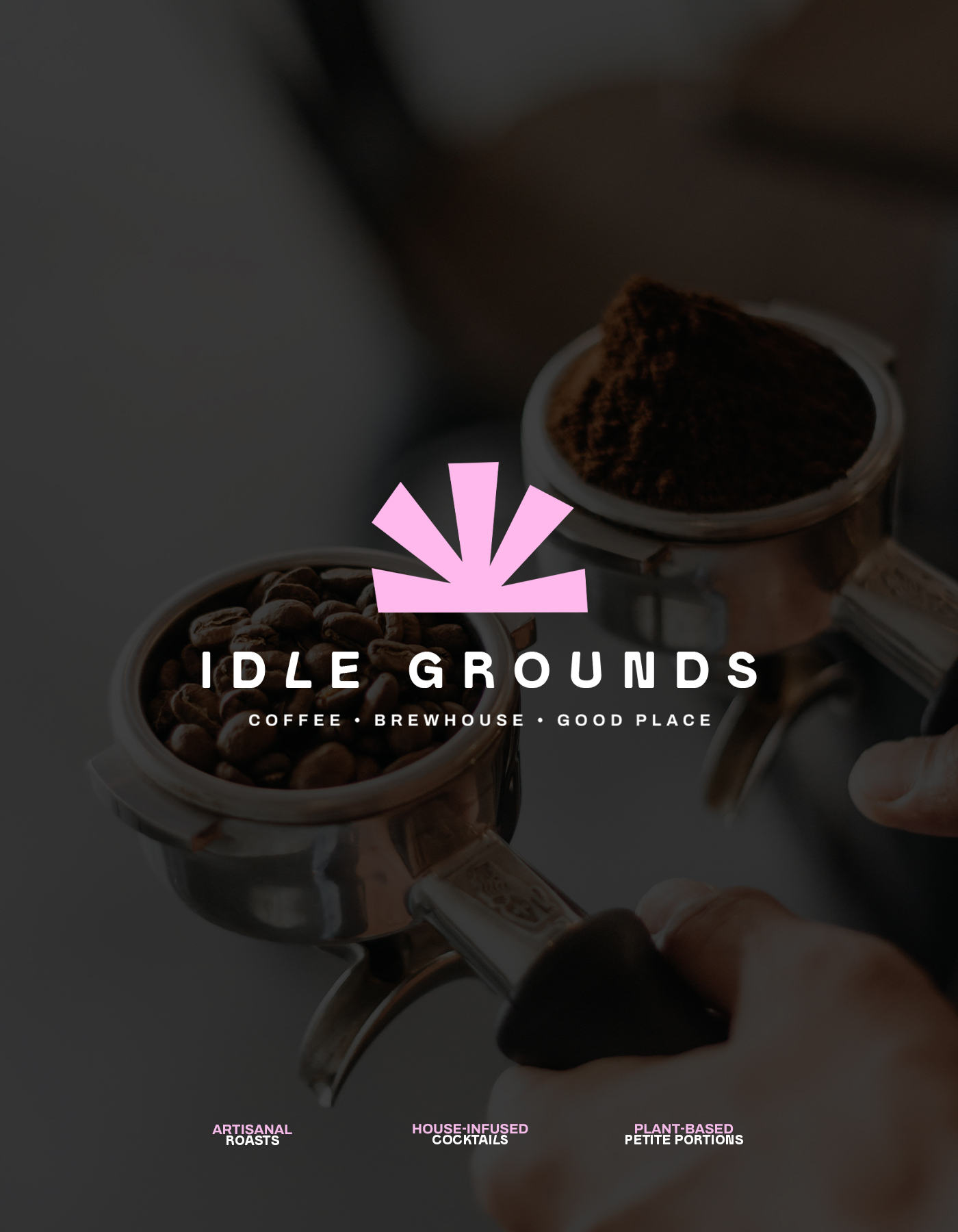
Brand identity and creative direction for a specialty coffee bar with a focus on calm, culture, and conscious indulgence.
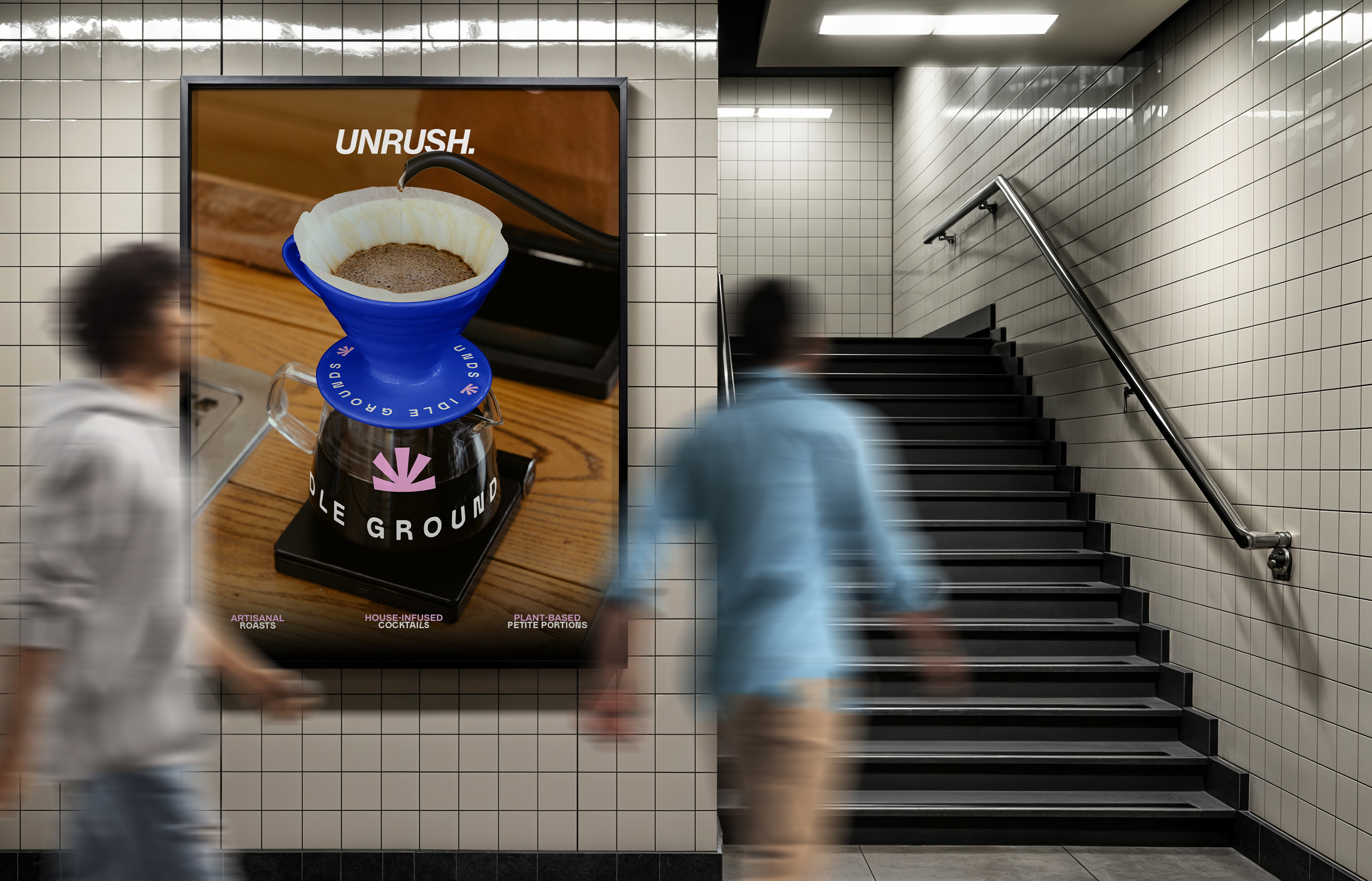
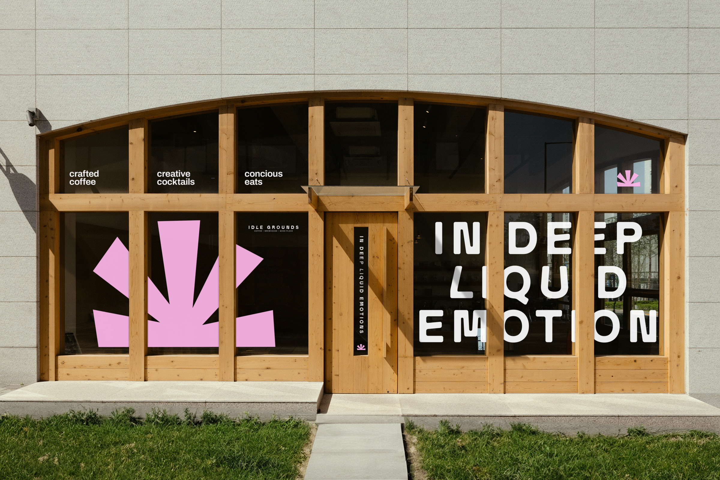
Idle Grounds isn’t just another coffee bar. It’s a cultural pause. A space made for people who care about how things taste, how they feel, and how they last. The founders approached us with a clear idea, to create a brand that feels thoughtful but not sterile, warm but not overdesigned. A place that invites people to slow down and notice the small things.
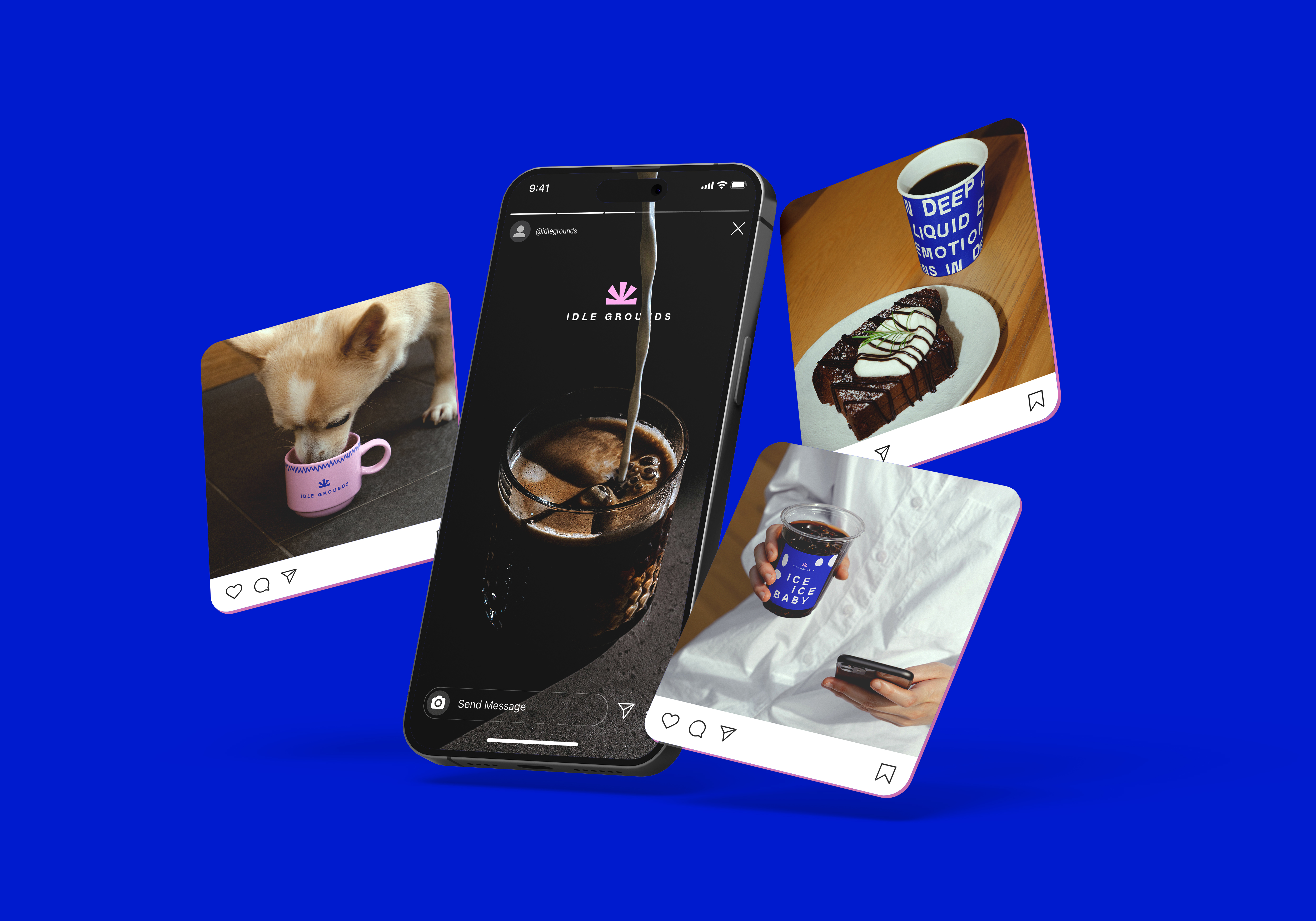
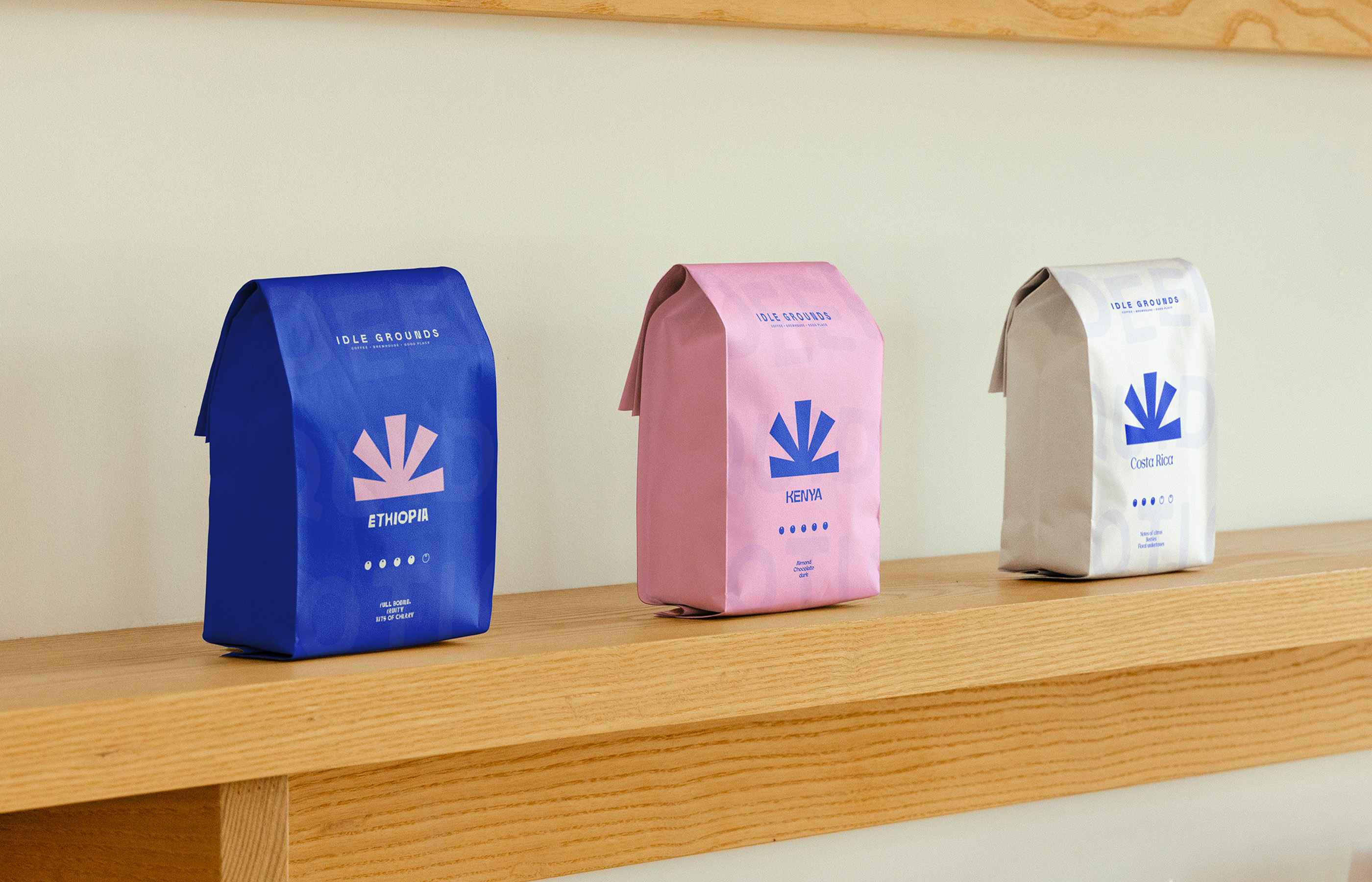
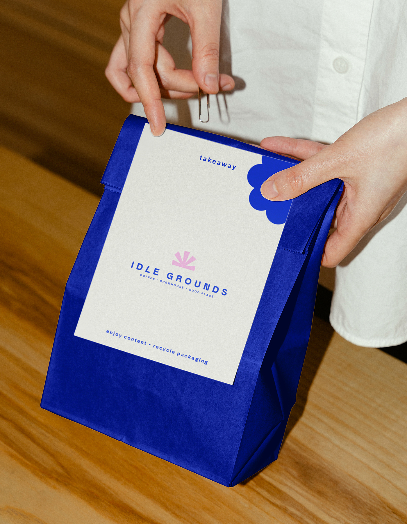
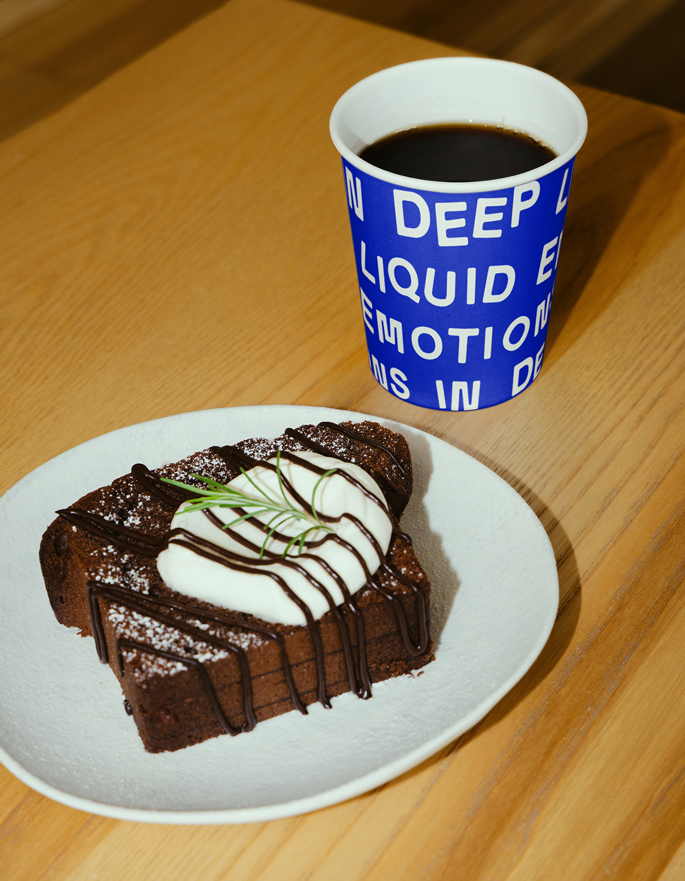
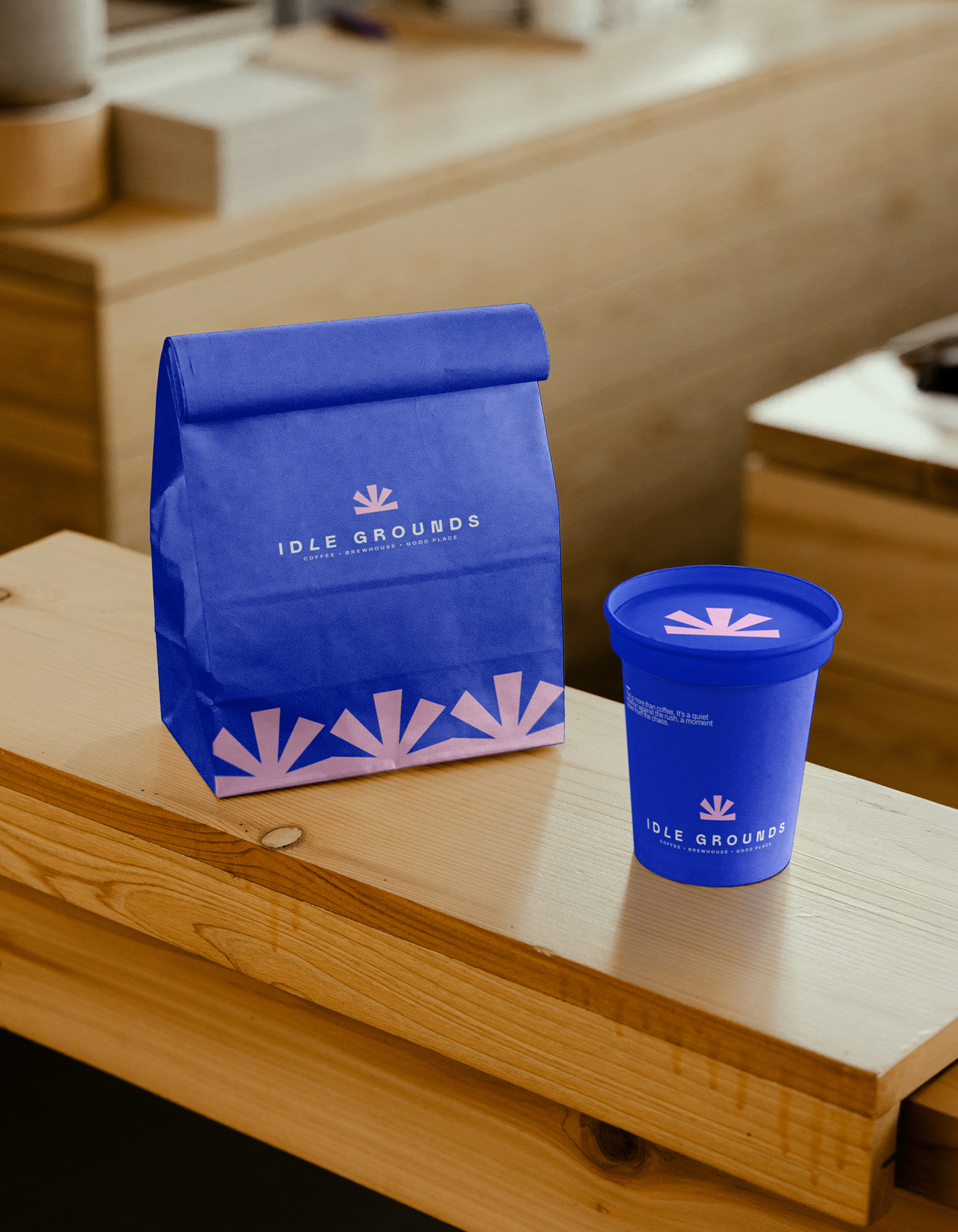
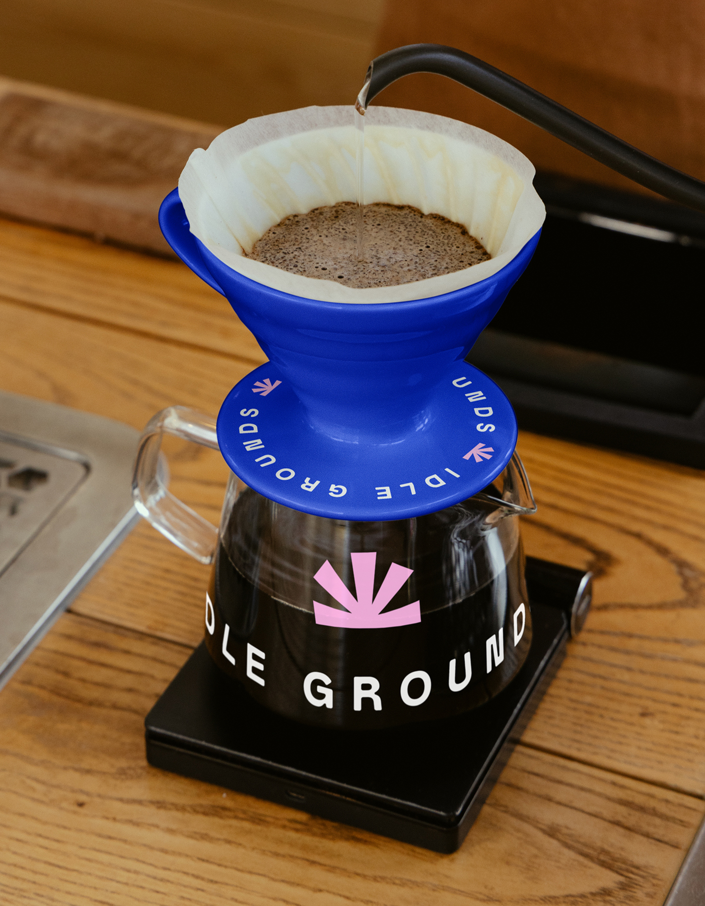
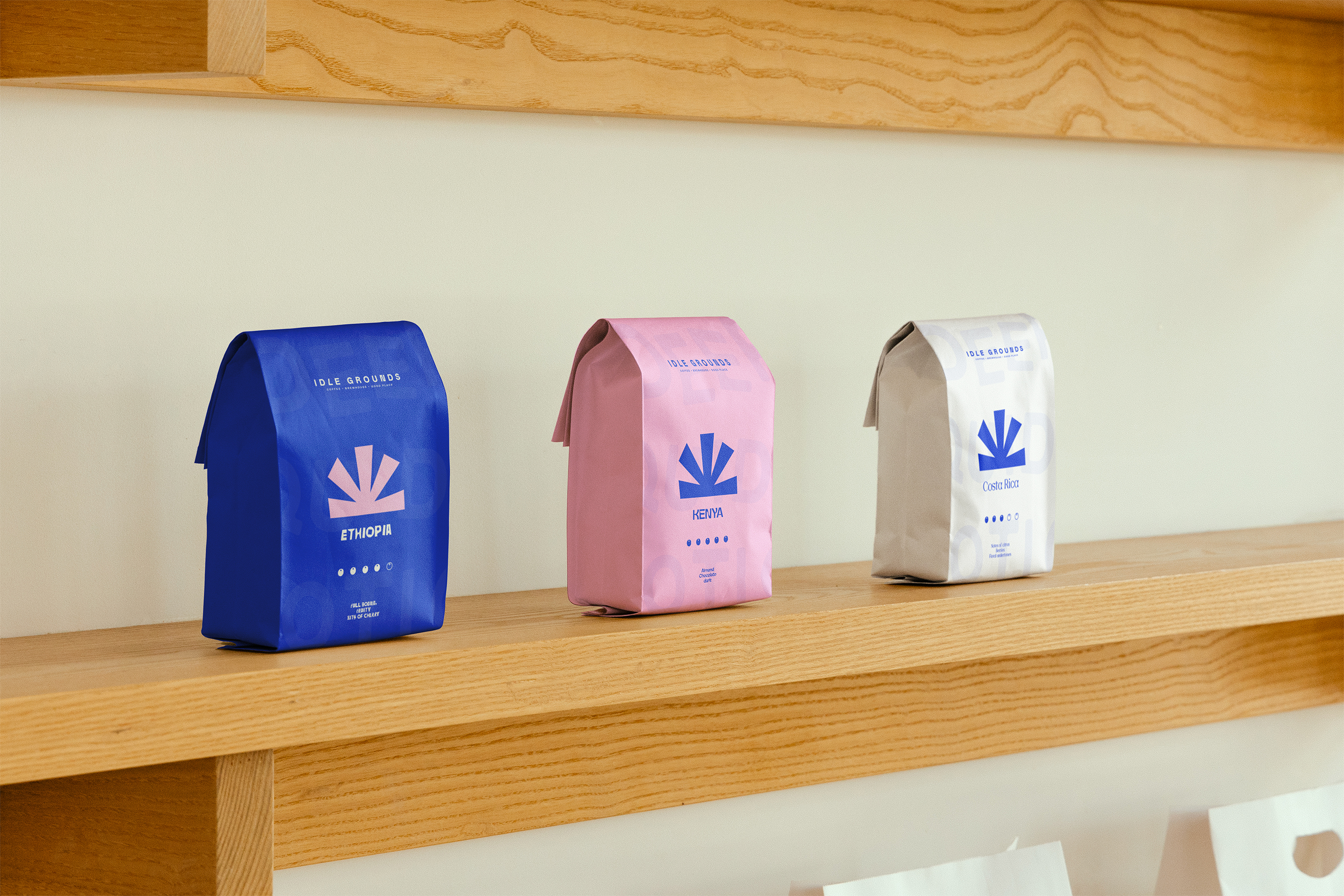
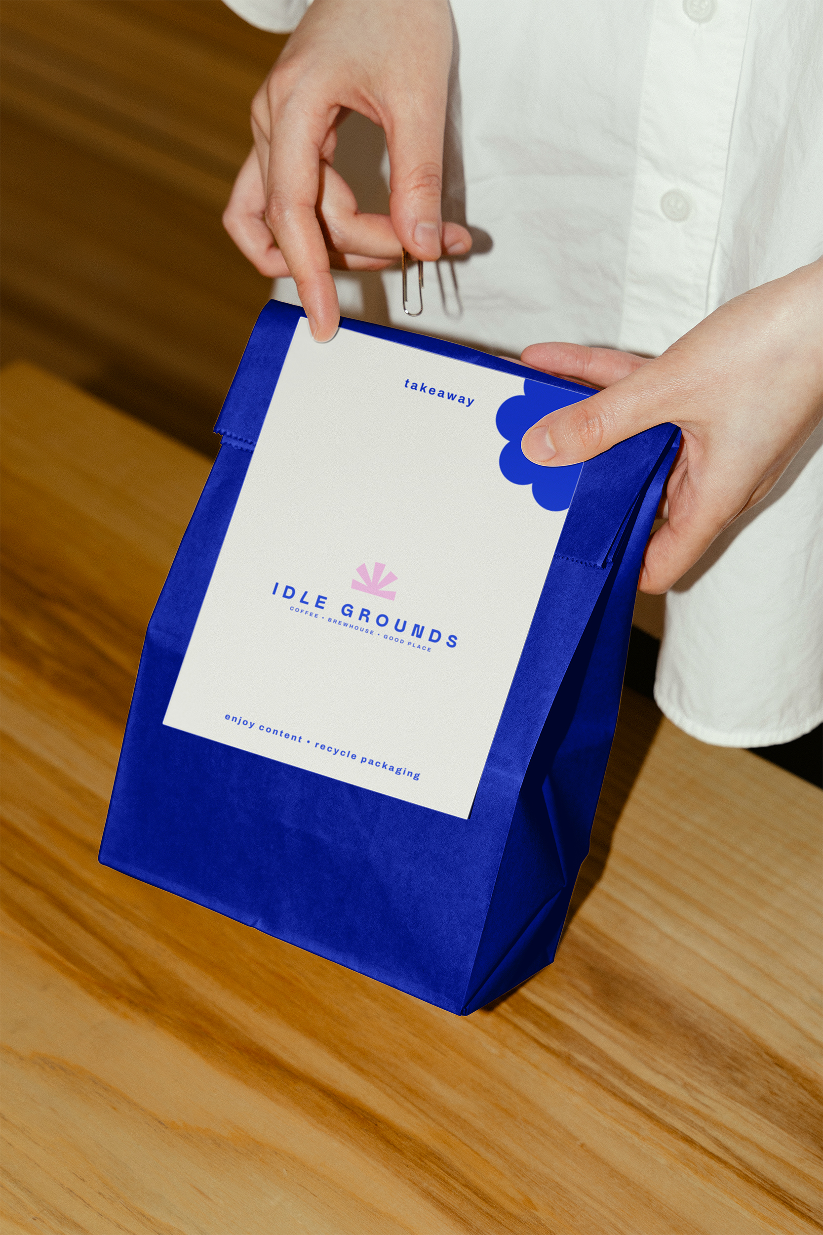
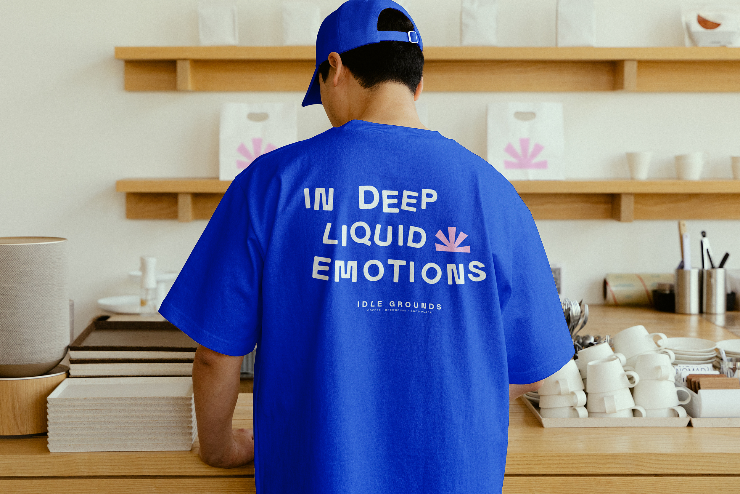
We developed a full identity system to reflect that mindset. Minimal, modular, and built for everyday use. The logomark is structured but open. Typography is grounded and legible, with soft edges that add warmth to clean lines. The colour palette leads with cobalt and blush, balanced by off-whites and charcoal. The result is calm, distinct, and modern without noise.
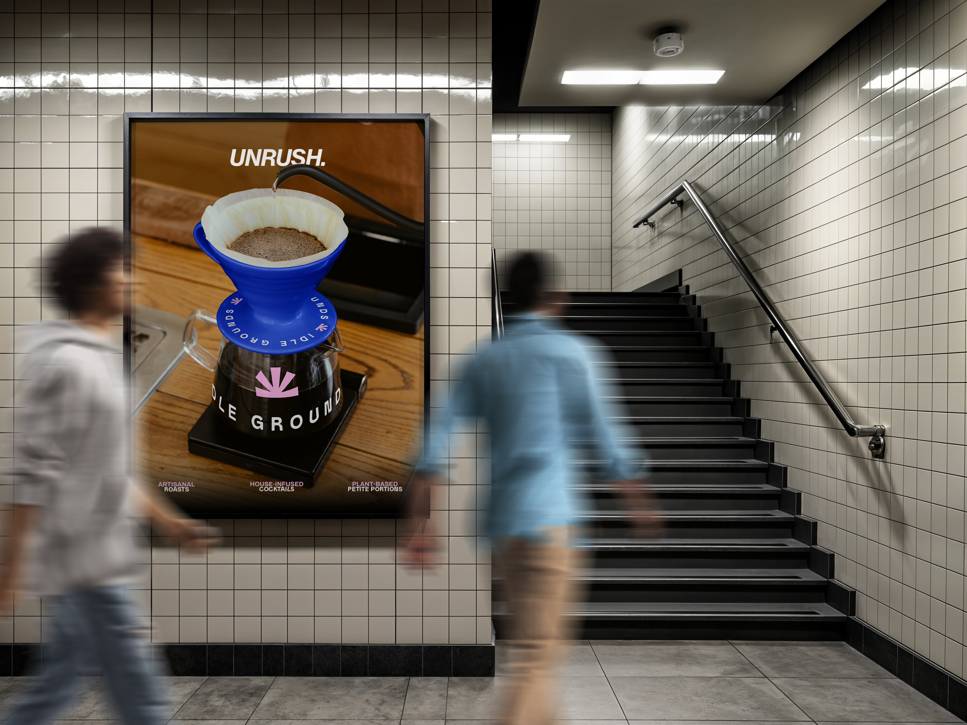
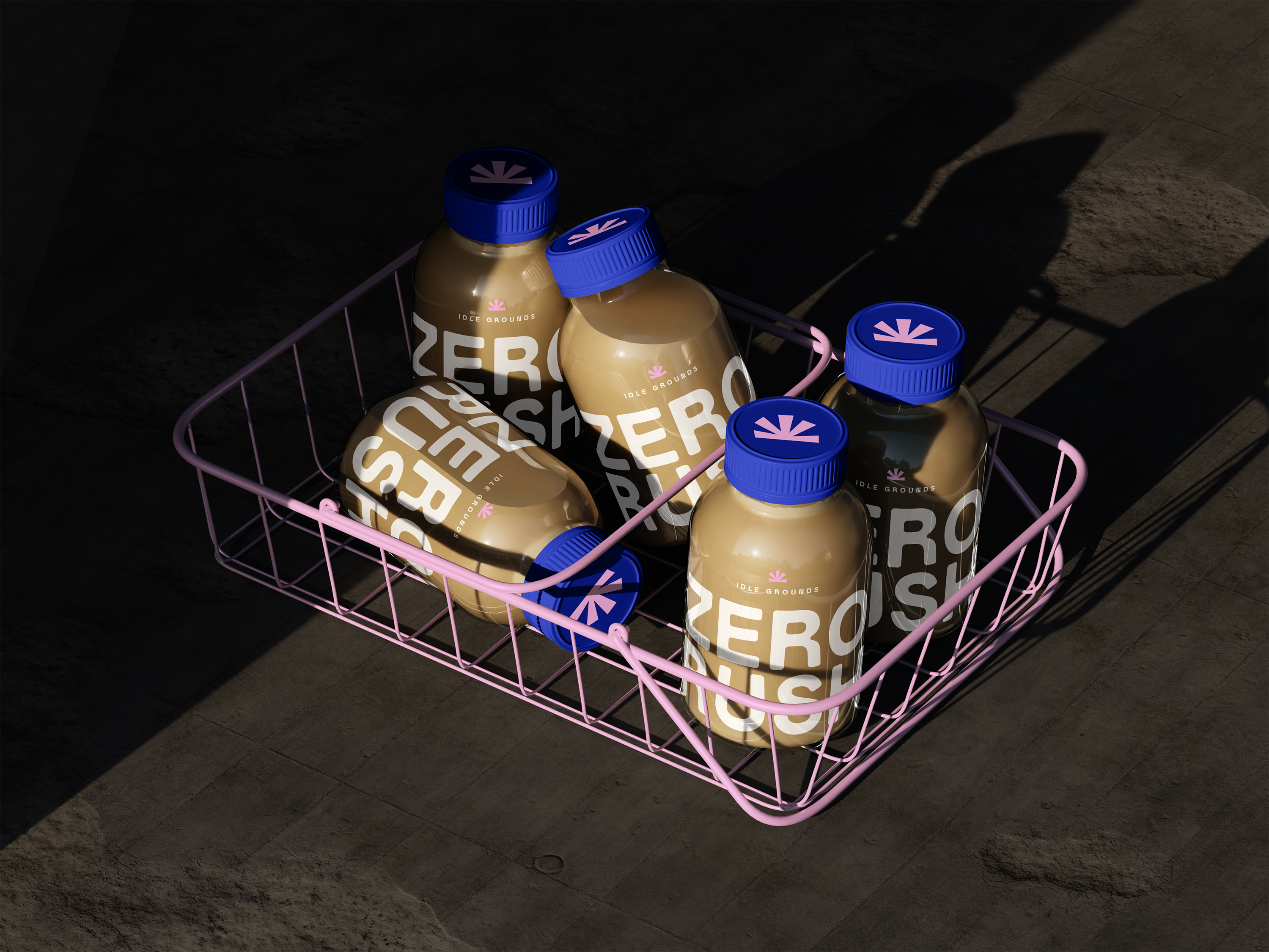
Packaging and merchandise followed the same approach. From cups to loyalty cards, every touchpoint was designed with tactility and intention. Print materials use natural stocks and minimal ink. The system flexes easily across bags, signage, apparel, and interior details, always clear and quietly present.
A specialty coffee brand designed to be slow, deliberate, and quietly bold in a world of rush.