Brand identity and creative direction for a plant-based fast food brand with a brutalist attitude and zero appetite for compromise.
SNUBS isn’t here to make friends. It’s here to prove that plant-based can hit harder than anything on the grill. Born from a love of fast food culture and a total rejection of the wellness-industrial complex, SNUBS needed a brand that felt bold, irreverent, and completely unforgettable.
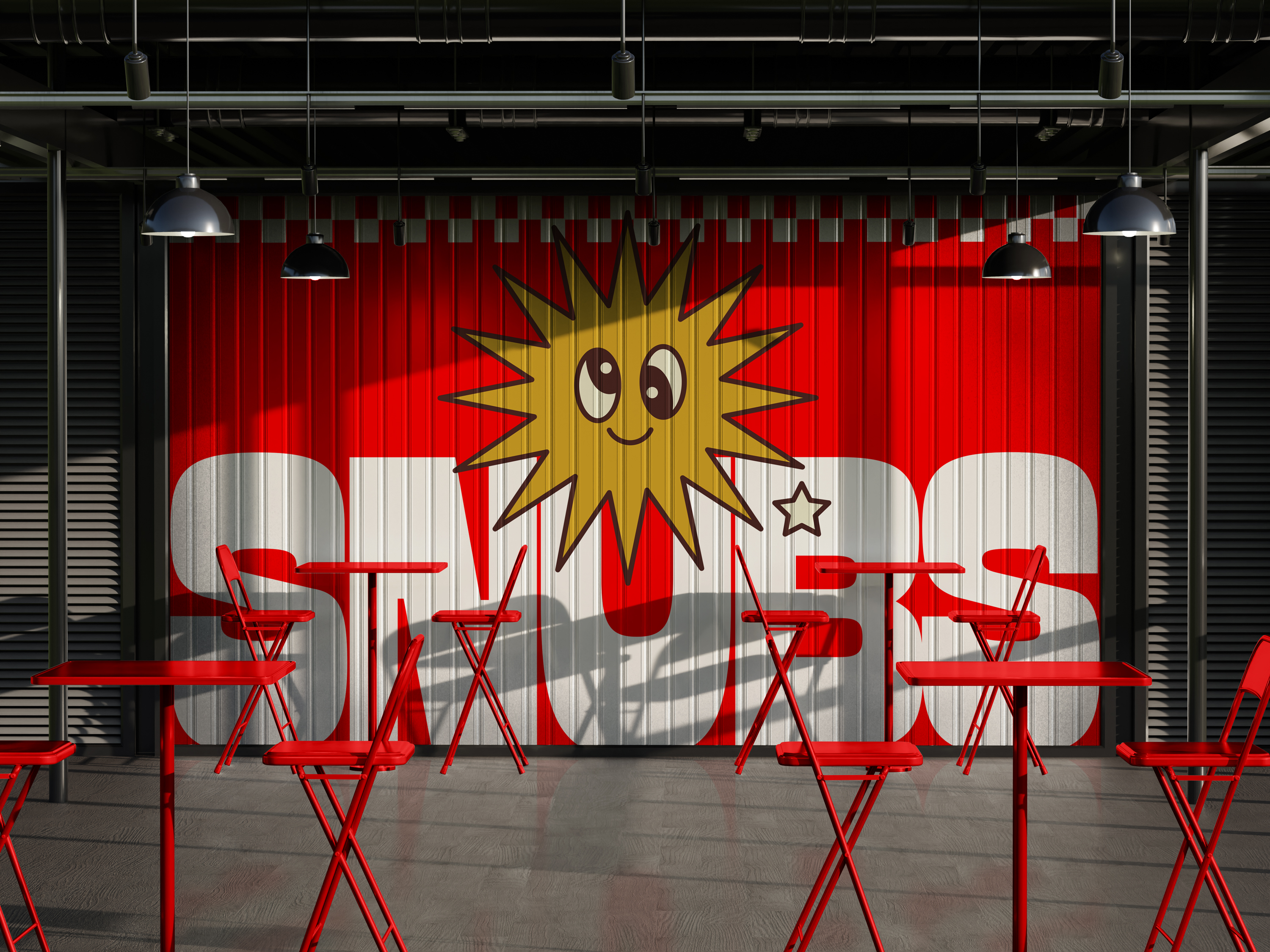
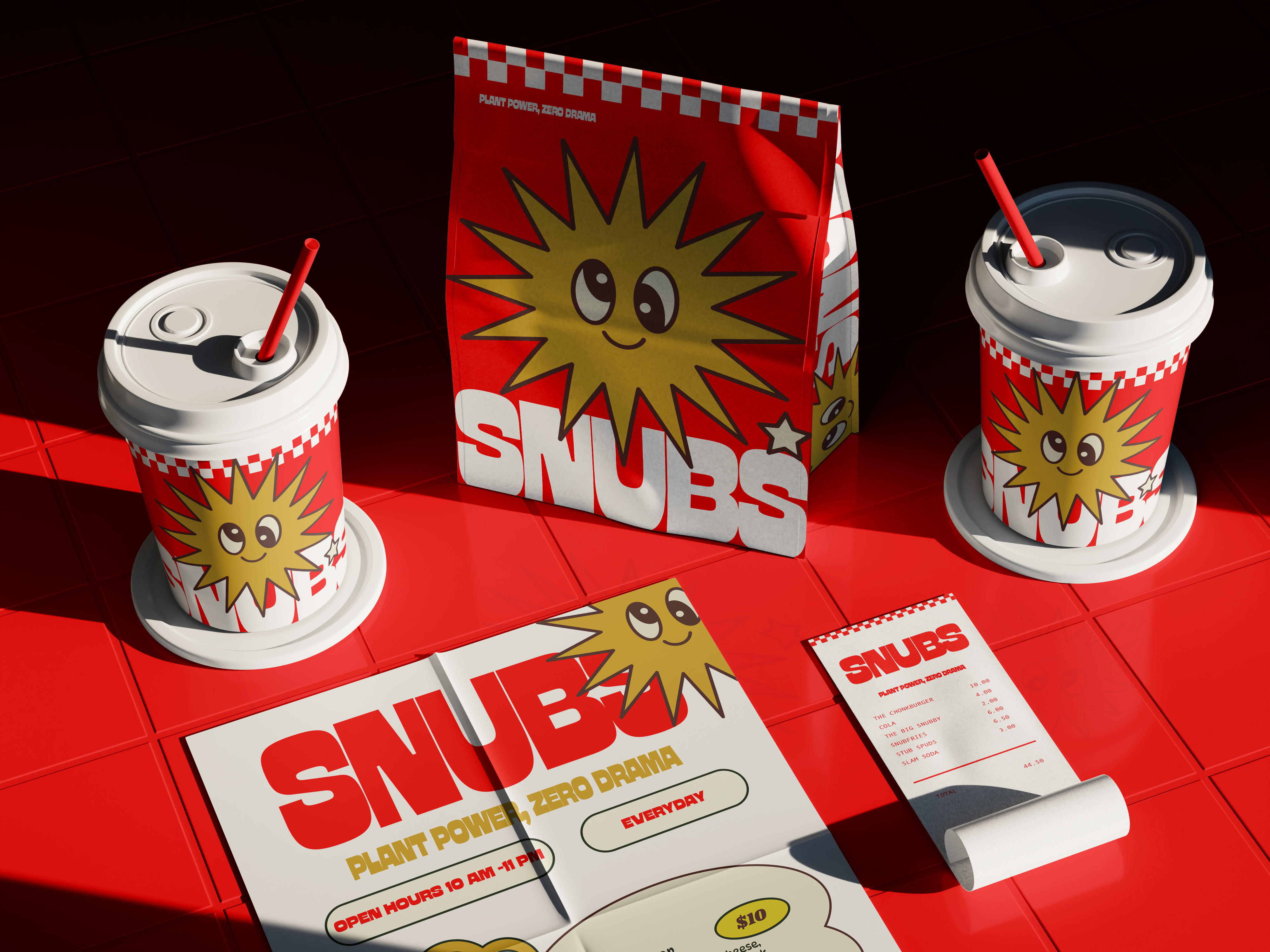
We worked with the founding team to shape a visual identity and packaging system that channels retro Americana with a brutalist twist. The strategy was simple: no subtlety, no compromise, and no meat.
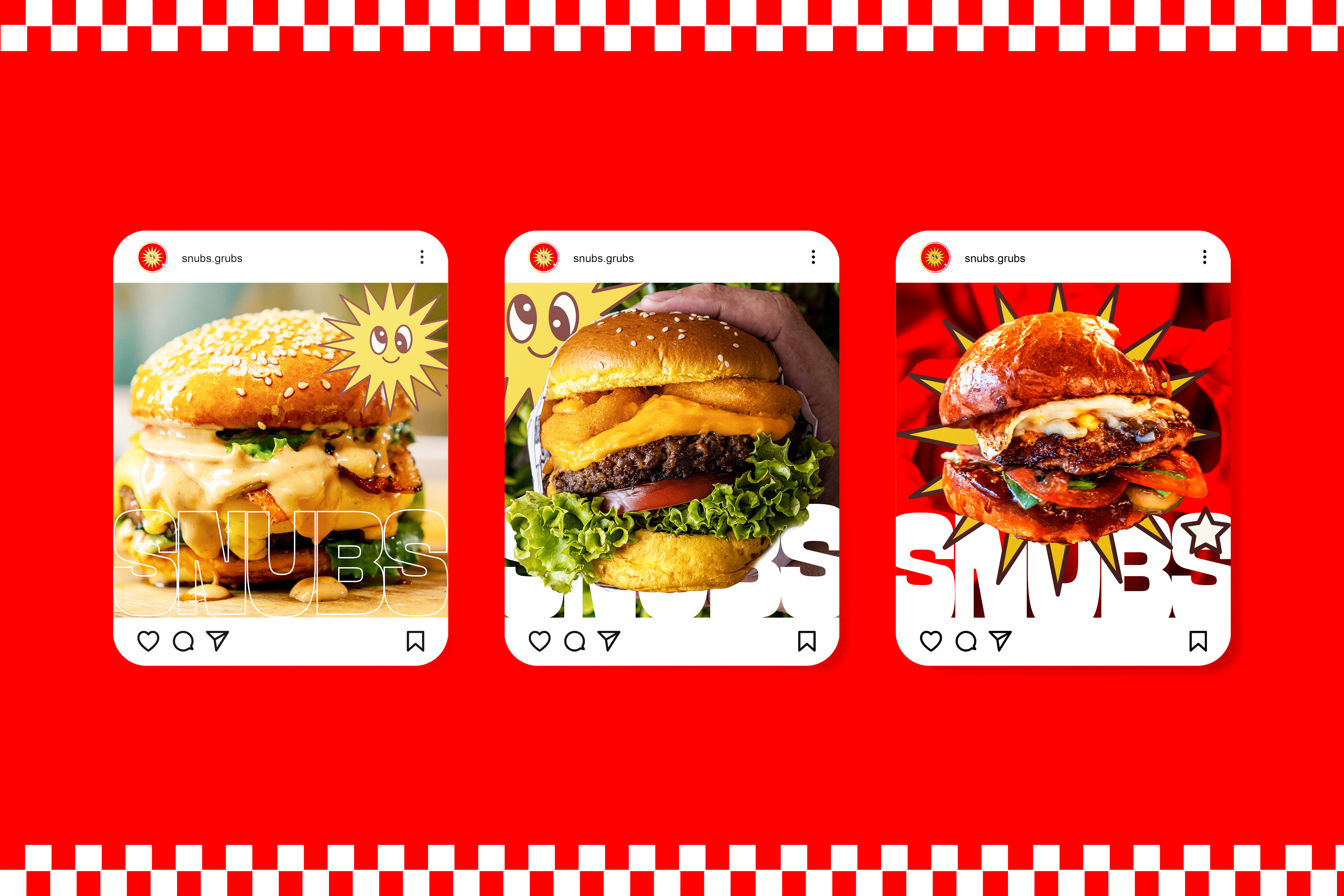
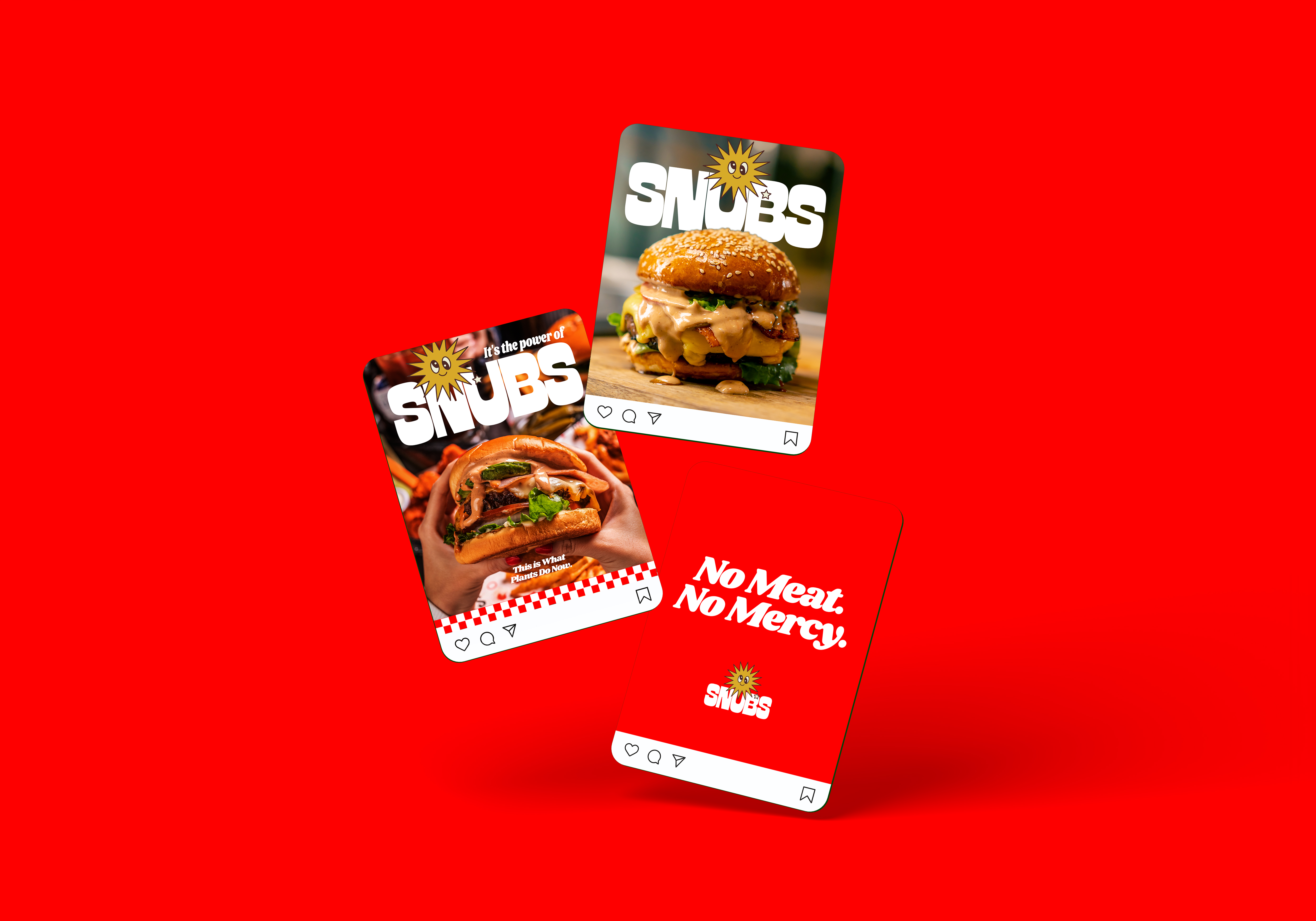
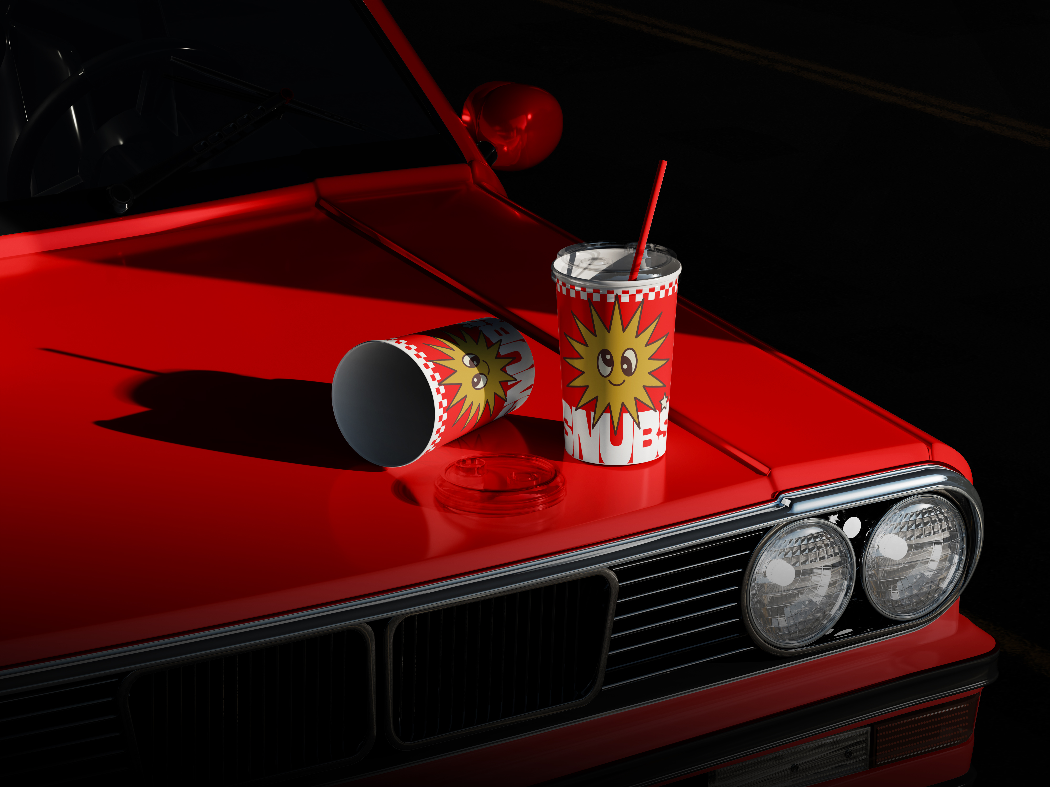
The logotype is loud and lowbrow, with a custom sun mascot that gives the brand its own weird personality. Colour plays a leading role. Red and mustard dominate the core range, while limited drops experiment with grime, grit, and graphic distortion. Typography is heavy, ugly, and proud of it. Every visual element was built to be memeable, merchable, and impossible to ignore.
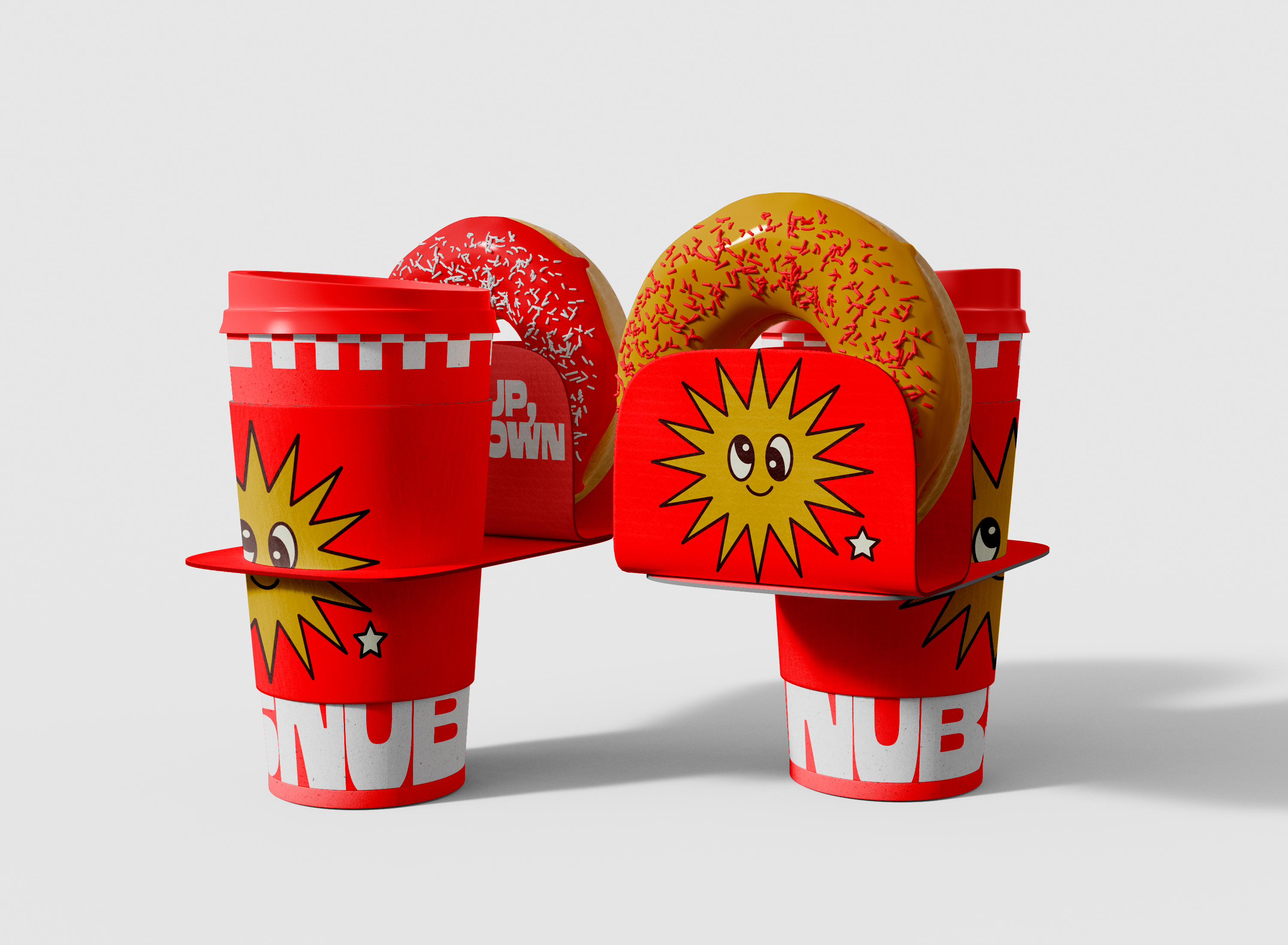
Packaging leans into parody. Wrappers and boxes nod to legacy fast food brands, twisting slogans and visual cues into something sharper and smarter. We created sub-lines like SNUBWAY and SNUB ZERO to extend the system, giving the brand space to evolve without softening its edge.
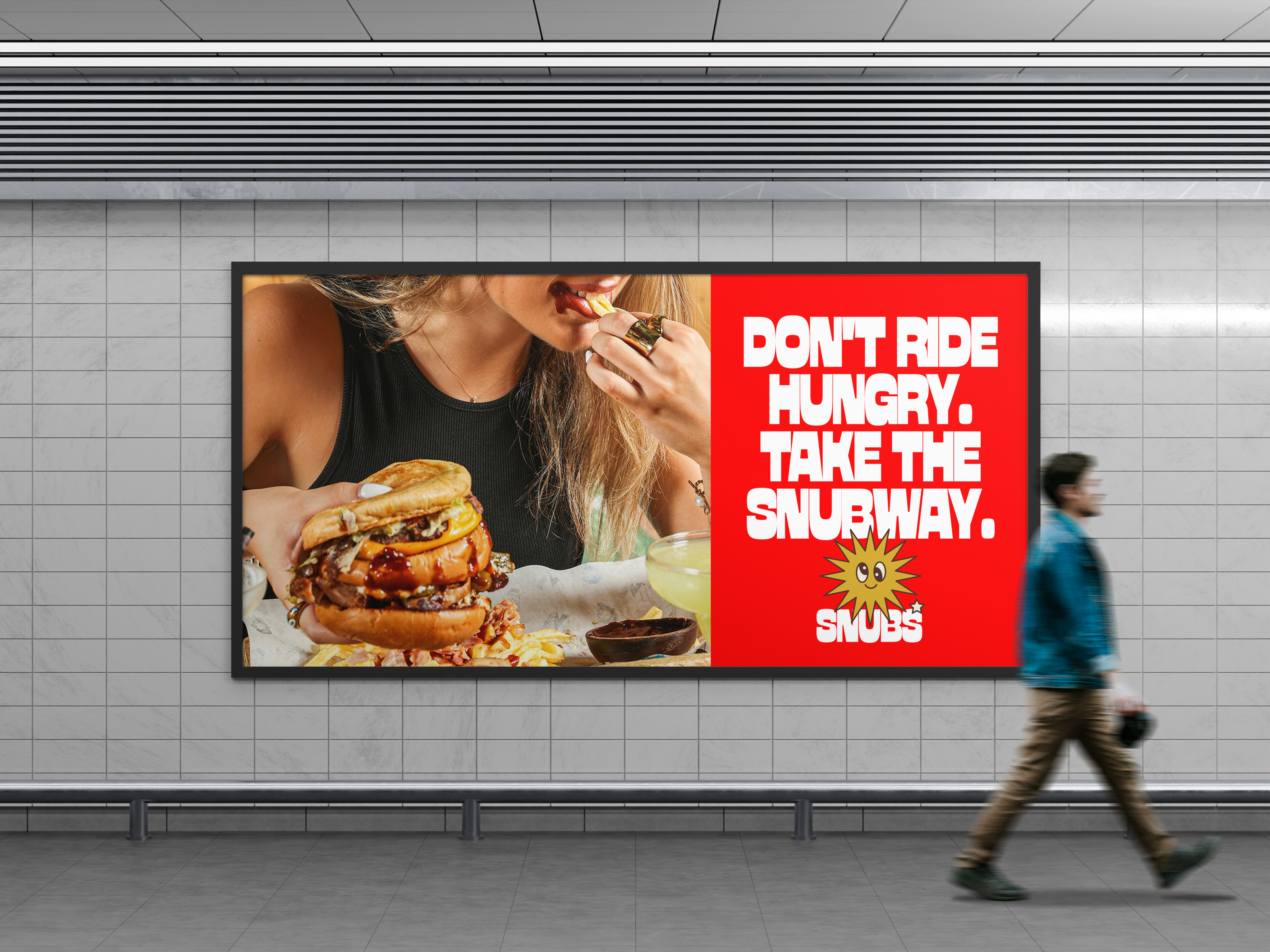
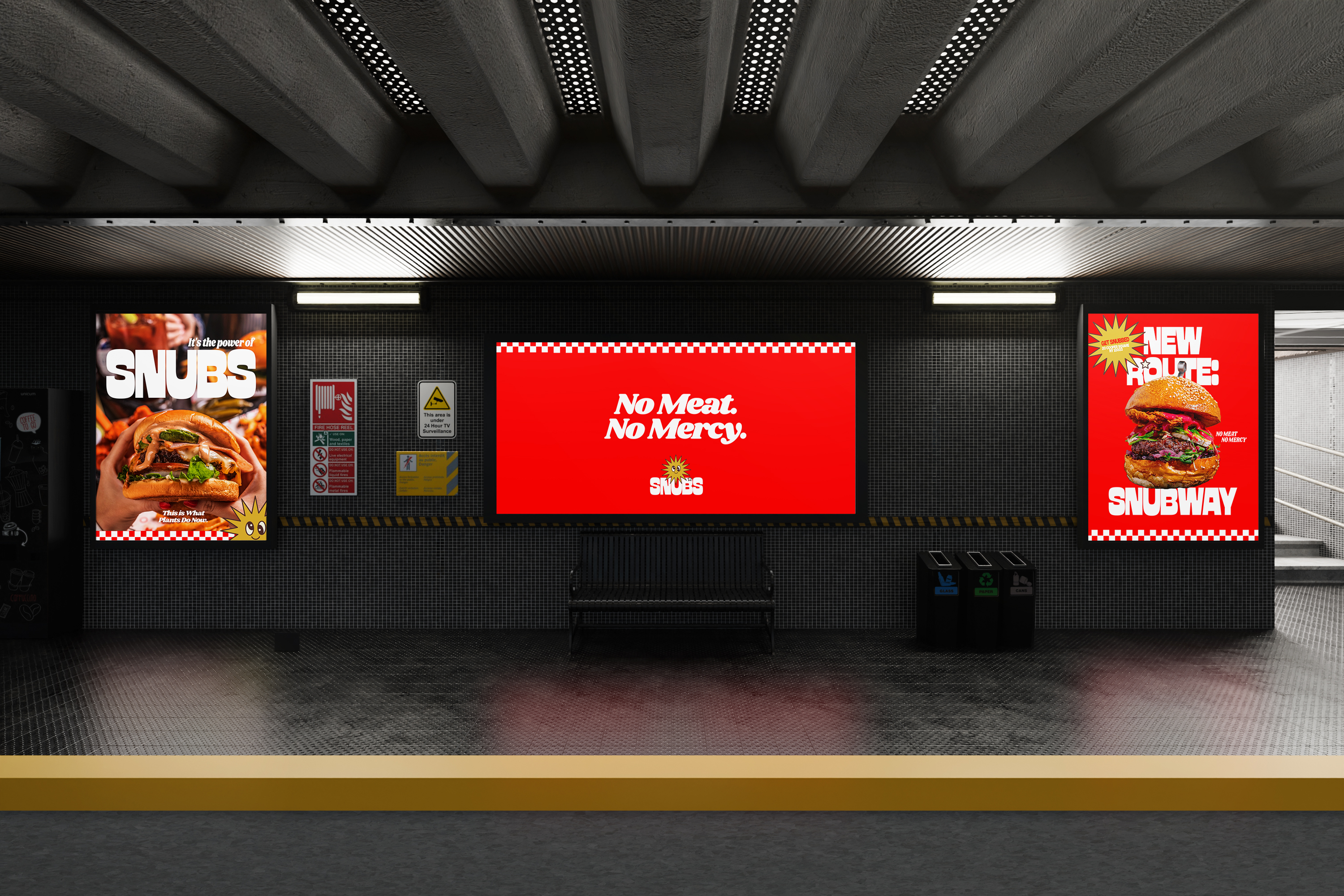
From outdoor campaigns to greasy-sticker merch, the brand’s voice stays loud across every channel. It’s confident. It’s carnivore-proof. And it’s built for a generation that’s over greenwashed guilt and ready for something with teeth.
SNUBS doesn’t sell salad. It sells attitude. No meat. No mercy.