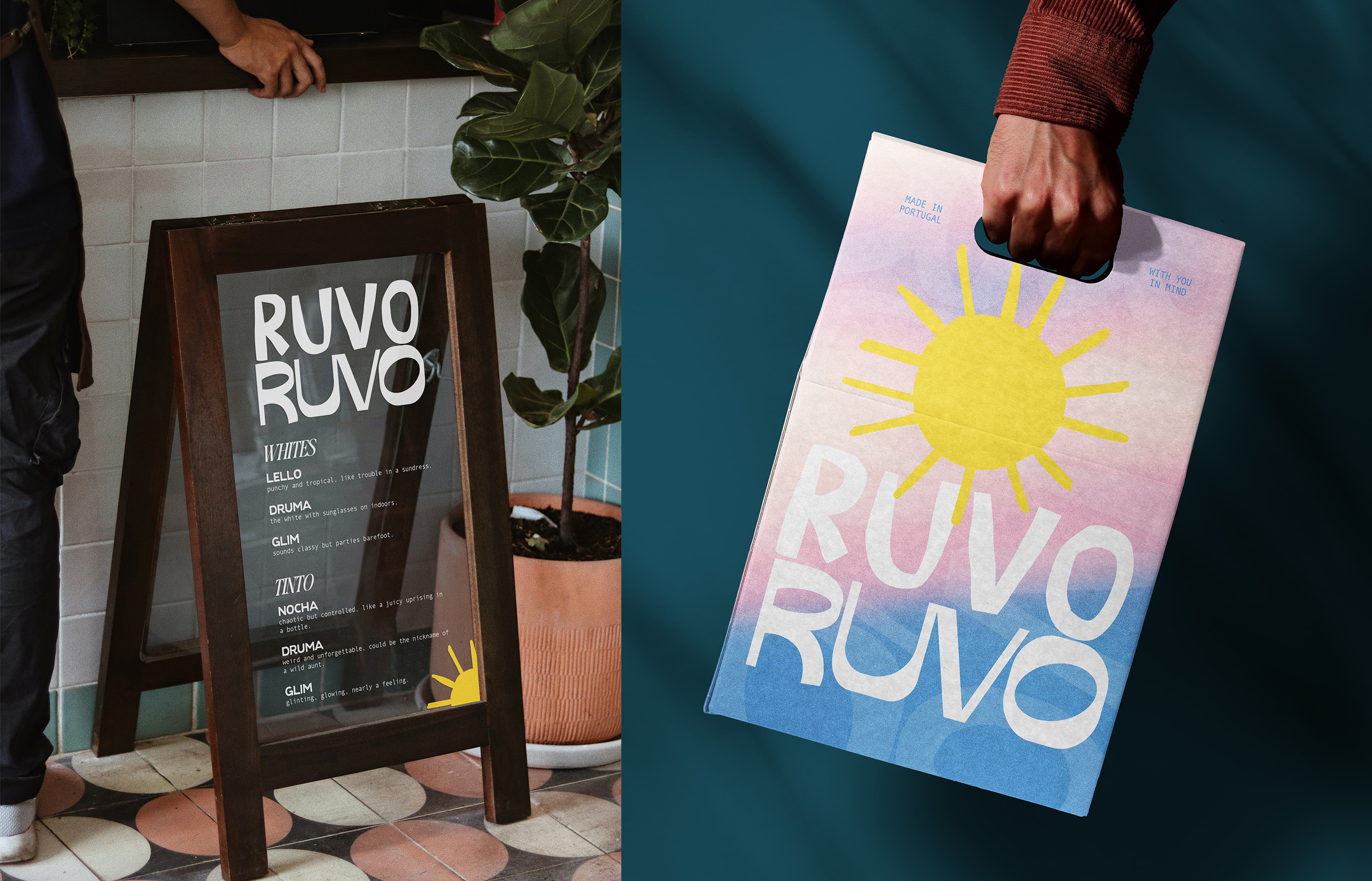
Brand identity and creative direction for a bold wine brand with a split personality and a name you won’t forget.

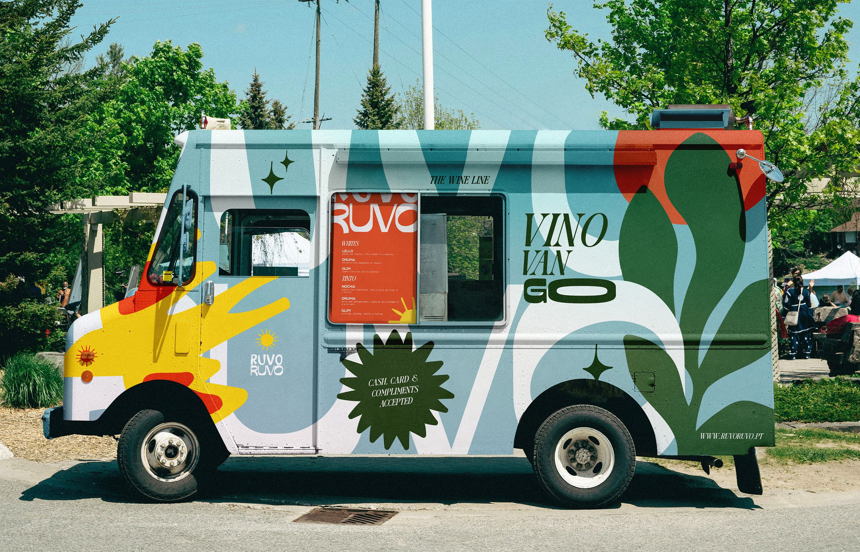
RuvoRuvo was built to stand out in a category defined by quiet minimalism and overly polished restraint. This brand wanted energy, flavour, and a distinct sense of personality. It needed to feel sharp but expressive, premium but never predictable.
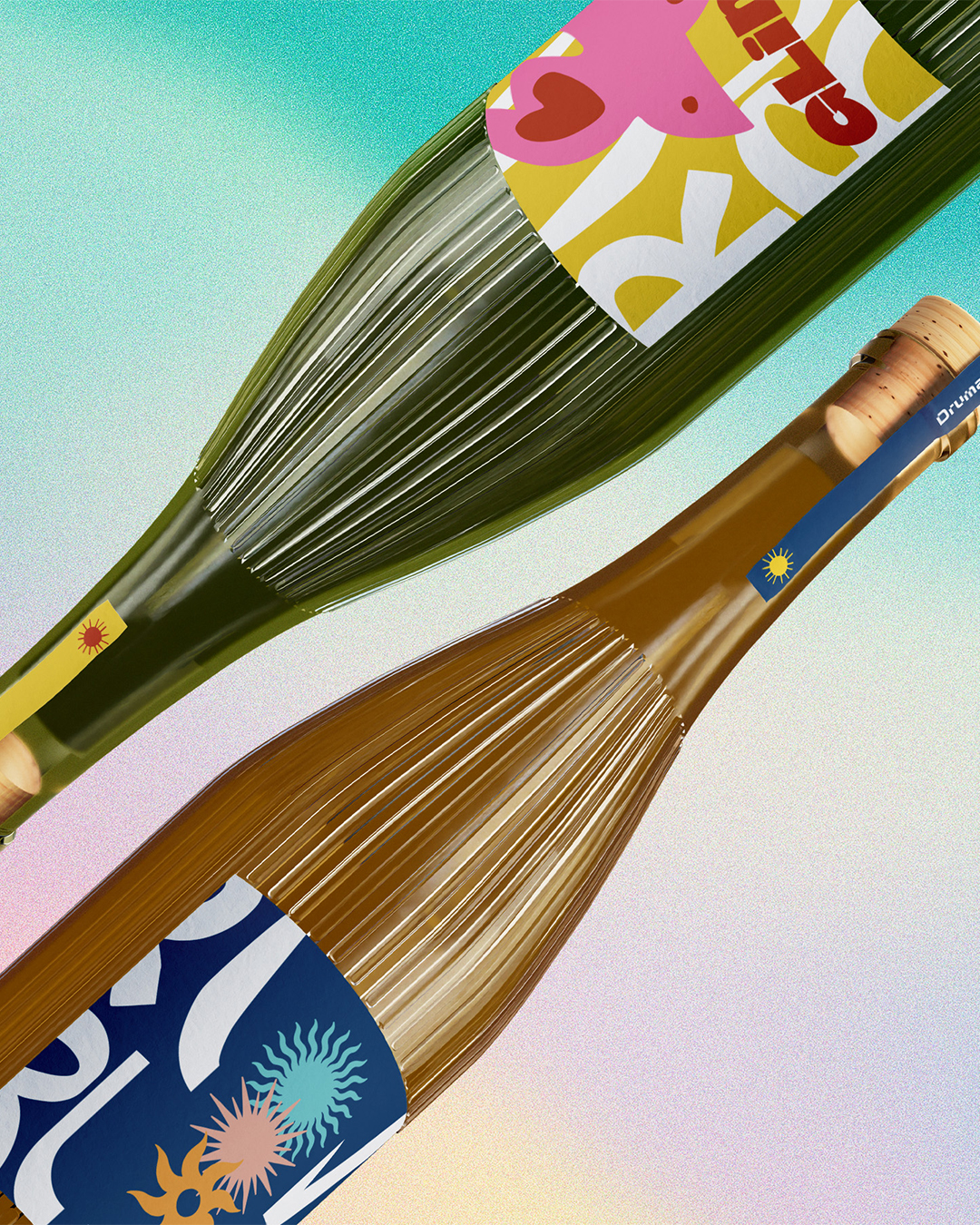
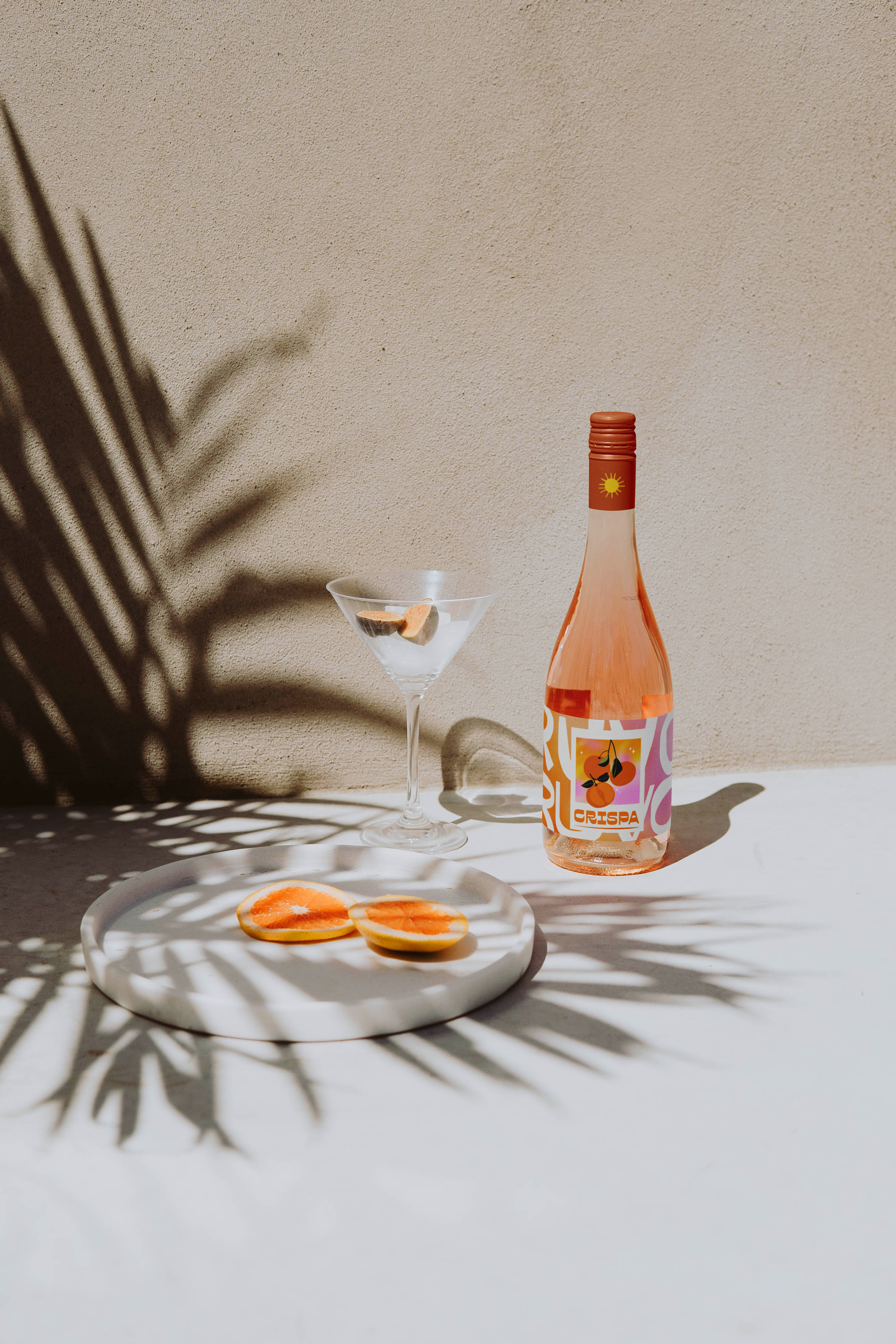
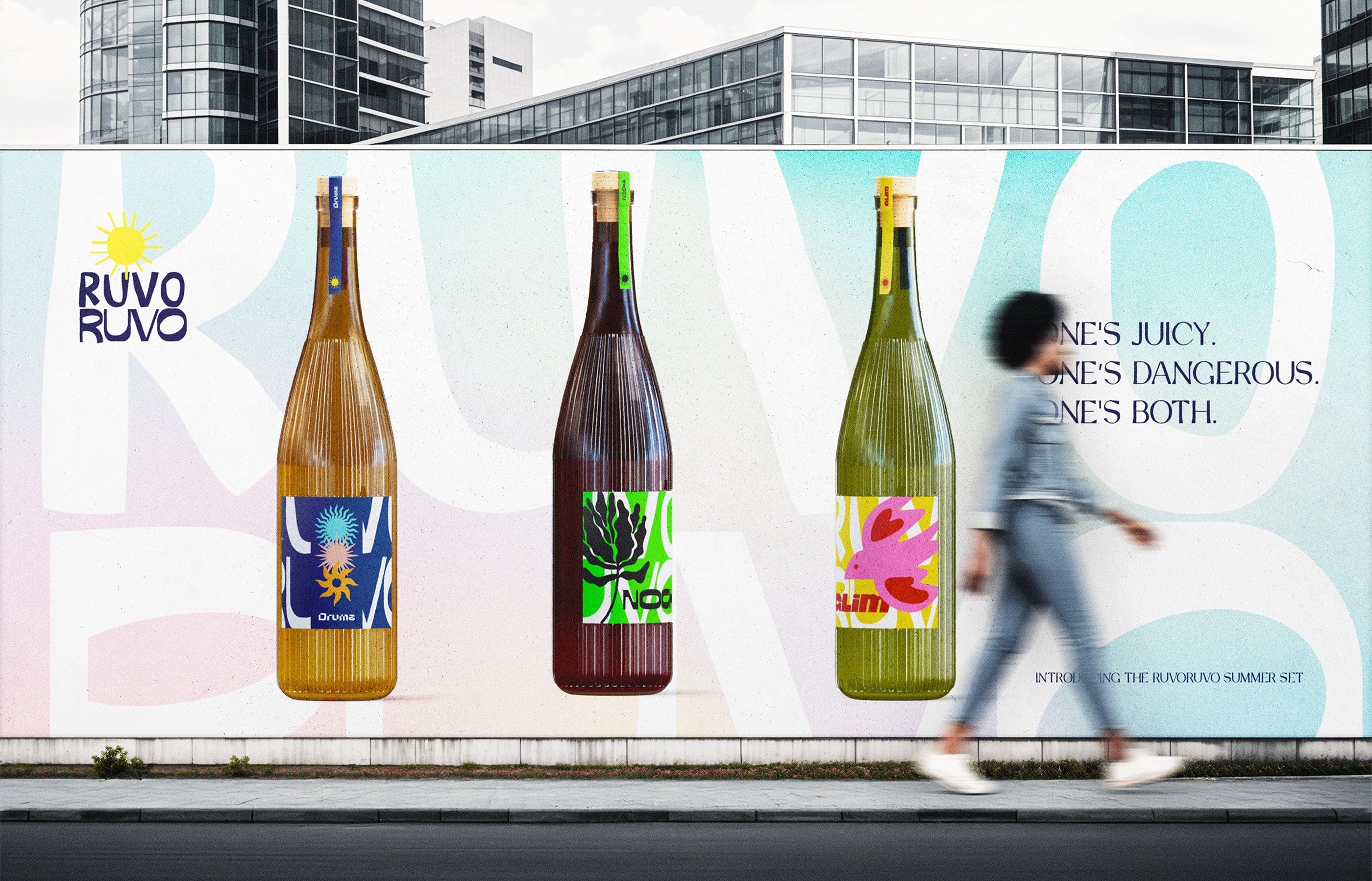
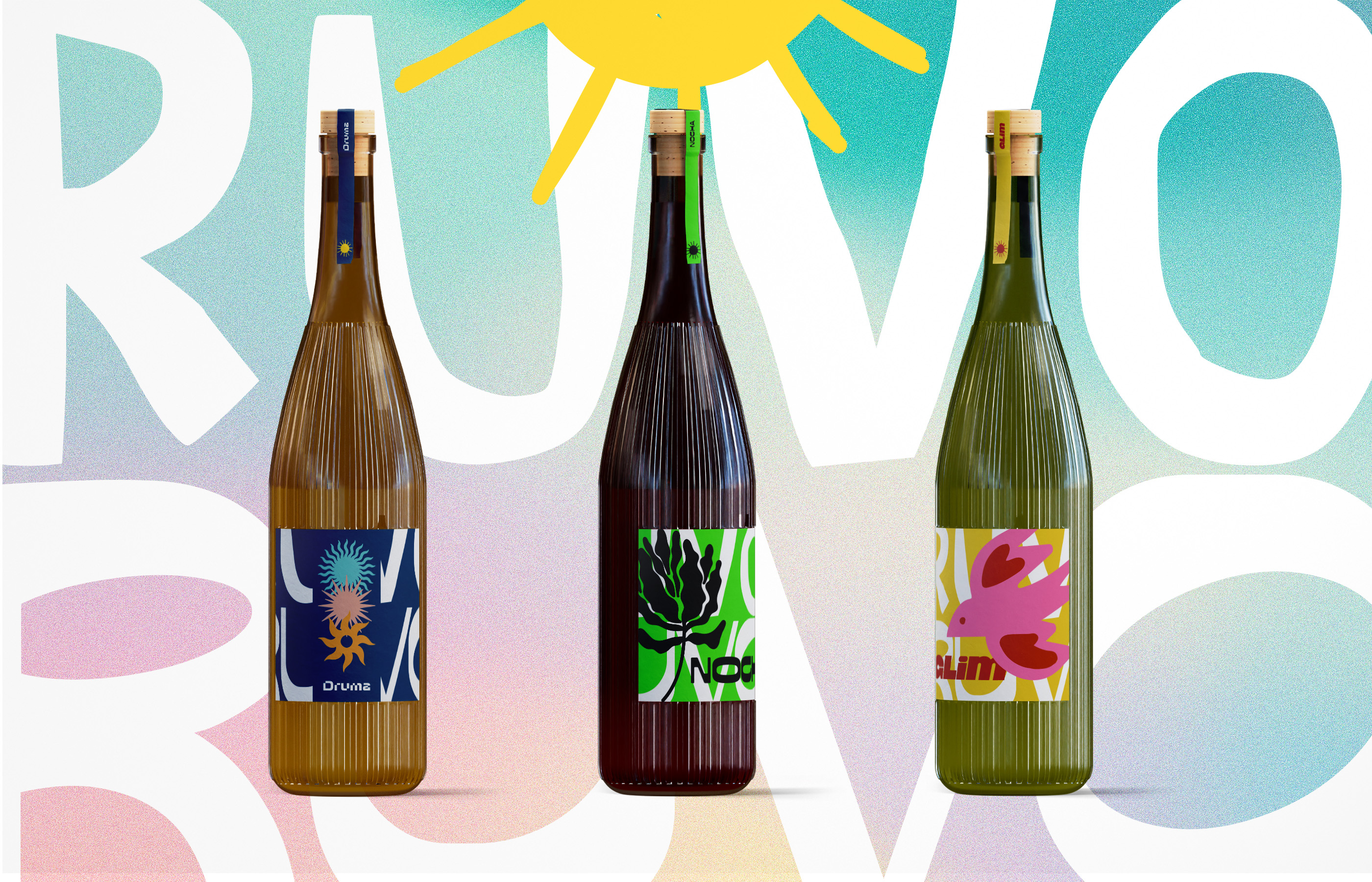
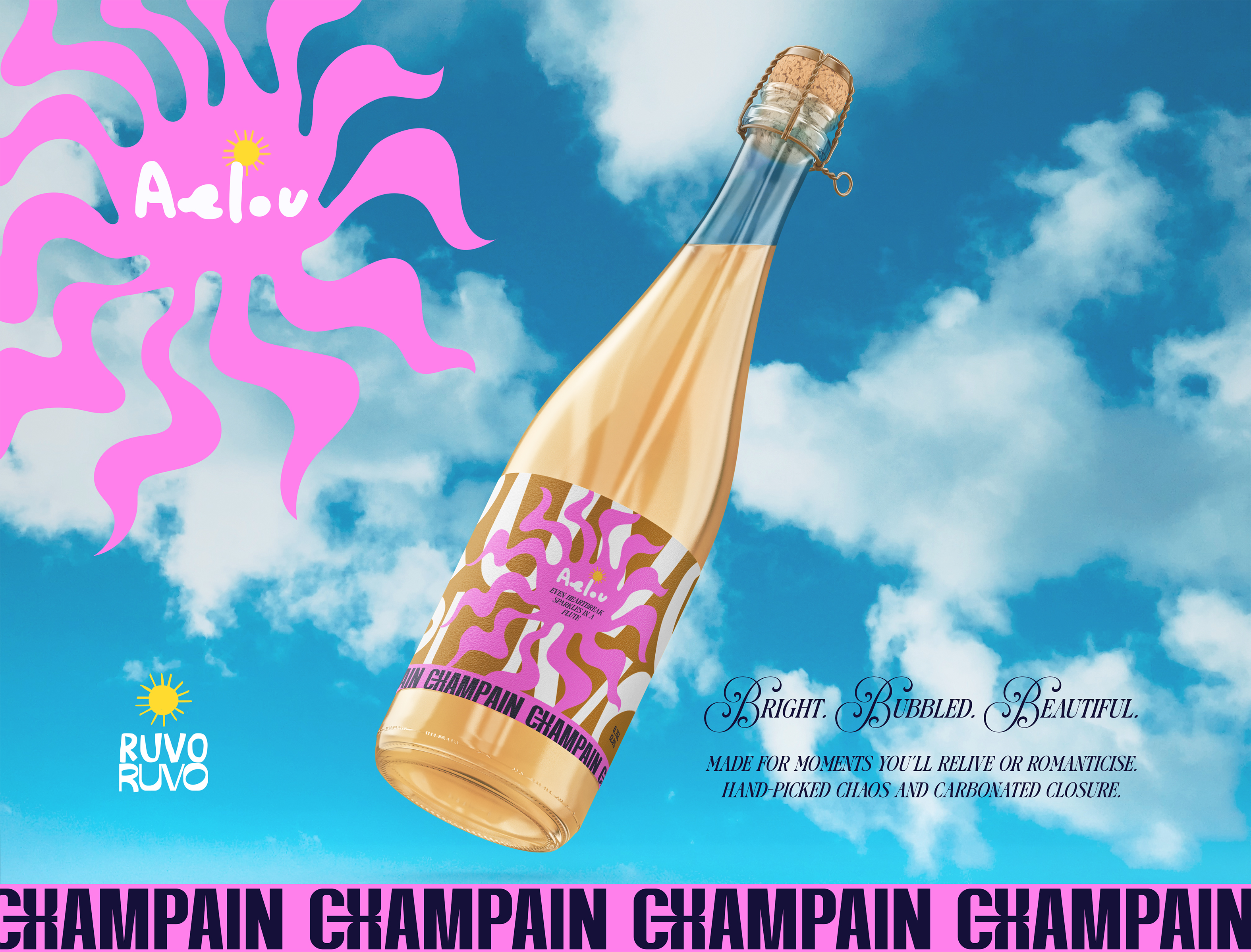
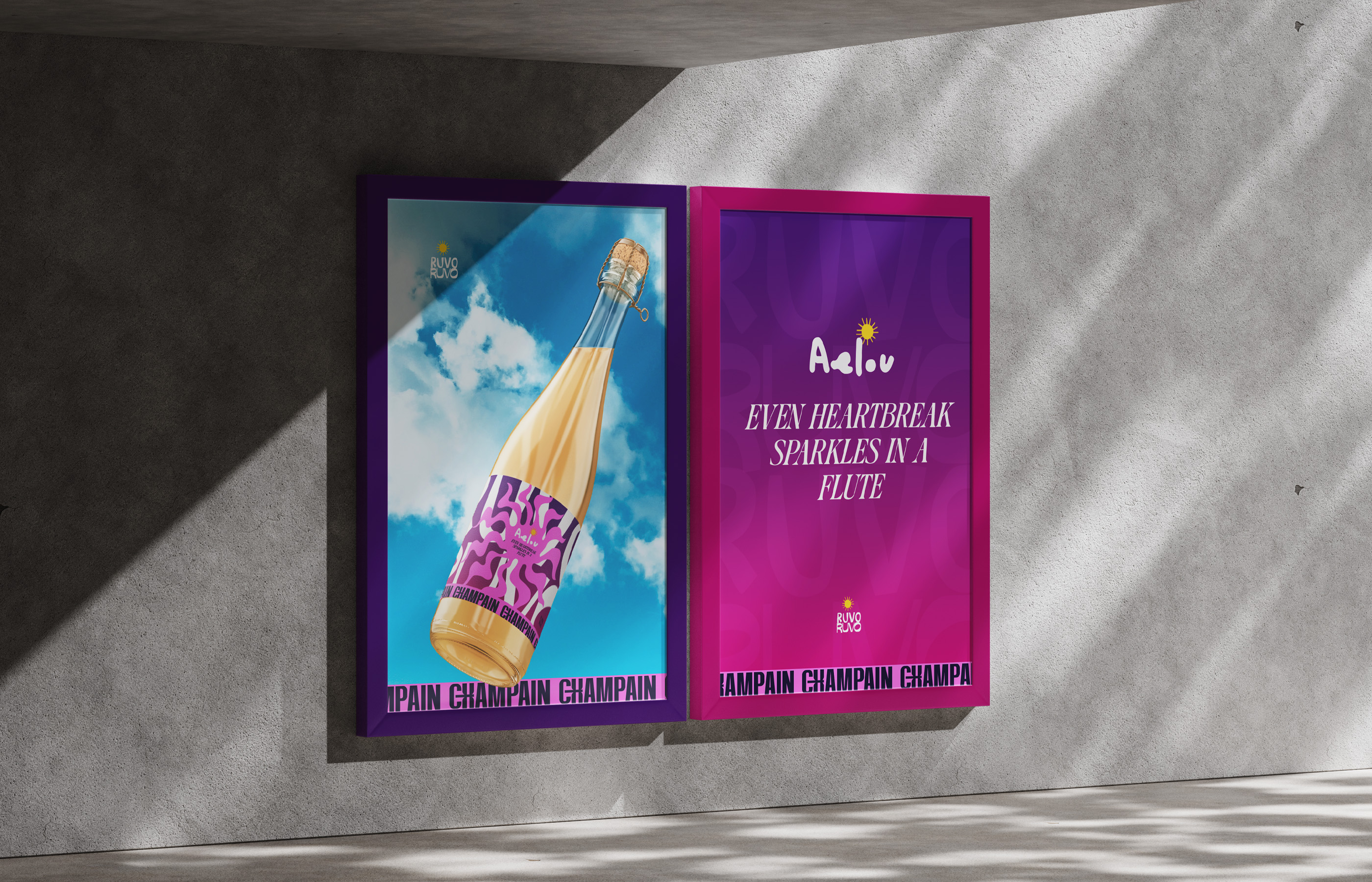
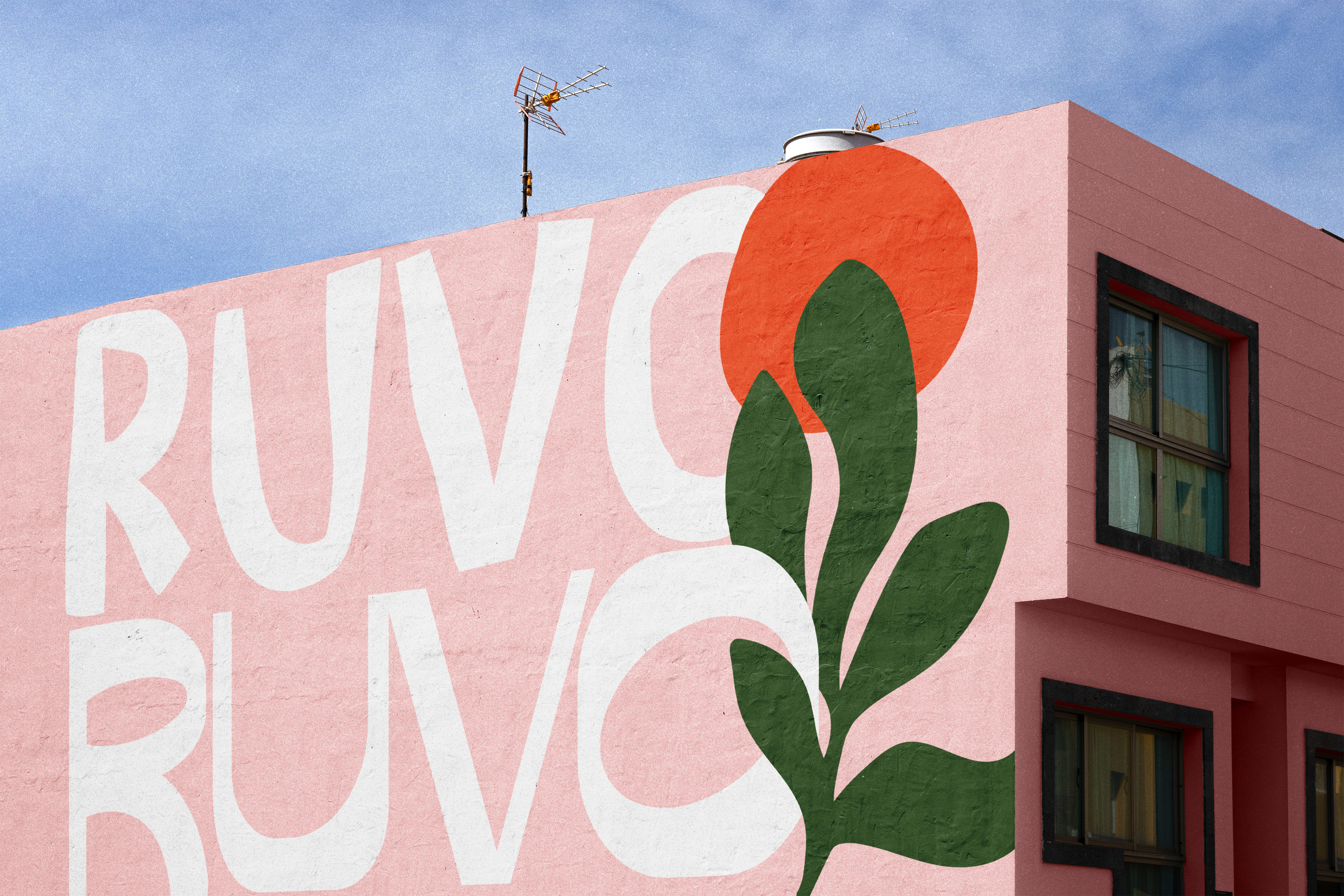
We developed a full brand identity and packaging system grounded in contrast. The name itself becomes a design device, repeating across type and layout to build rhythm and recognition. A vibrant palette, flexible typography, and confident copy give each label its own character while keeping the system cohesive.
The brand voice leans playful but smart. Messaging balances punch with clarity, shaped to appeal to modern wine drinkers who value story as much as taste. From bottle to box to shelf presence, every element was created to cut through the noise and carry meaning.
RuvoRuvo is not background wine. It is built to be picked up, remembered, and shared. An identity full of colour, charisma, and just the right amount of contradiction. So good we named it twice.