Light, Rhythm, Ritual
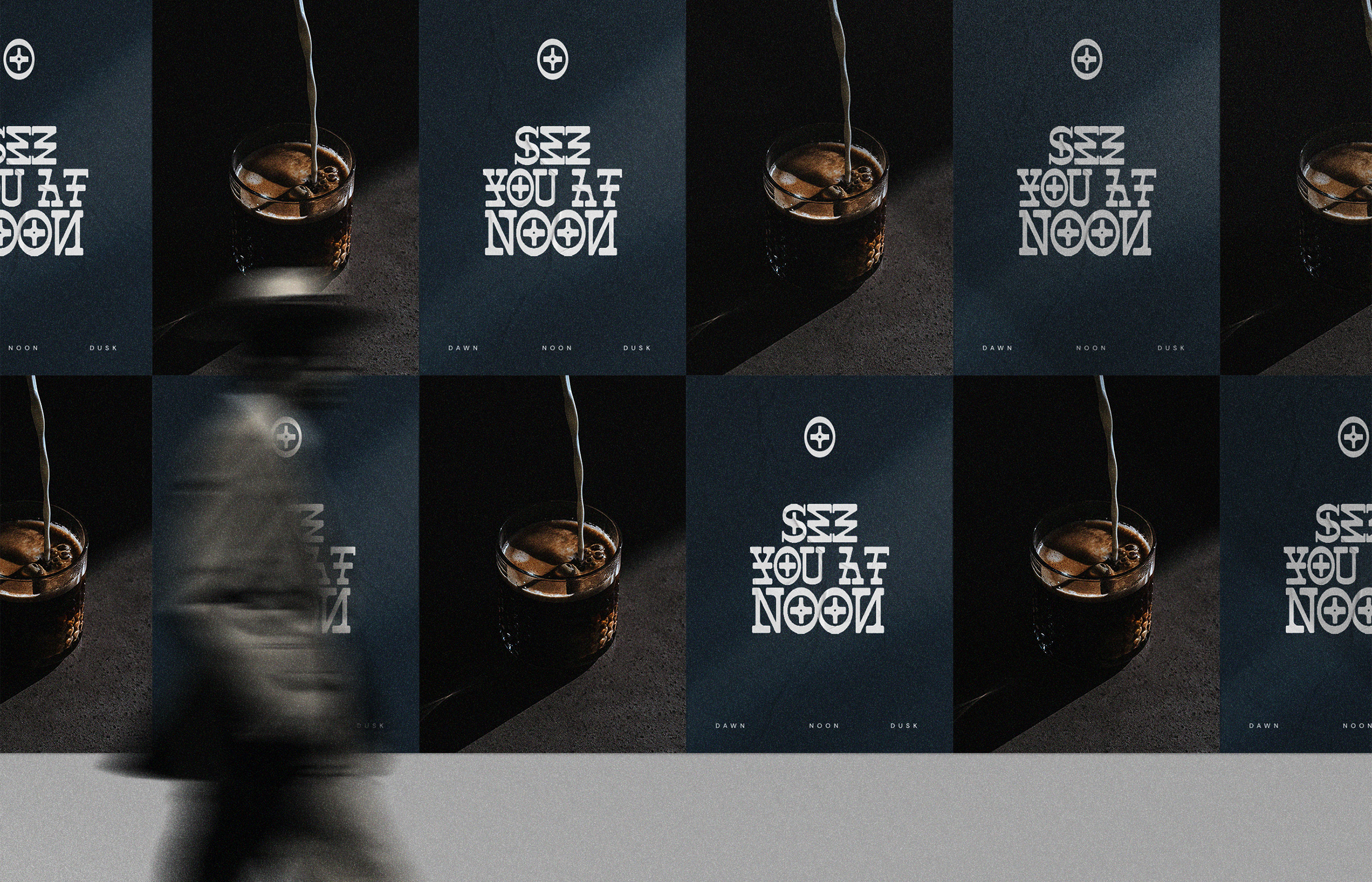
NOON explores the rhythm of a day through light and stillness. The brand is shaped by the small transitions people fall into without thinking. Coffee in the morning. Clarity at noon. A darker pour in the evening. Each moment guided by a simple sense of pace and presence.
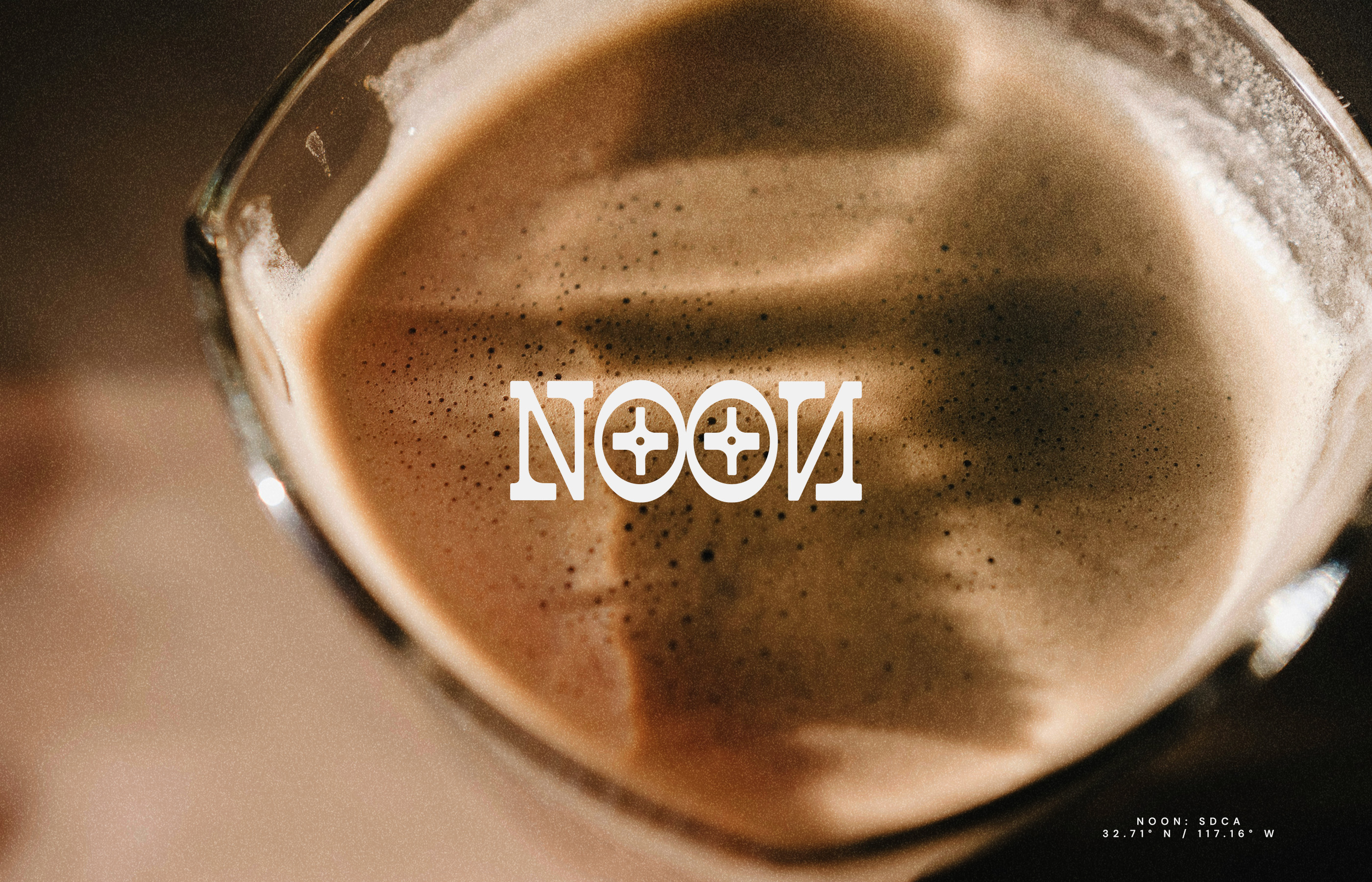
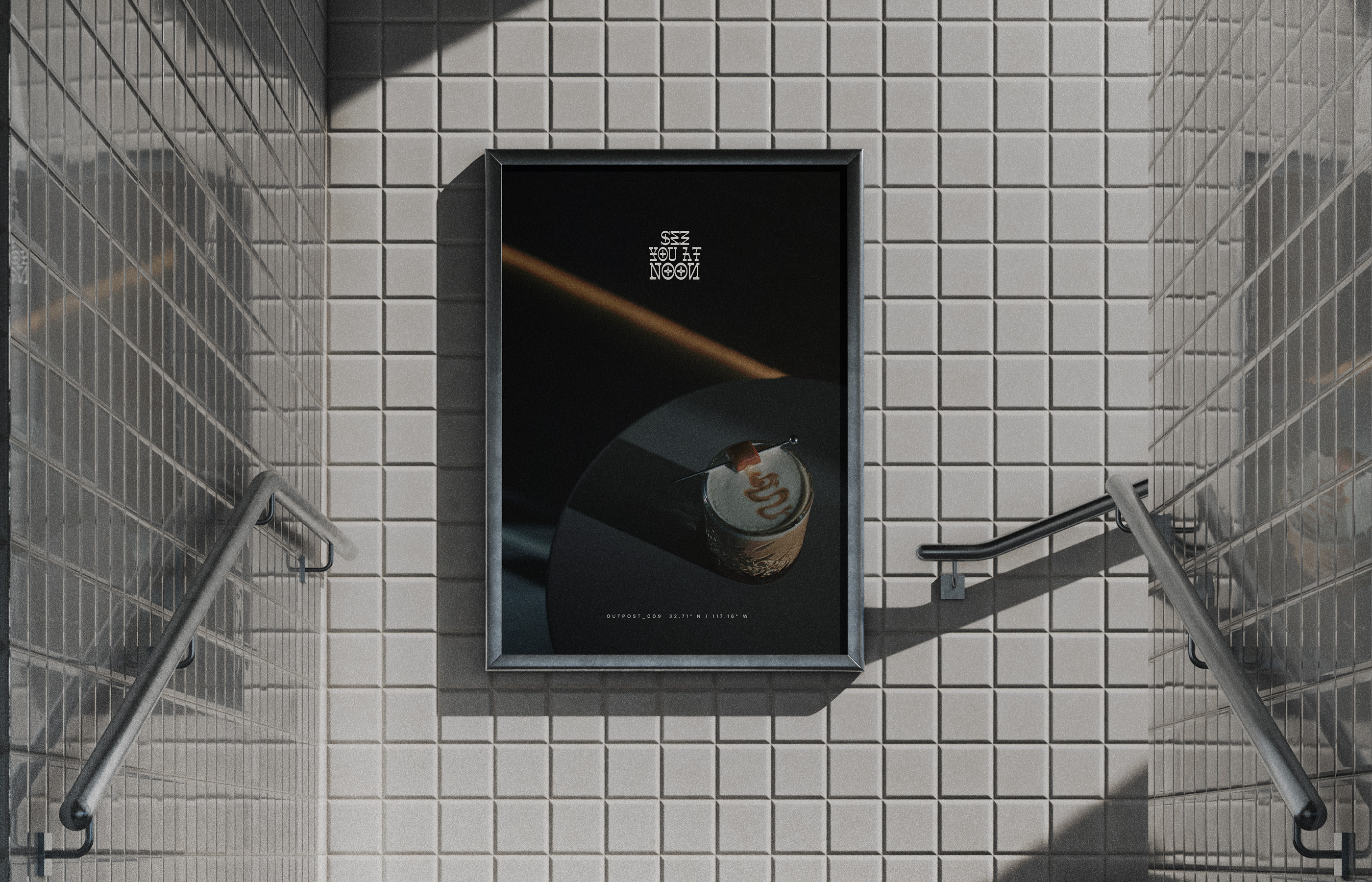
We built the identity around one idea. The way light moves through time. The system uses beams, shadows and soft gradients to create a visual language that feels cinematic and controlled. Nothing feels loud. Everything feels intentional.
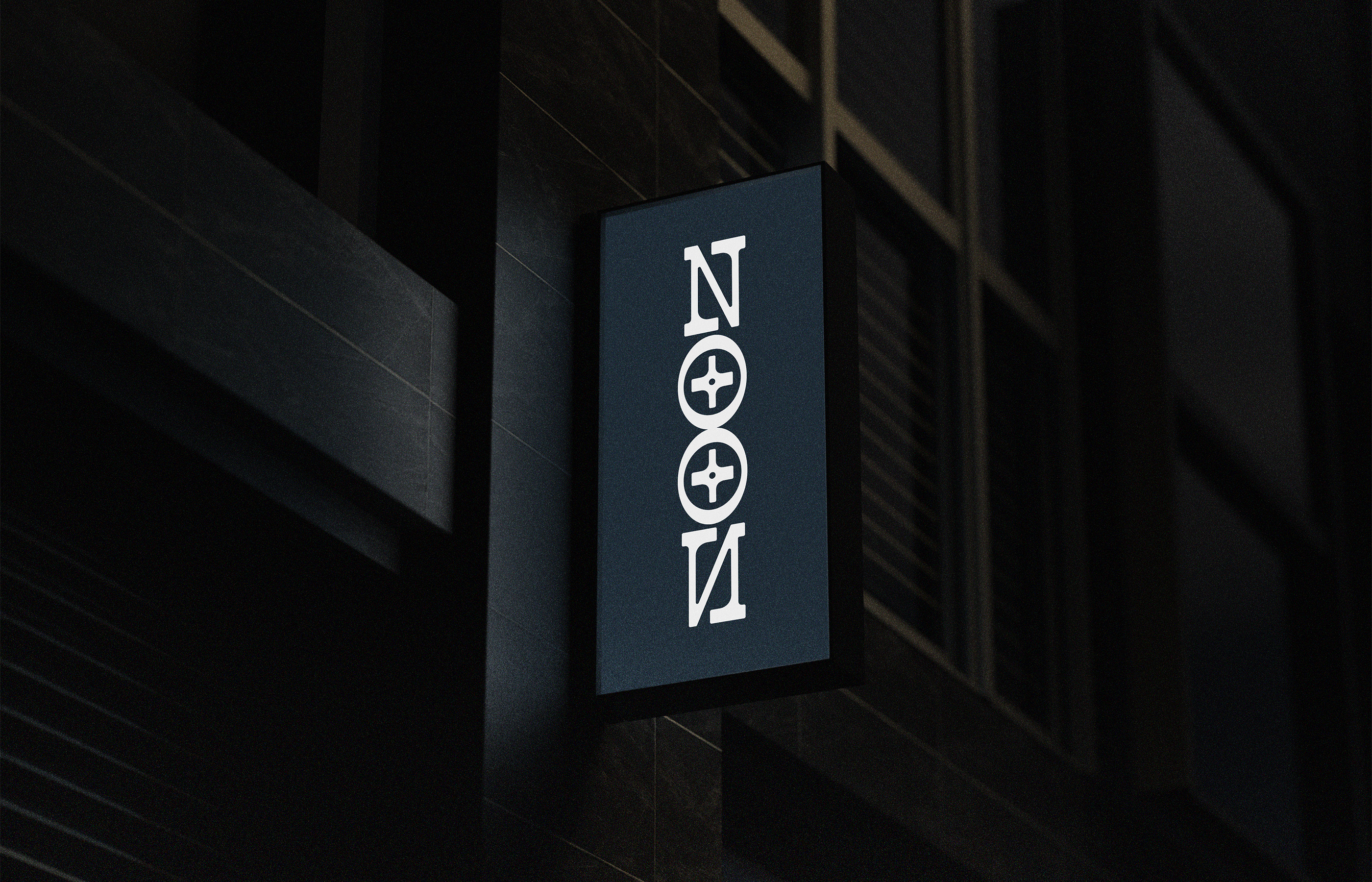
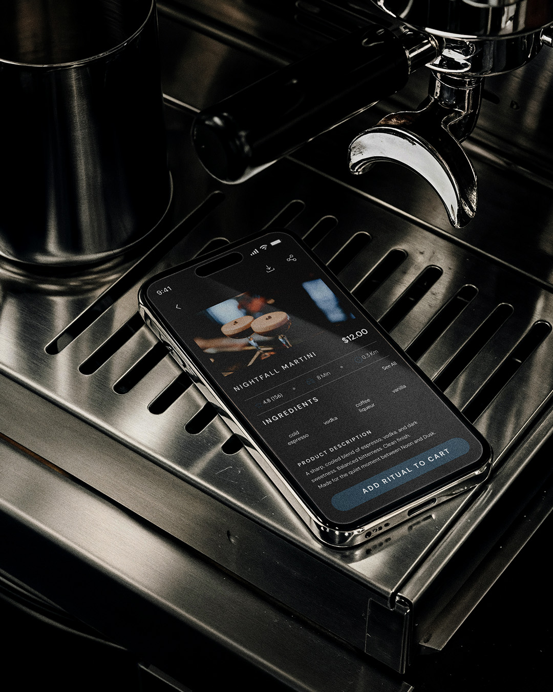
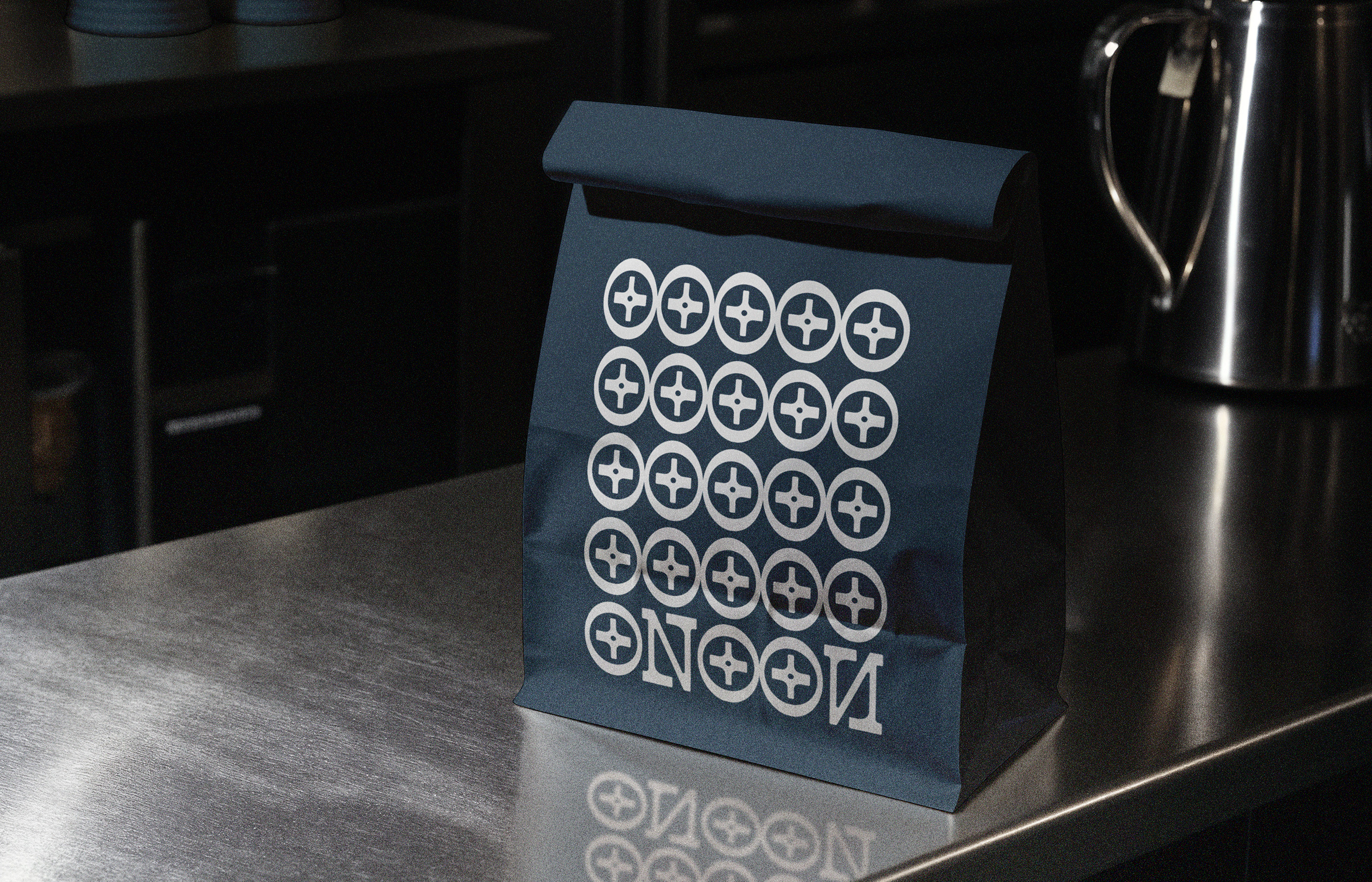
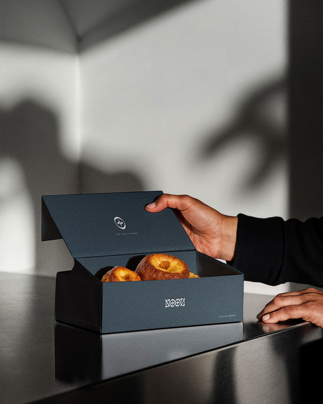
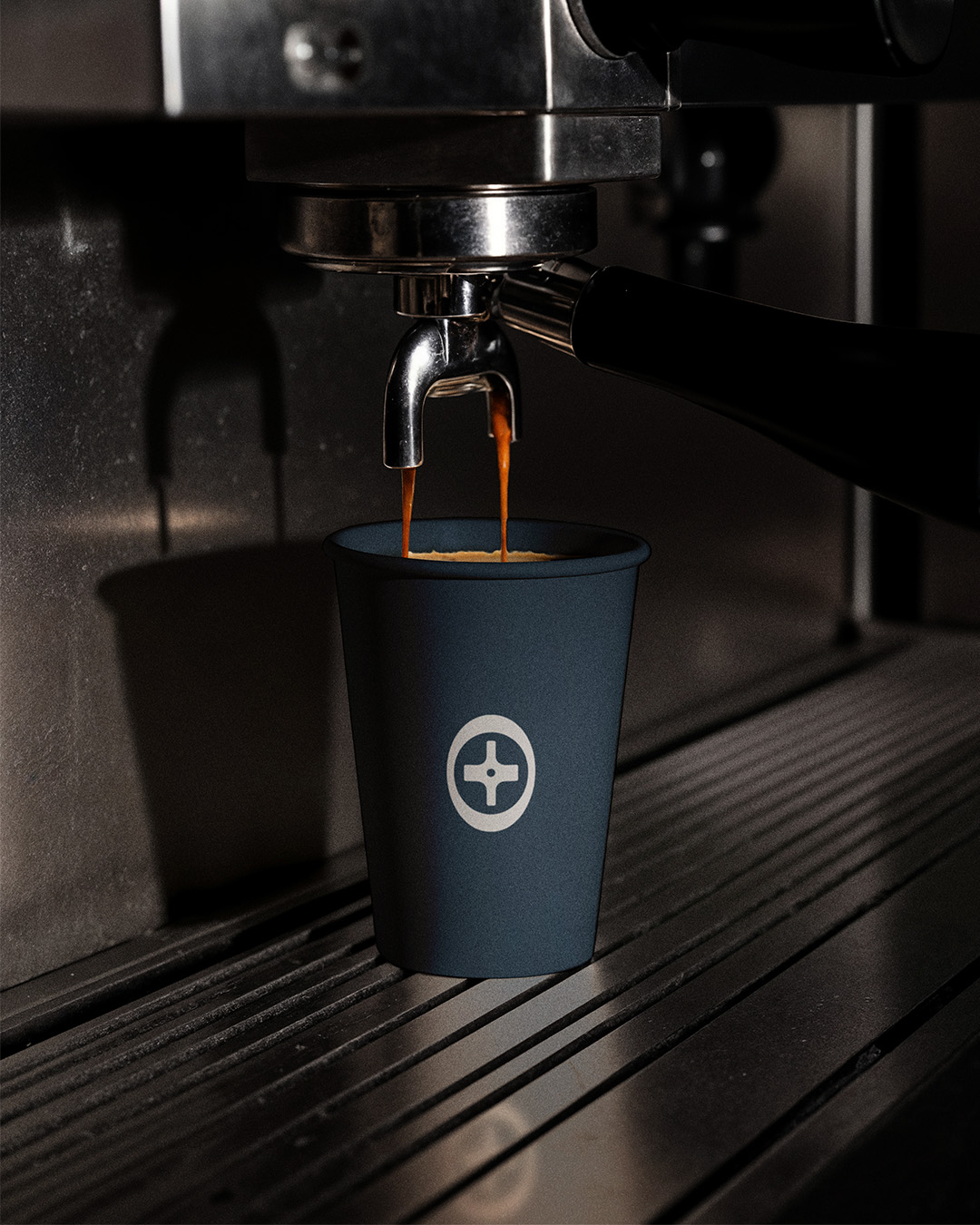
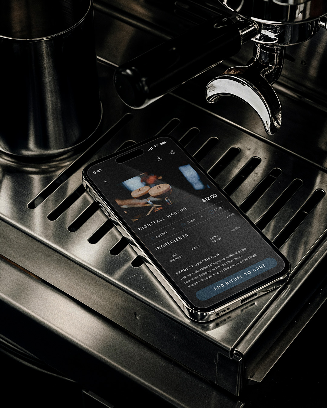
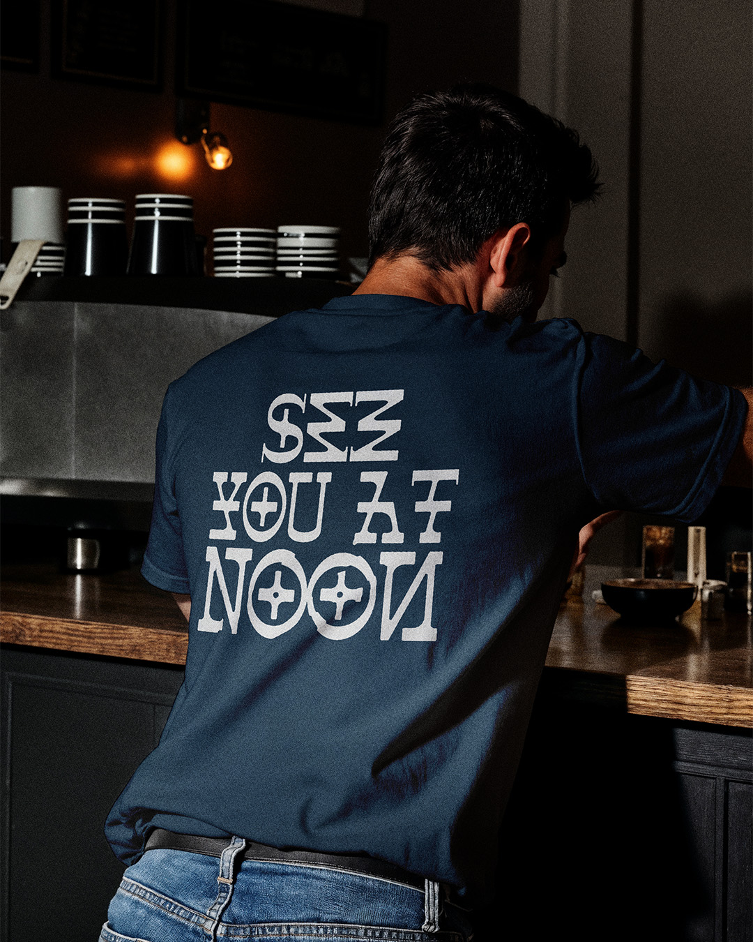
The symbol works as a compass point and the mirrored wordmark carries the idea of duality. Day into night. Work into rest. Espresso into martini. A simple shift that holds the brand in a constant sense of balance.
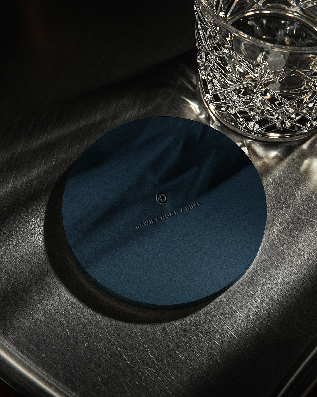
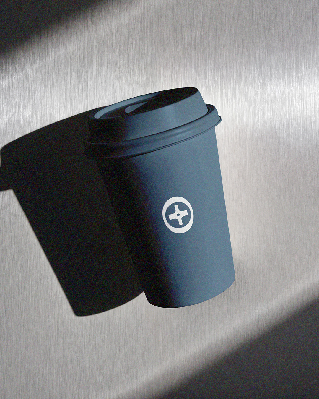
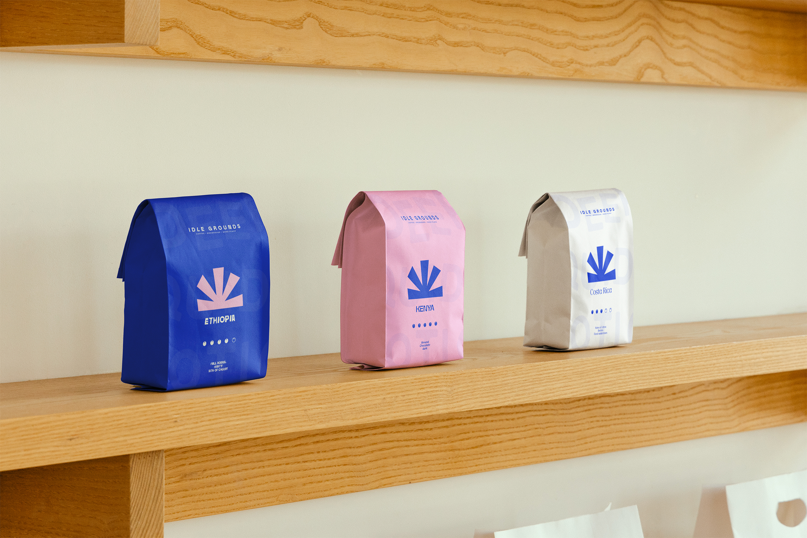
Every touchpoint follows the same rules. Precision. Tension. Stillness. Cups, coasters, menus, receipts, packaging and uniforms all follow a quiet structure based on repetition and clarity. No decoration. No noise. Only considered moments.
The palette stays narrow so light and shadow can act as part of the identity. Inside the space, reflections, movement and haze become living elements of the brand. The design feels architectural and grounded, built from calm contrast and controlled mood.
NOON is a brand found through experience, not volume. A quiet environment shaped by presence and the moments in between.