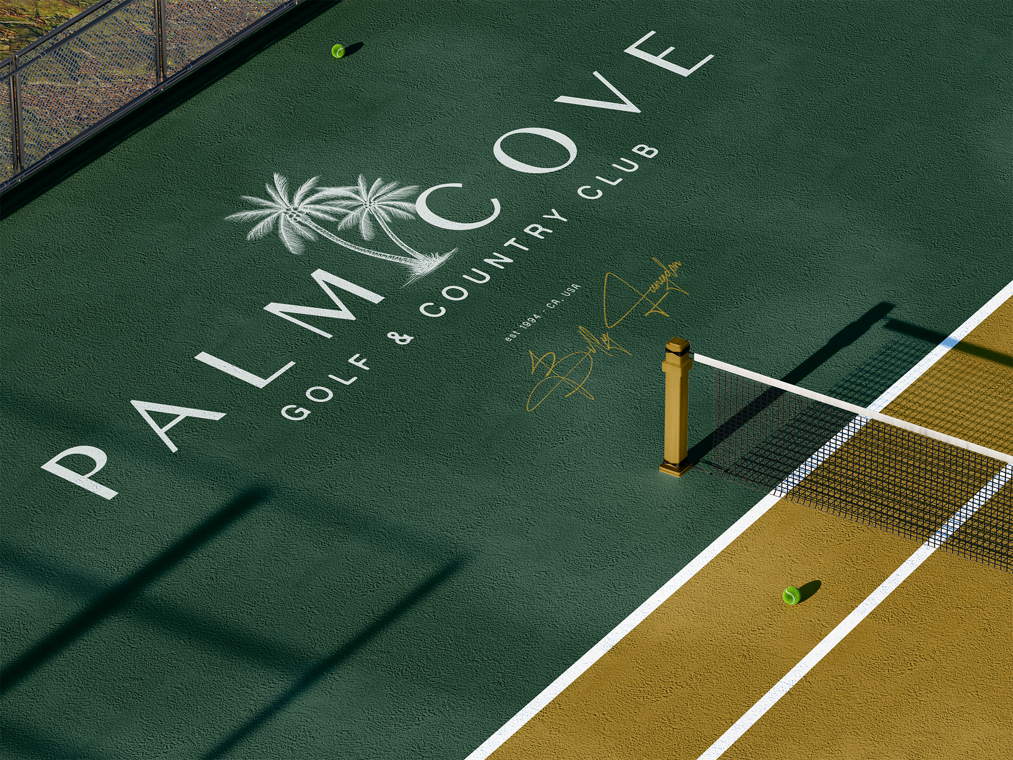
Brand identity and creative direction for a contemporary golf and country club rooted in coastal calm, modern hospitality, and quiet heritage.
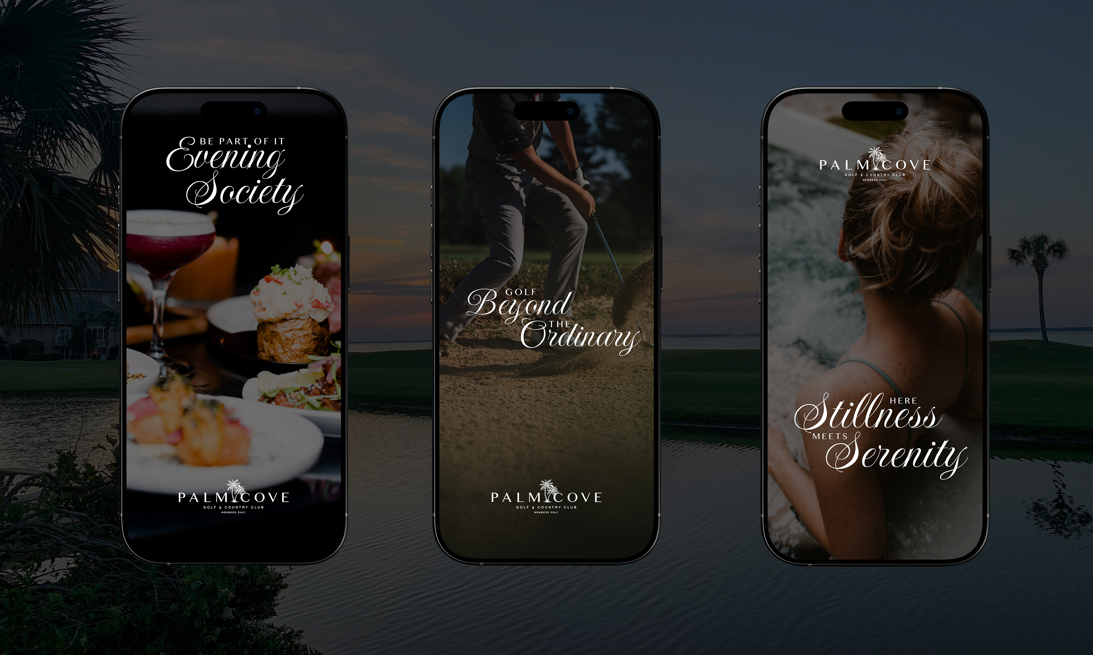

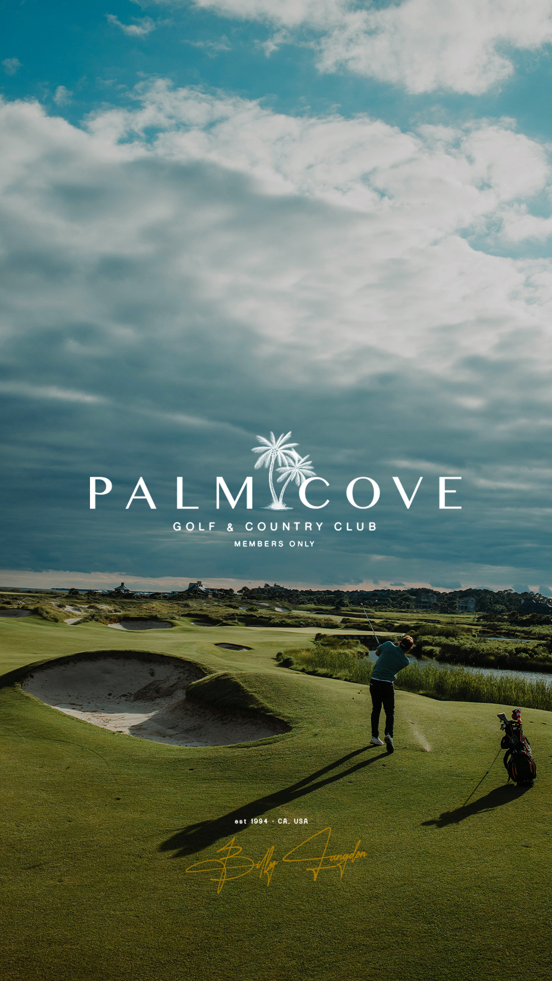
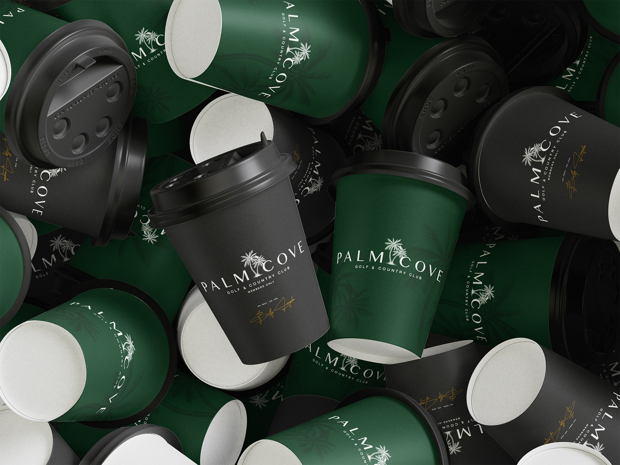
Palm Cove blends sport and setting, nature and nuance. We worked closely with the leadership team to build a brand that captures that balance. Nothing loud. Nothing forced. Just confident, sun-warmed elegance designed to live effortlessly across signage, menus, merchandise, and digital touchpoints.
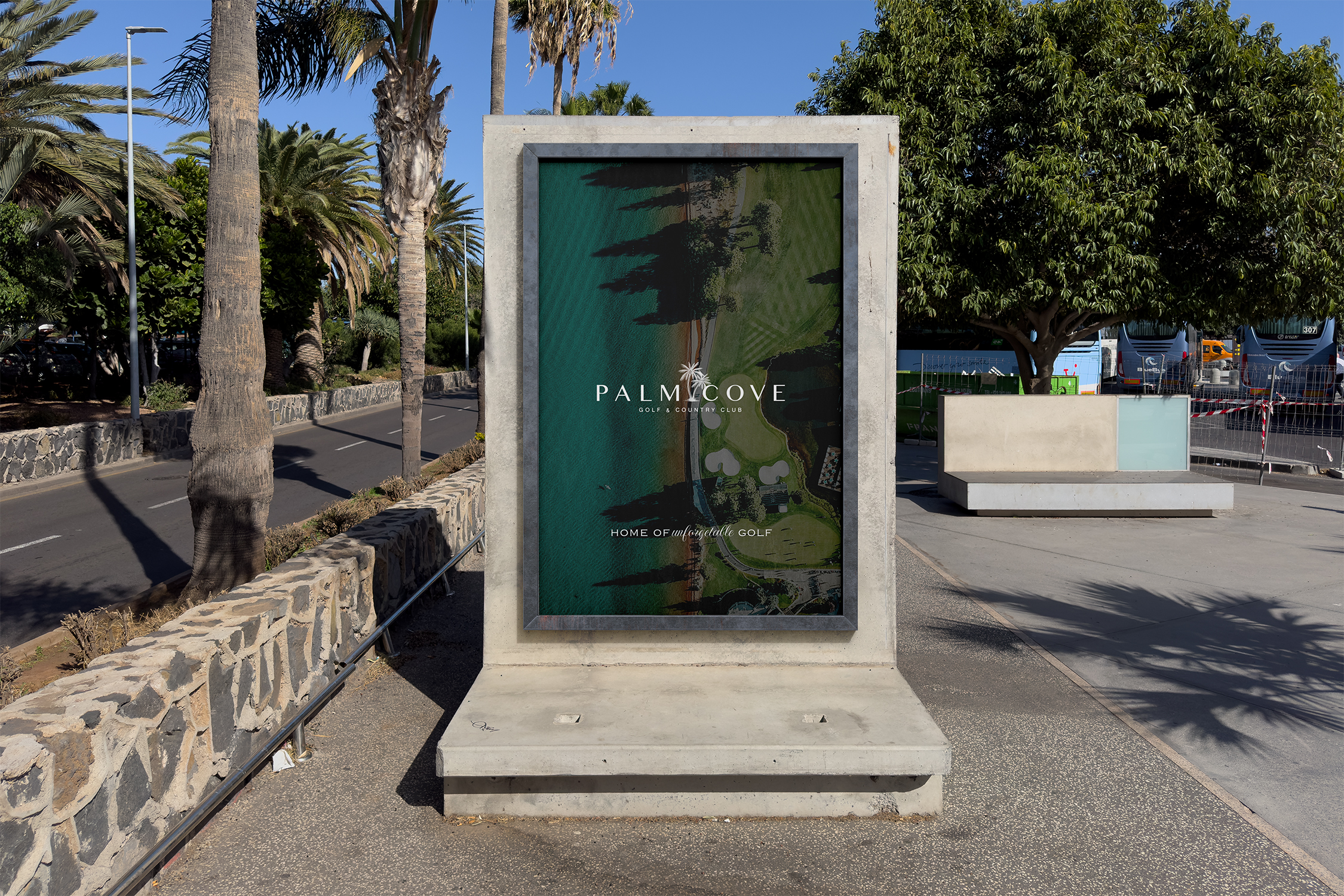
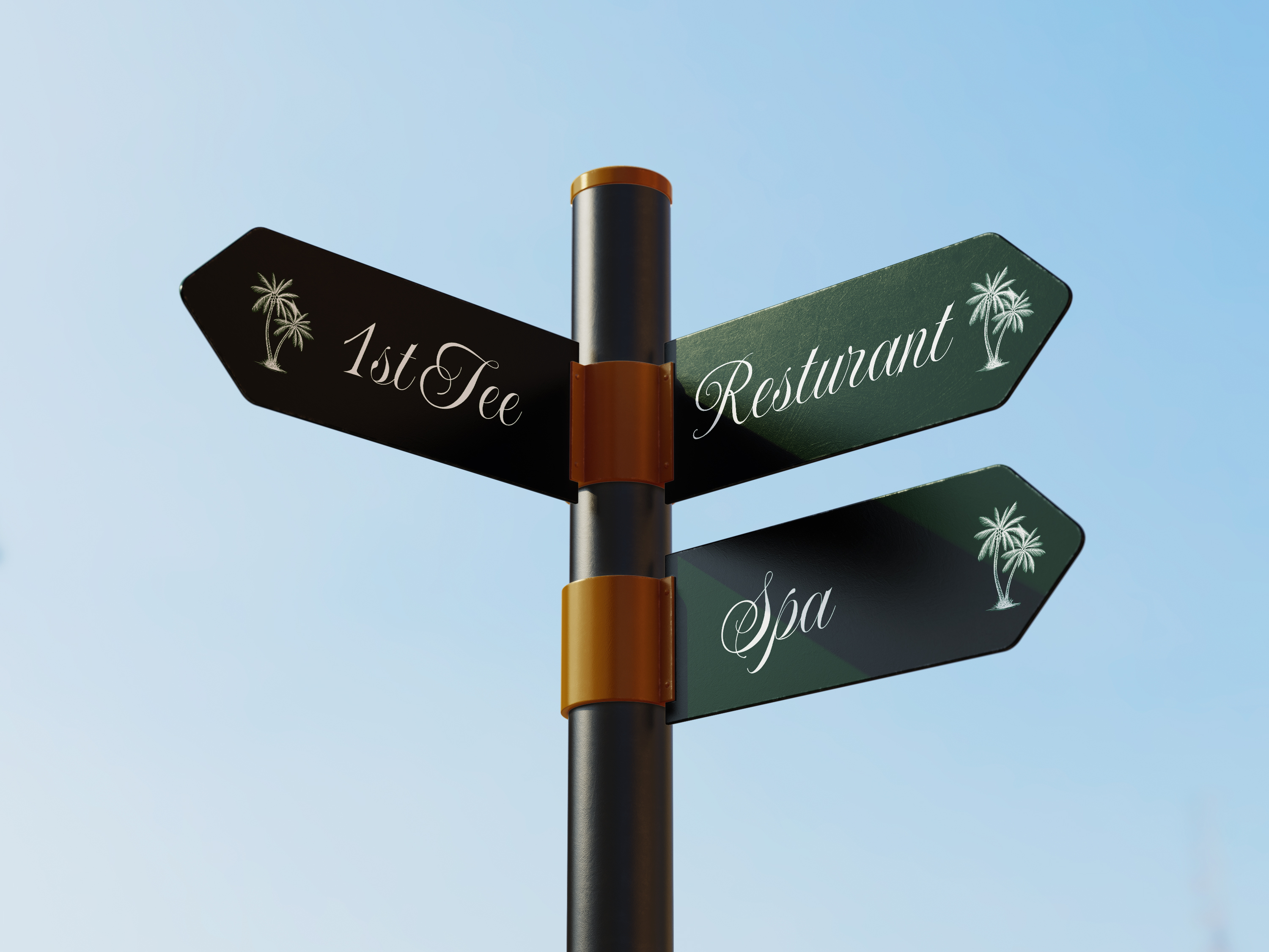
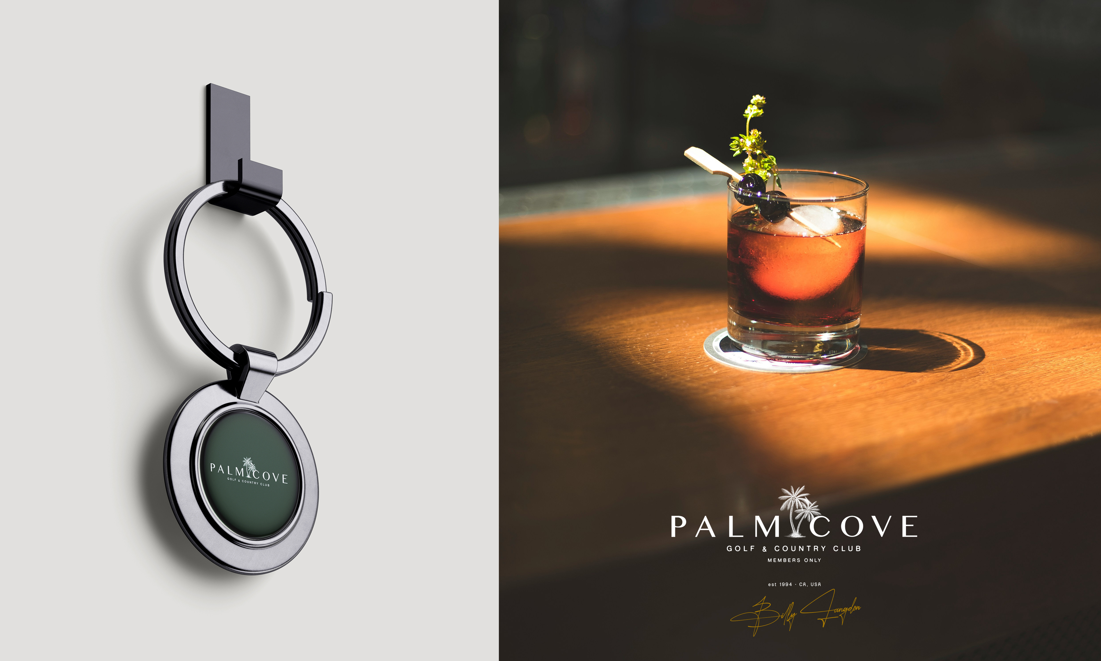
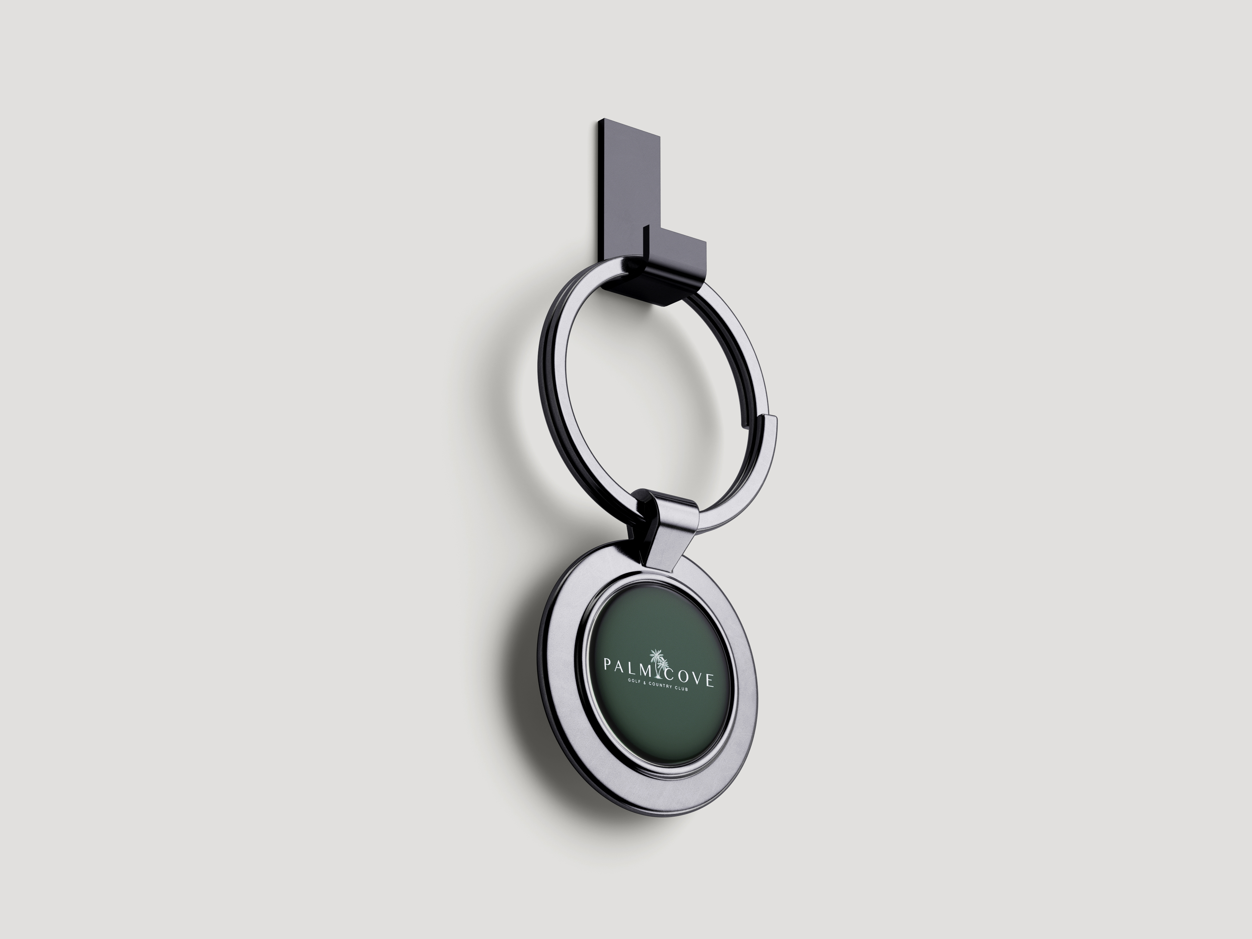
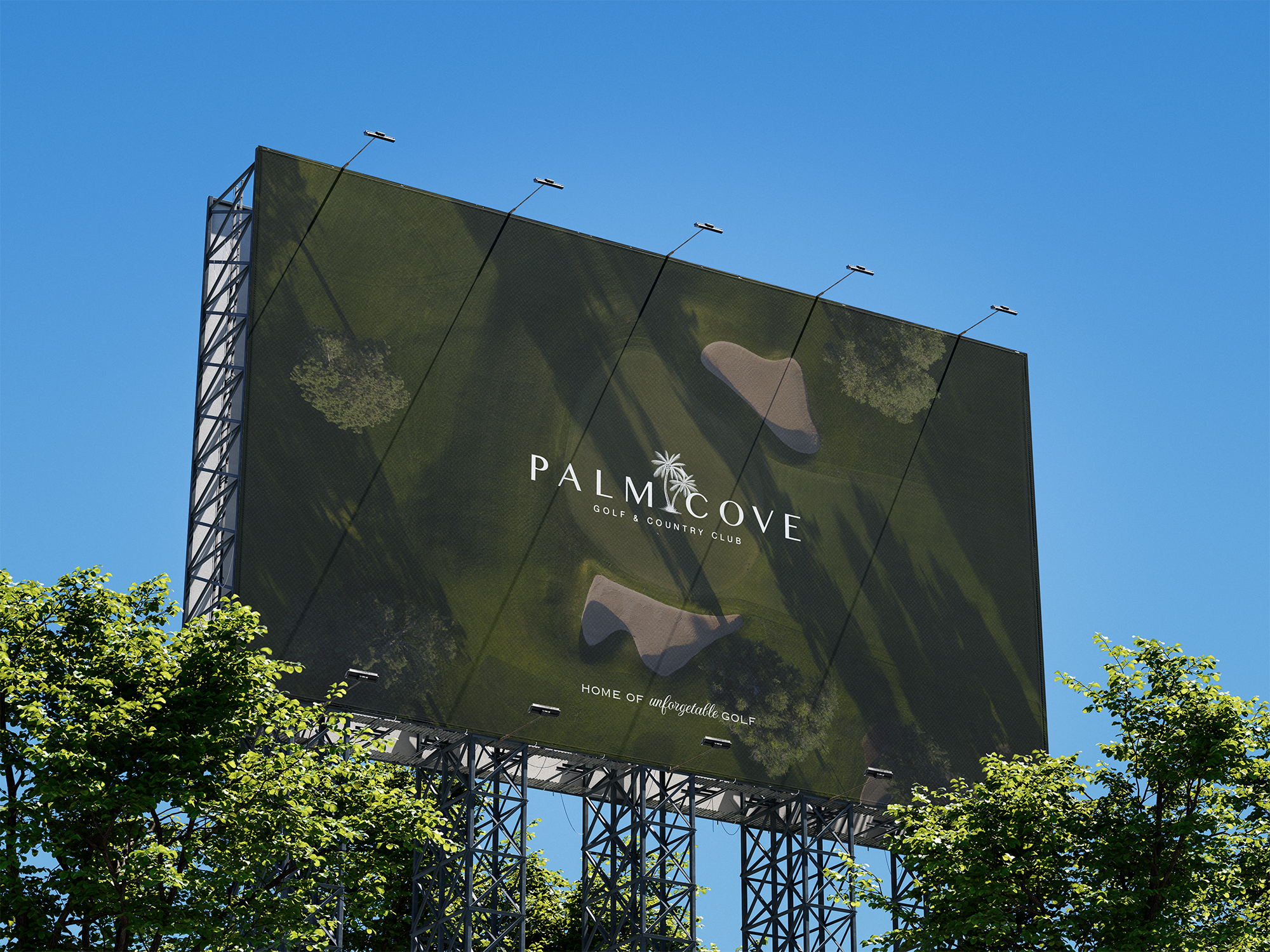
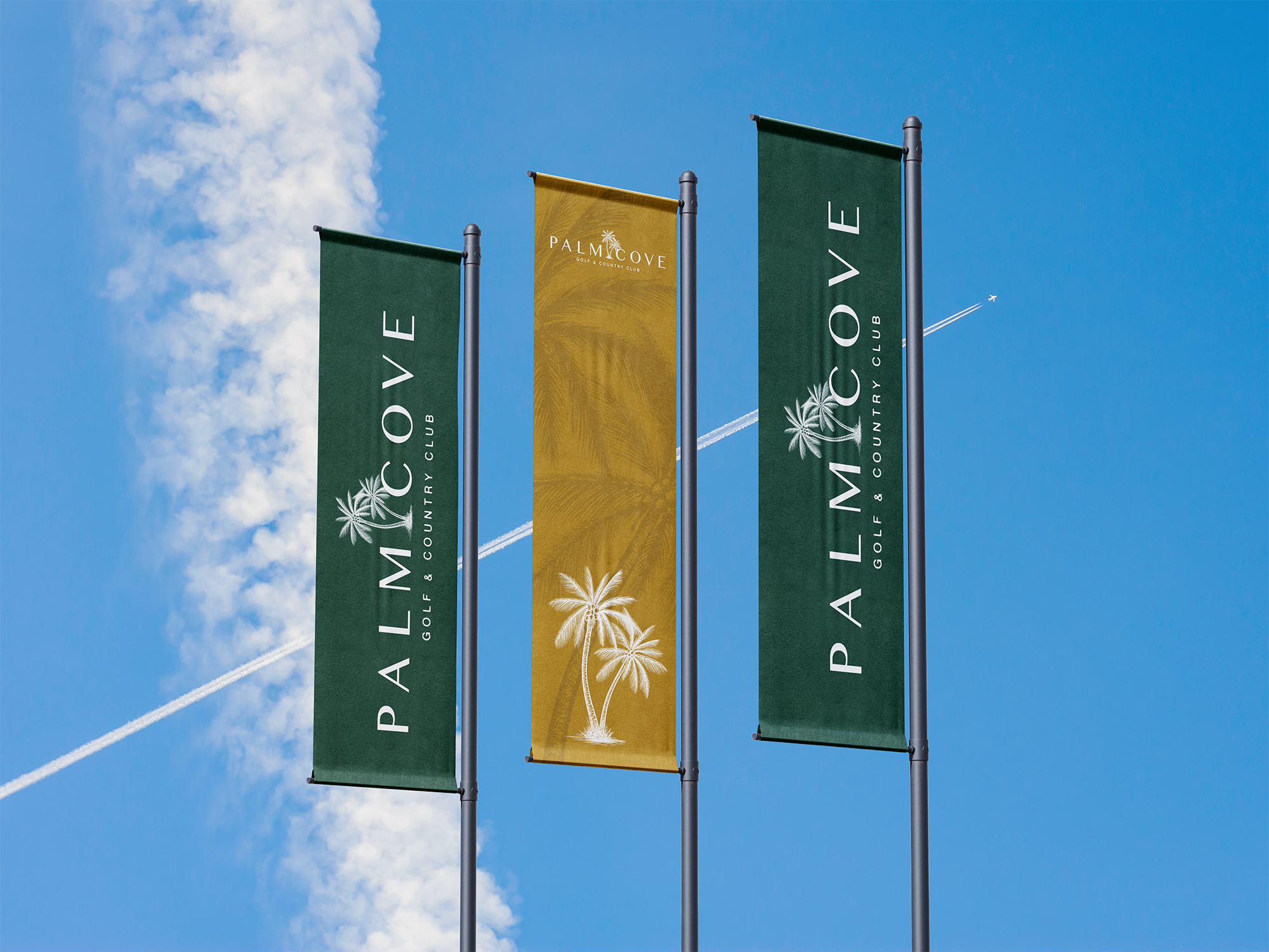
The logomark is clean and compact, anchored in geometry and inspired by course layout forms. The custom wordmark sits comfortably beside it, made to feel equally at home on a golf ball, a wayfinding sign, or an evening menu.
Typography is sharp but relaxed. Print and digital collateral were designed with restraint, prioritising space and utility over embellishment. The colour palette draws from the course itself, greens softened by sunlight, warm off-whites, and navy accents that add weight and contrast.
Every element was made to bring a sense of ease, calm, and quiet prestige. This isn’t a brand trying to shout. It’s a brand that feels lived-in, well-tended, and ready for the next chapter.