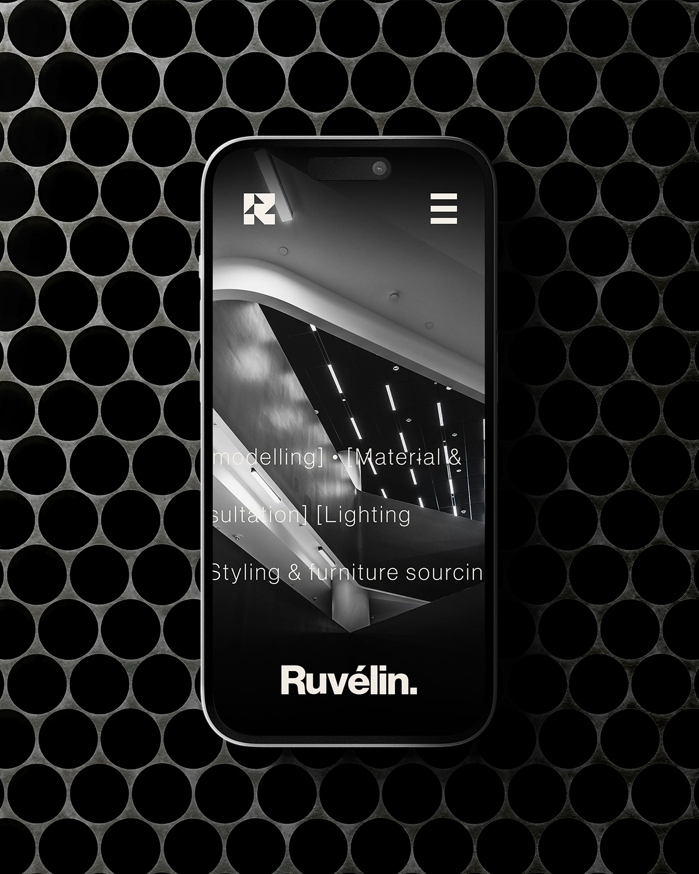
Visual identity and digital brand for an interior and spatial design studio rooted in minimalism and architectural clarity.


Ruvélin designs spaces that speak quietly — measured, thoughtful, and deeply intentional. They came to us looking for a brand that would reflect the same clarity and control they bring to their interiors.
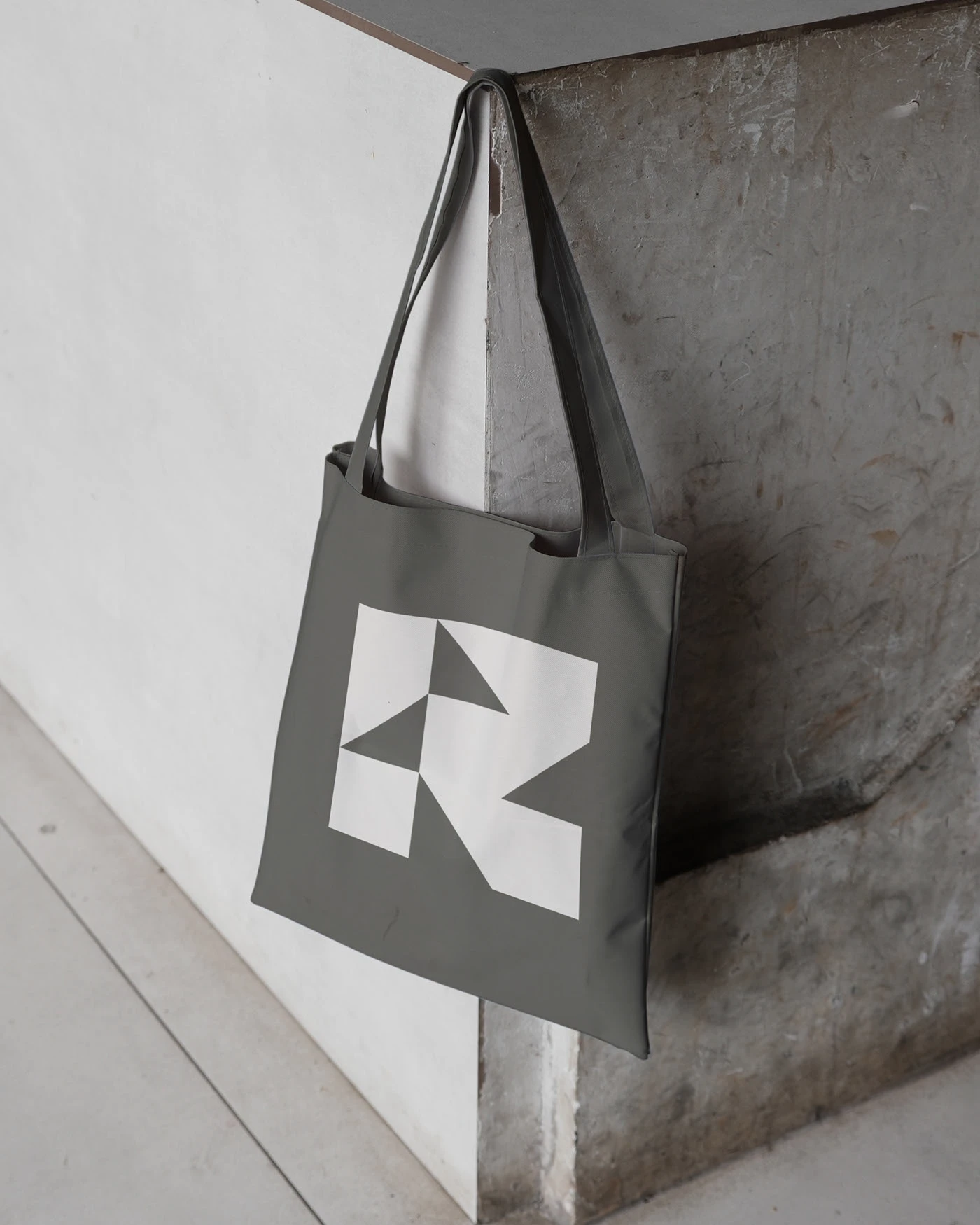
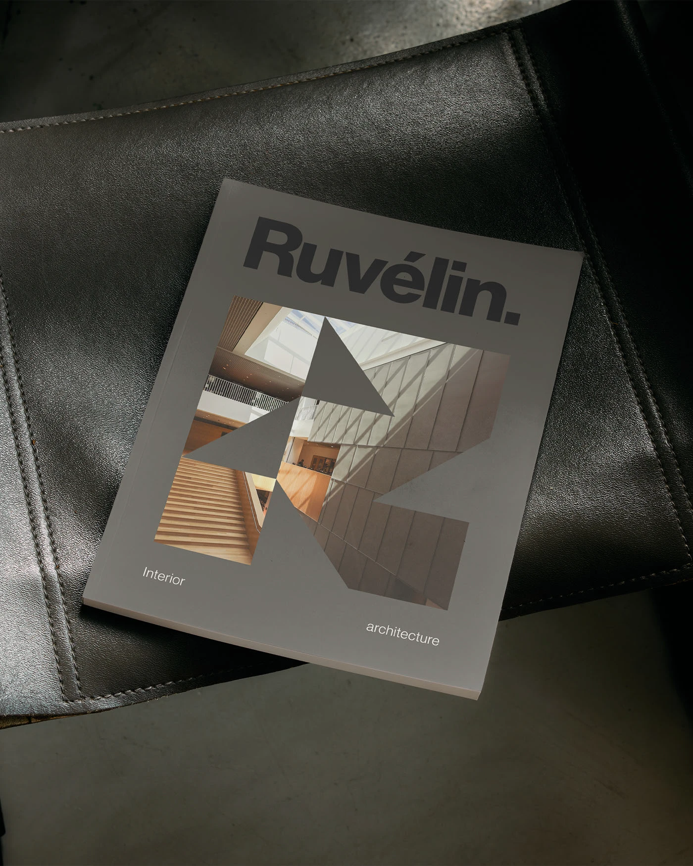
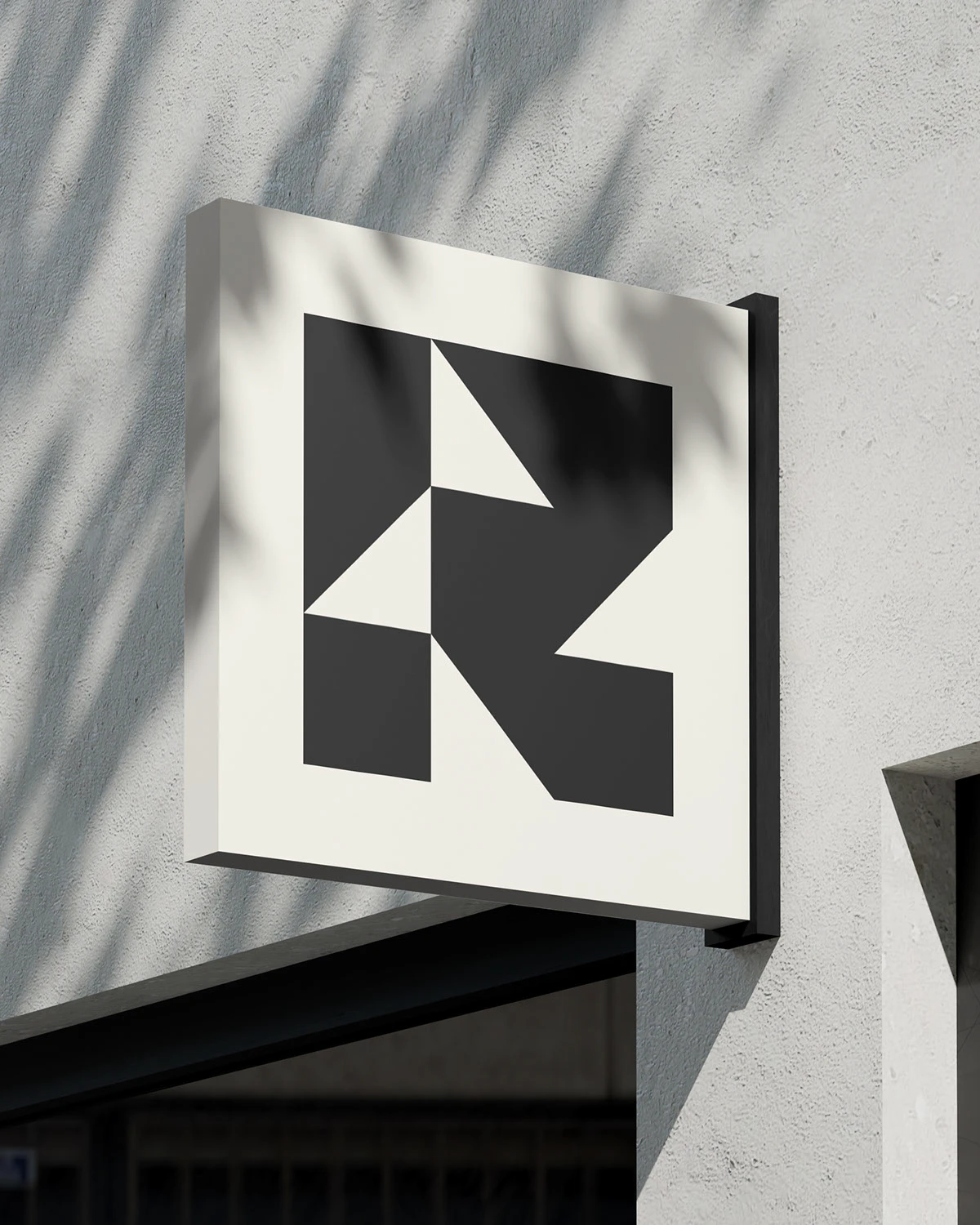
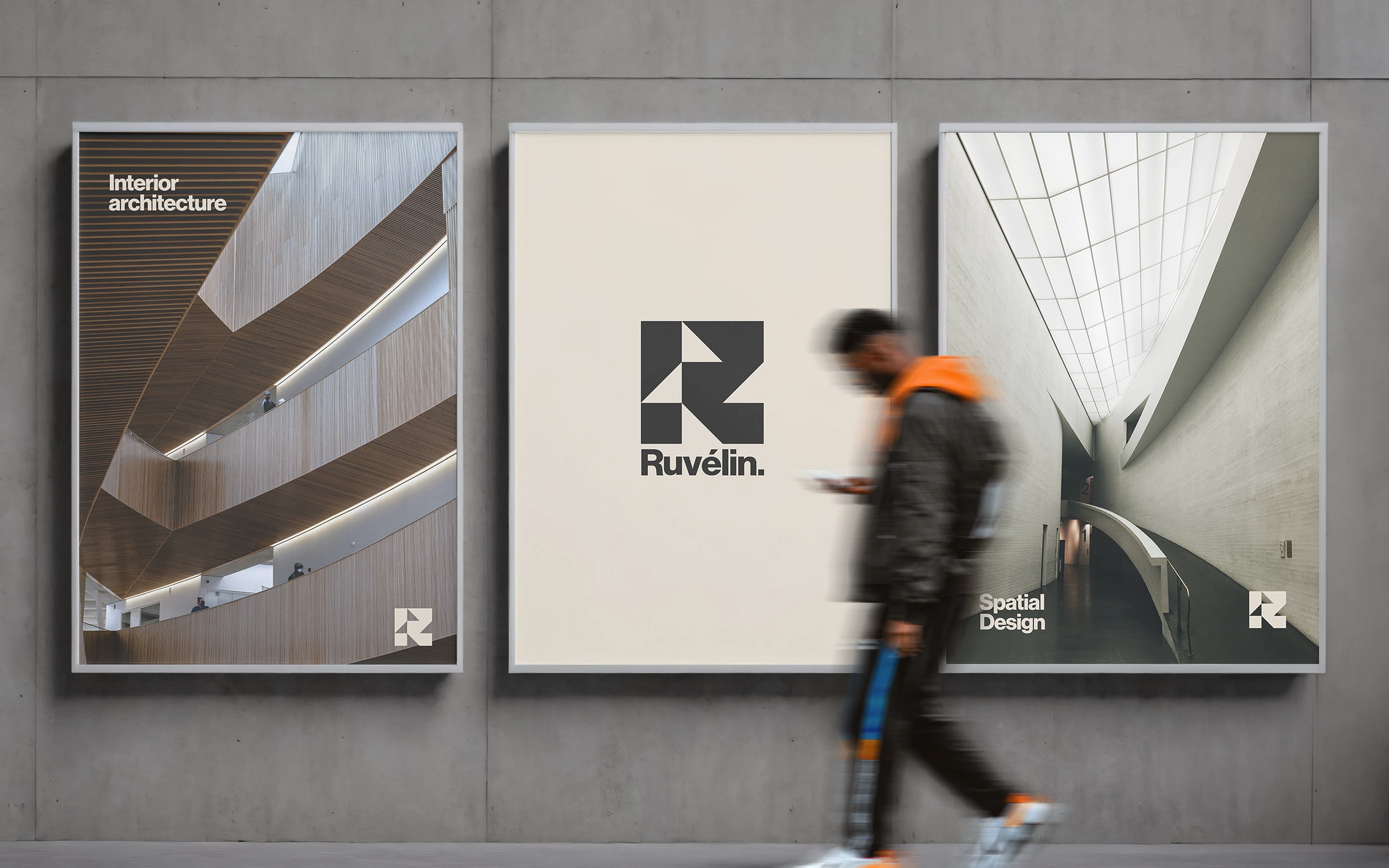
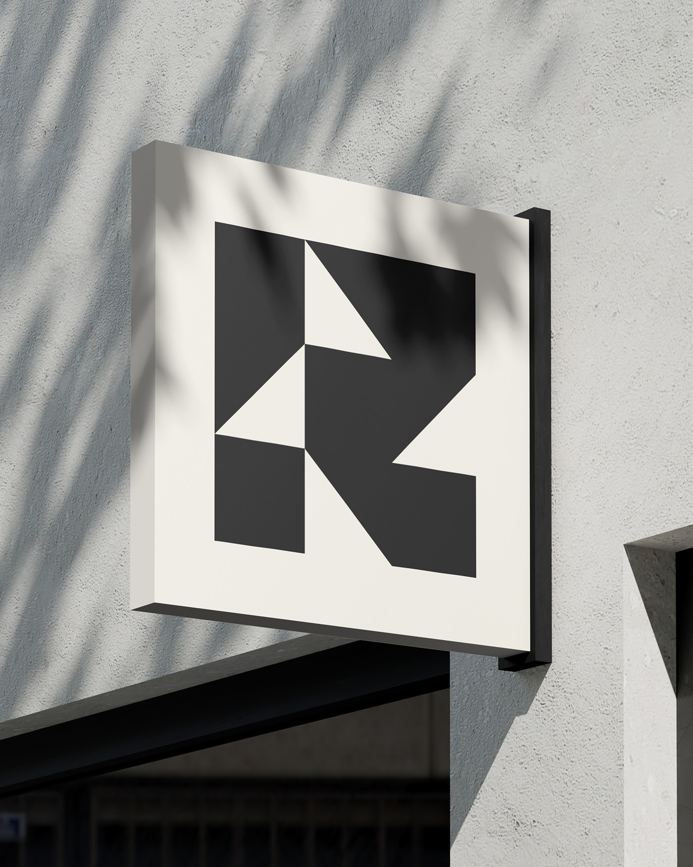
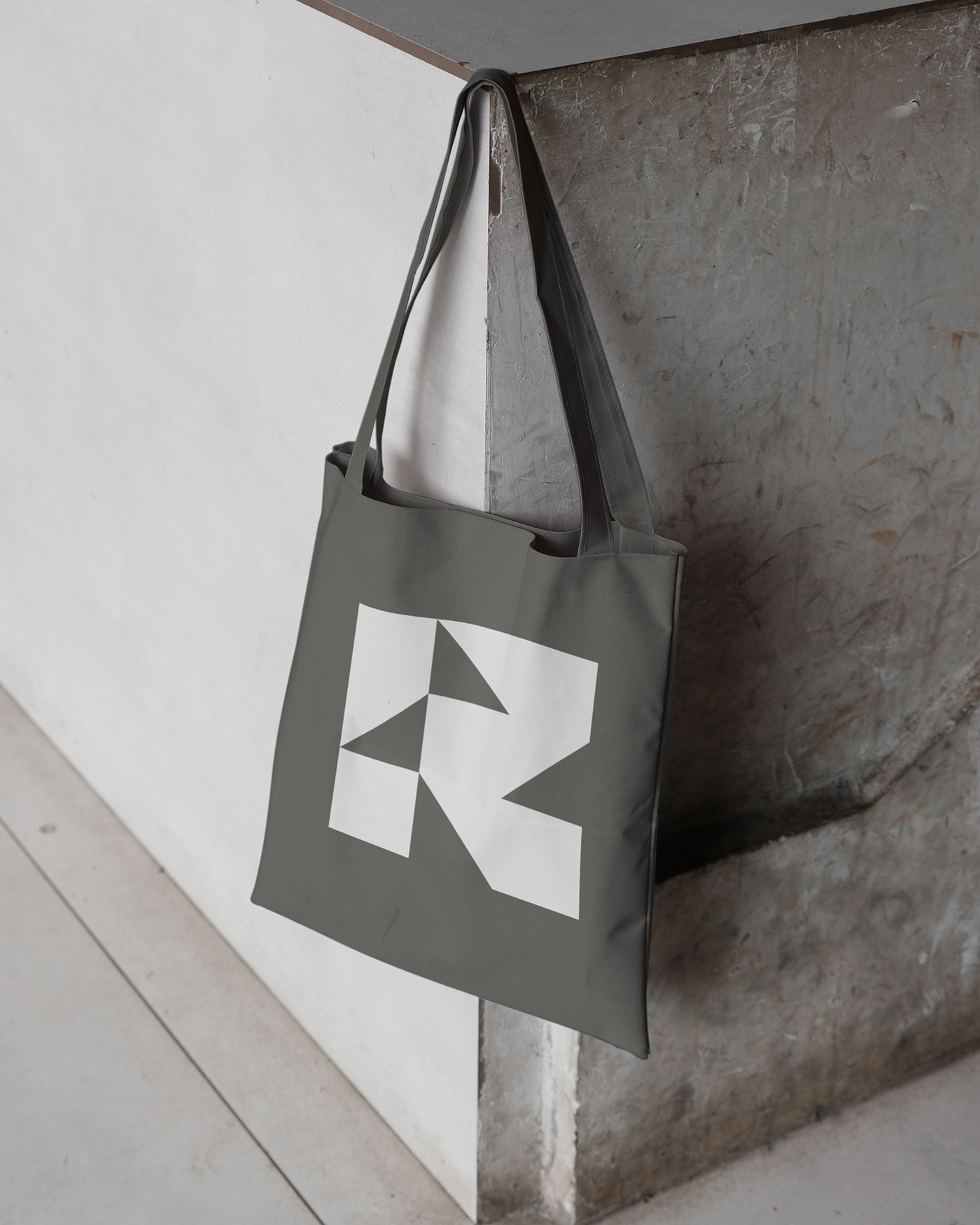
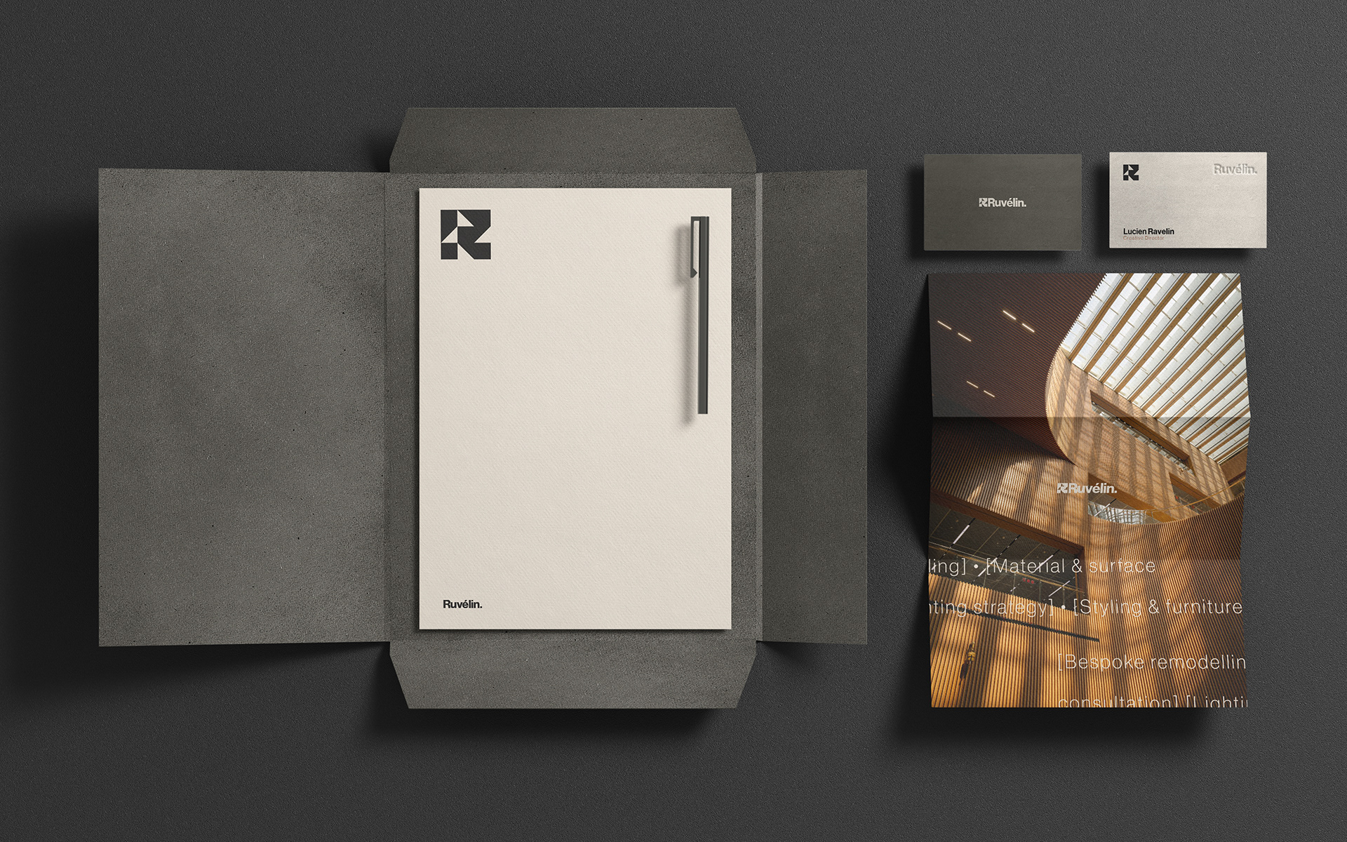
We began by framing the core identity around their key value: restraint. How little is enough? From this principle, we built a logo and language system grounded in geometry and minimal form. The logomark is an abstract, structural ‘R’ — precise and recognisable without ornament. It stands still but feels made to move.
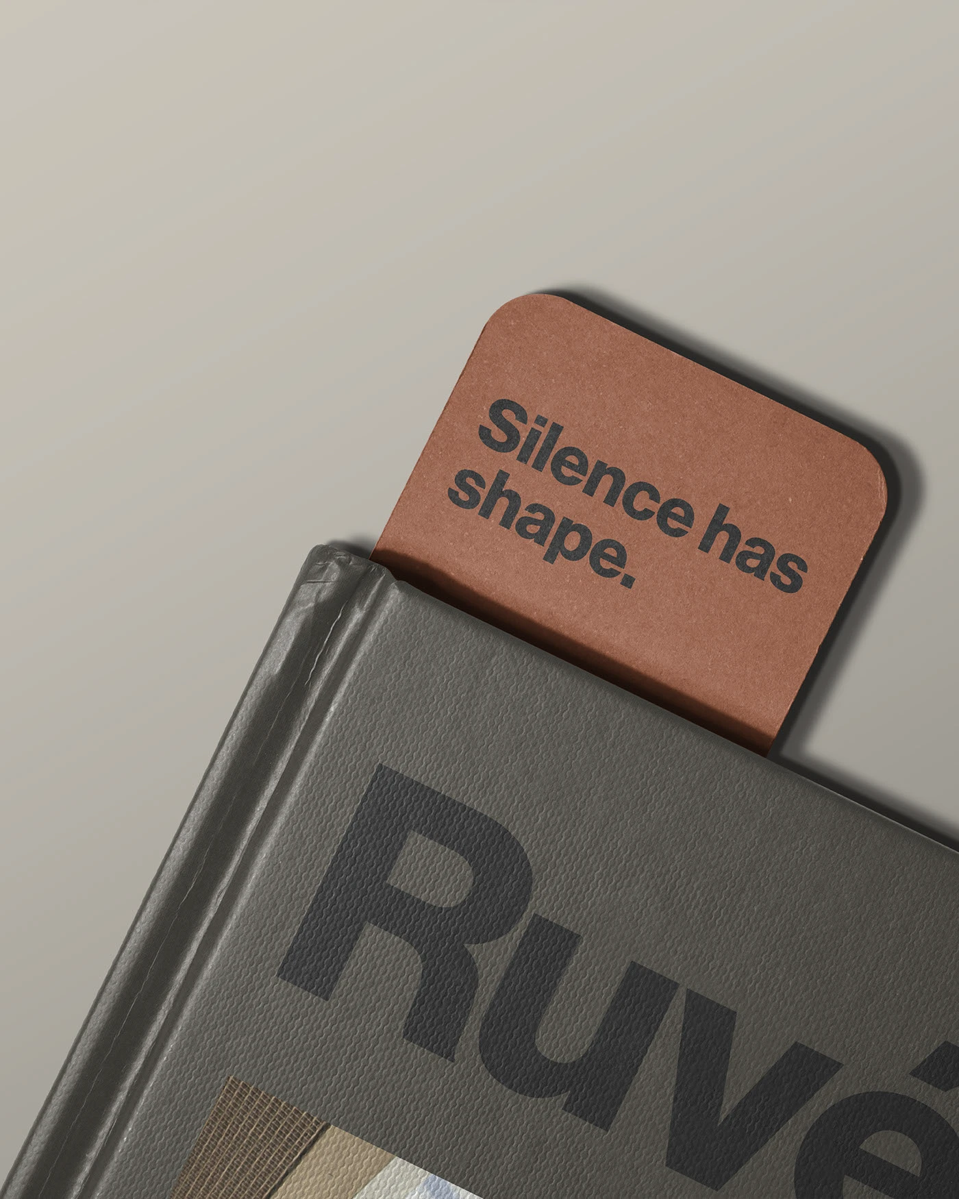
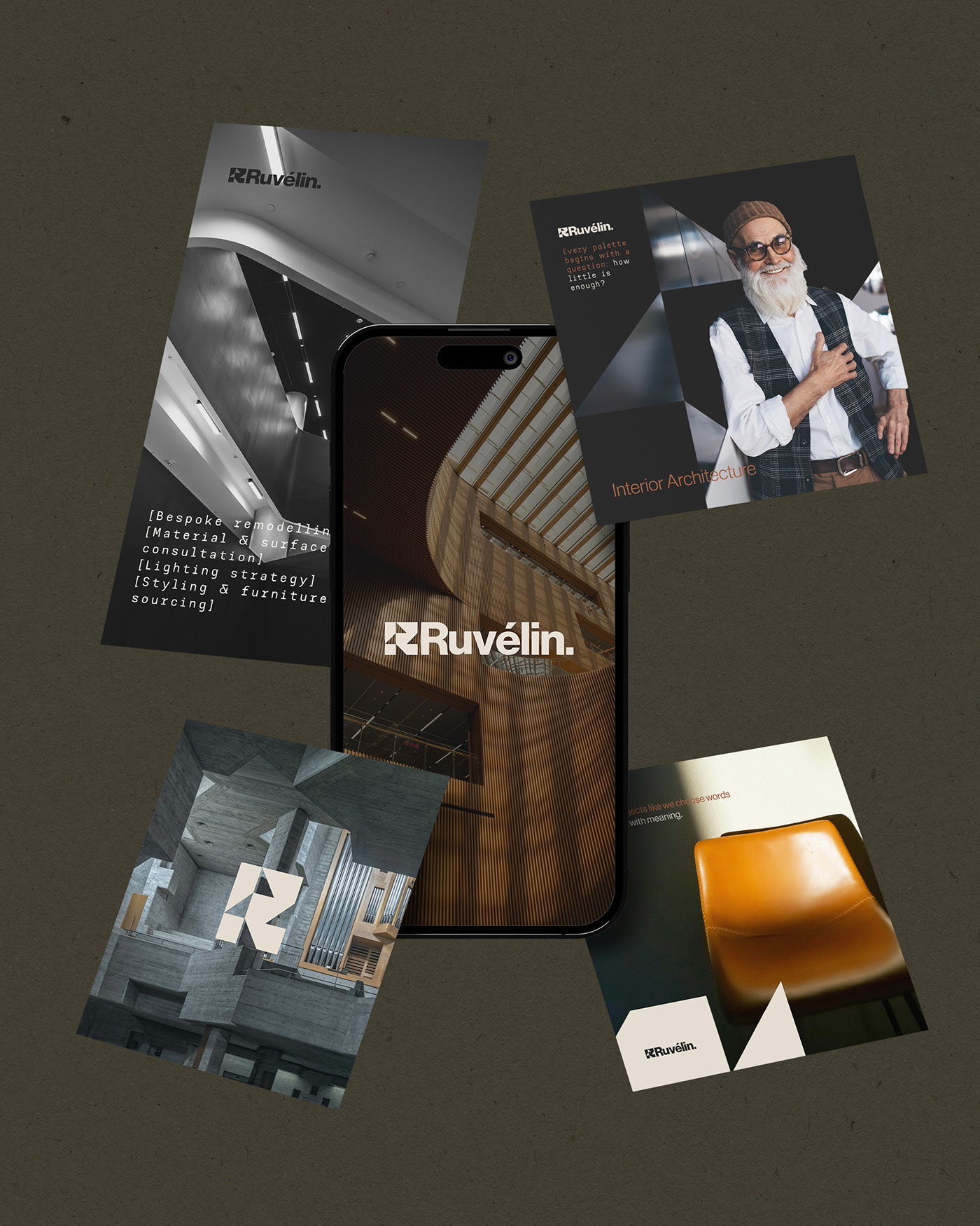
Every aspect of the brand system follows the same logic. Sharp but warm typography. Soft-touch materials. Natural pigments in clay, stone, and wood. The tagline “Silence has shape” became a foundation, guiding voice and visuals across all outputs.
From printed matter and social content to signage and mobile UI, the brand was crafted to feel calm, controlled, and architectural. Designed for a studio that understands the power of doing less, beautifully.

.webp)