05
November
25
Branding & Identity

Cupid's Creamery

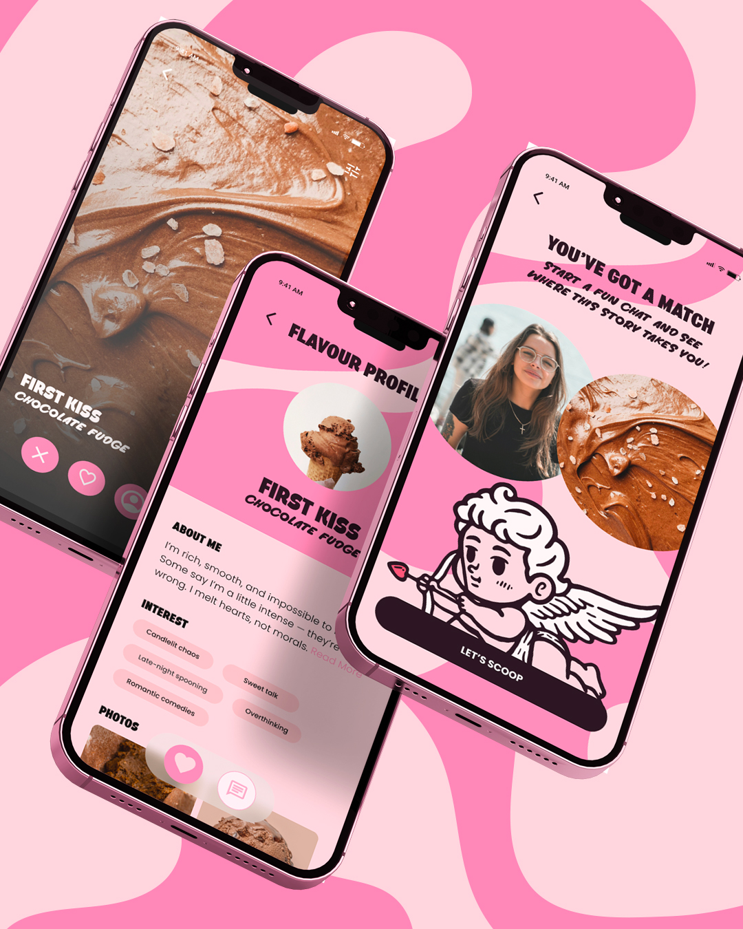
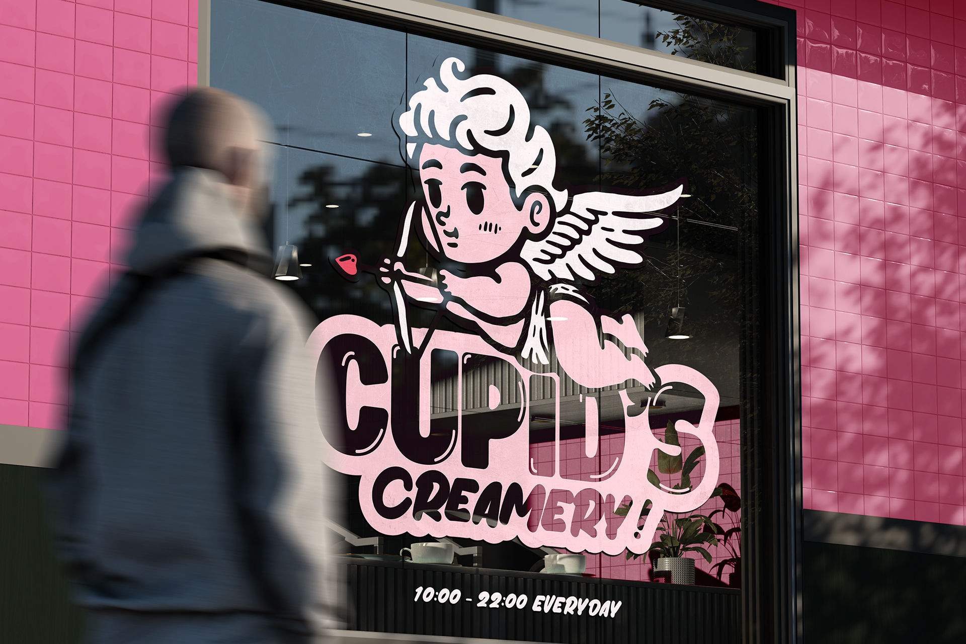
Brand identity and digital concept for a vegan ice creamery. Playful storytelling, curvy forms, and a cheeky mascot create a world where modern romance meets indulgent design.

Love at First Scoop

Cupid’s Creamery reboots the vegan ice cream experience as a modern romance. The brand brings the fun and flirtation of first crushes to life through bold design, bright colour and character led storytelling.

Built around a heart-stroked wordmark, a cheeky Cupid mascot and swirling pink textures the identity feels nostalgic yet confident. Typography is soft and rounded like the whipped ice cream, the palette is sugary pastels and early 2000s pop culture.

The concept extends beyond the visuals to a UX/UI experience where customers match with the flavour that’s right for them. It’s playful, ironic and proves vegan indulgence can be fun and charming.

Project Brief
Client :
Cupid's Creamery
Timeline :
Designer Role :
Design created by:
Daniel Baker

A Brand to Melt Hearts

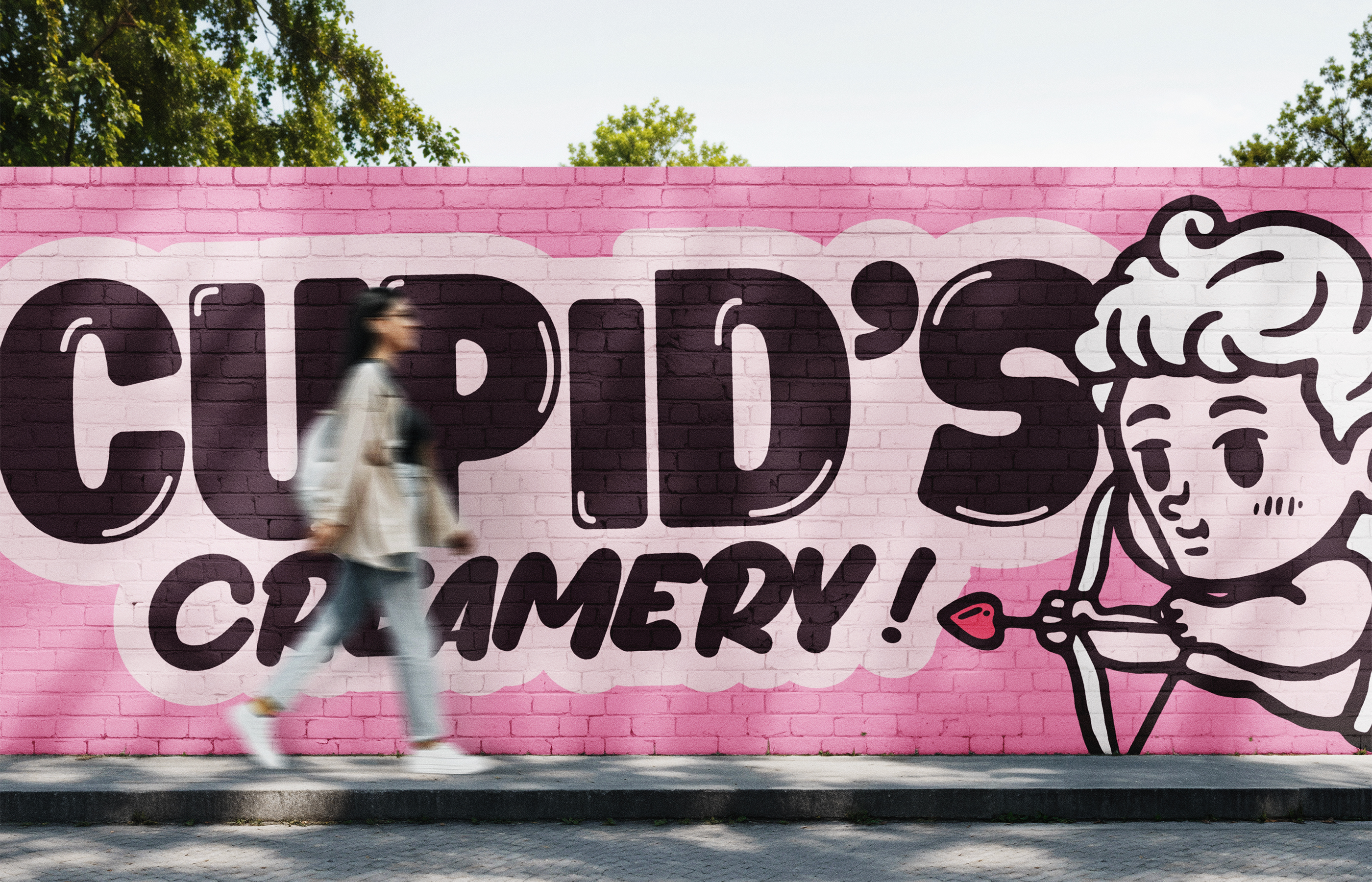
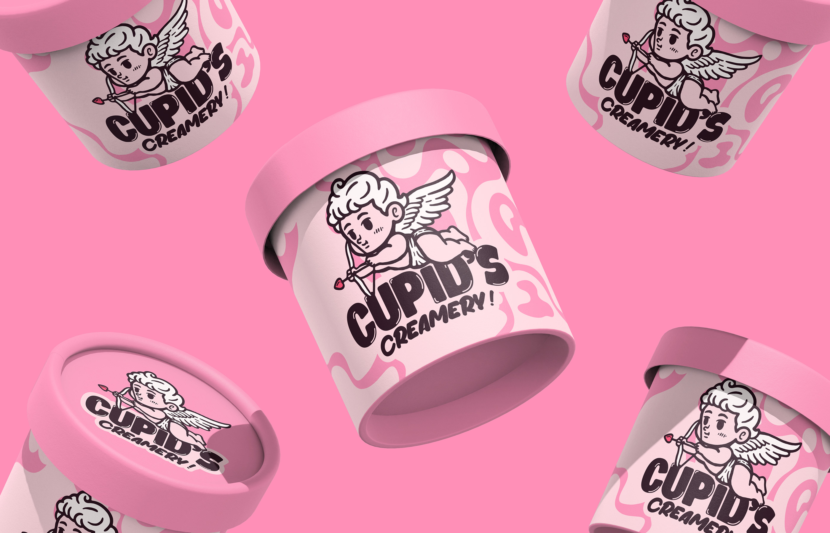
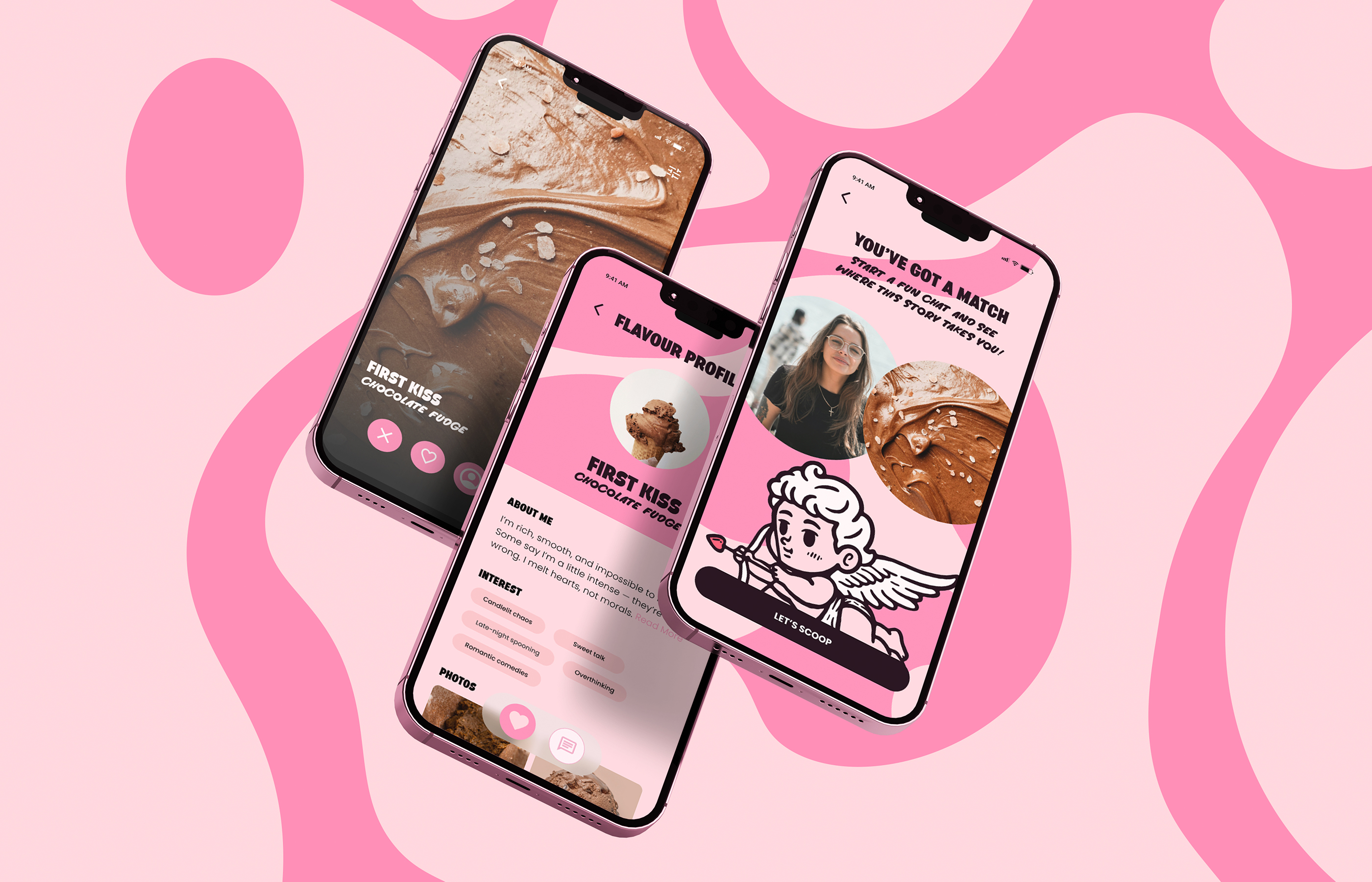
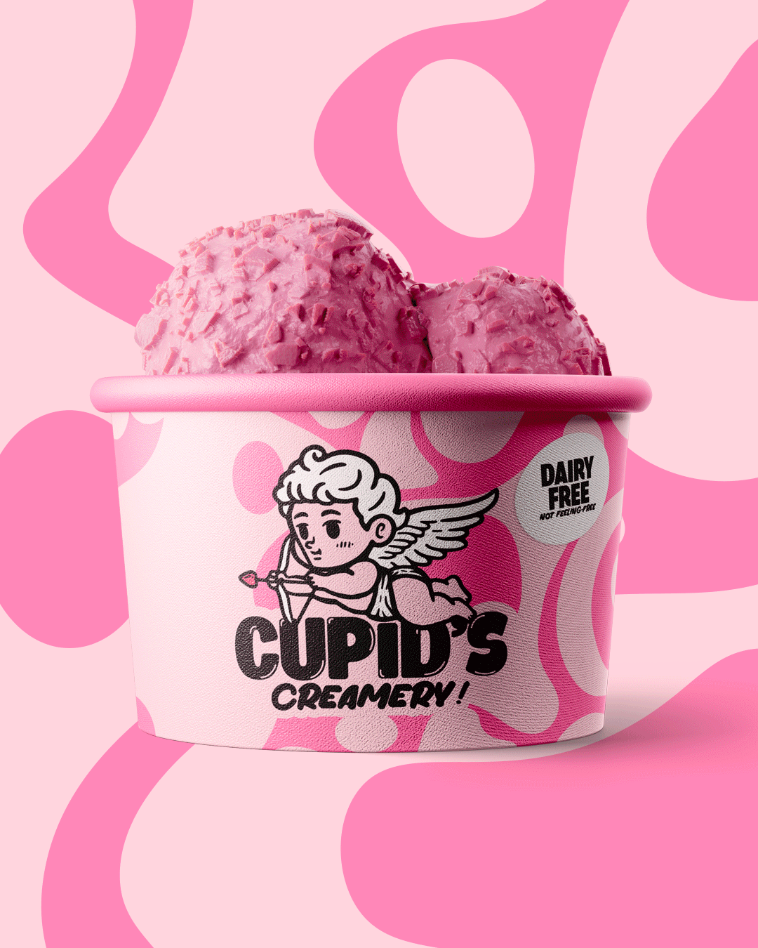
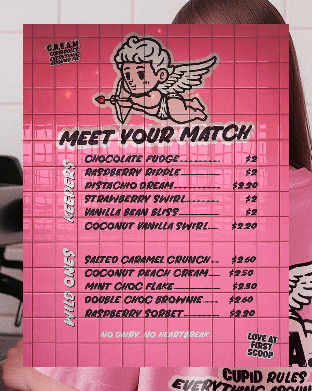
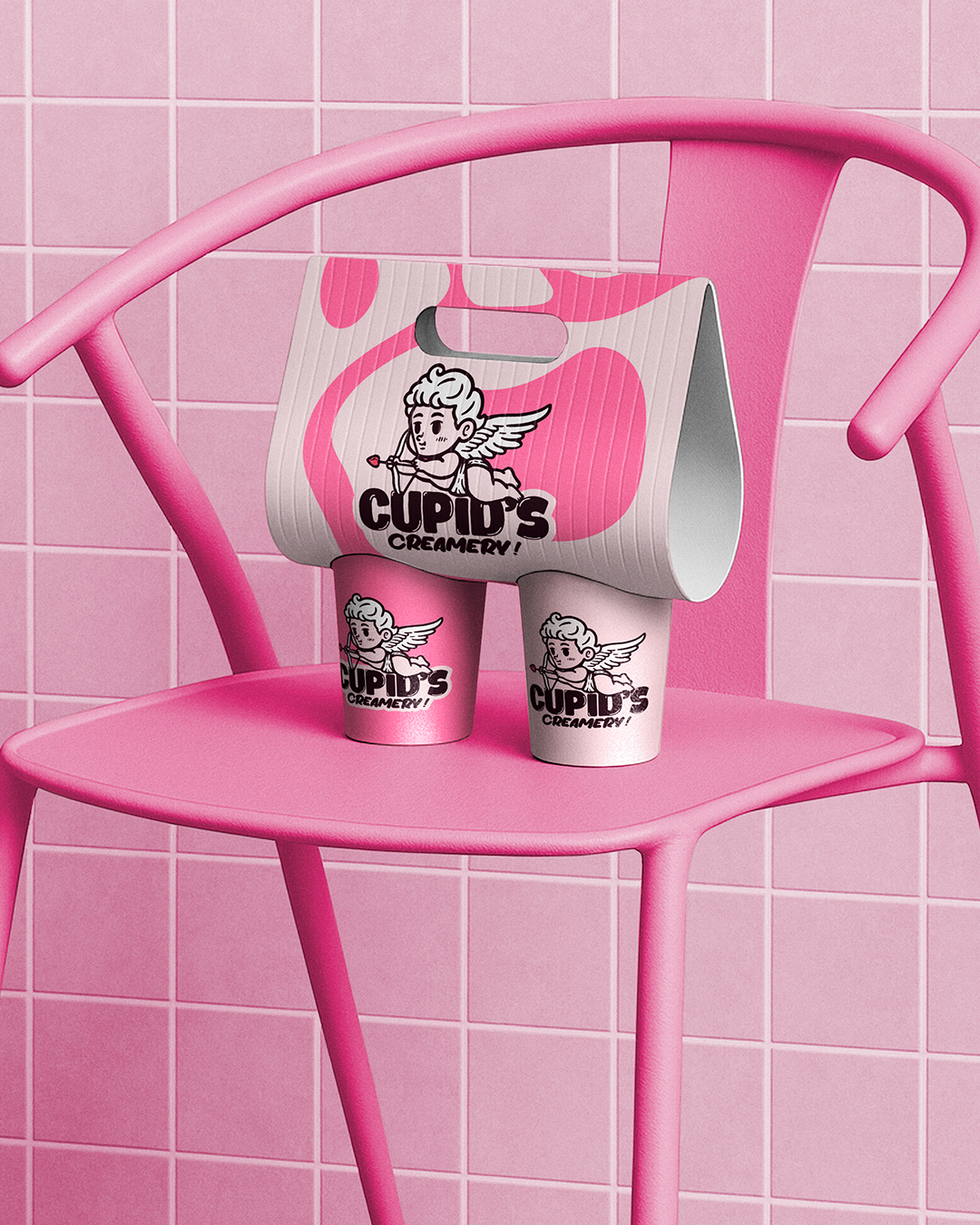
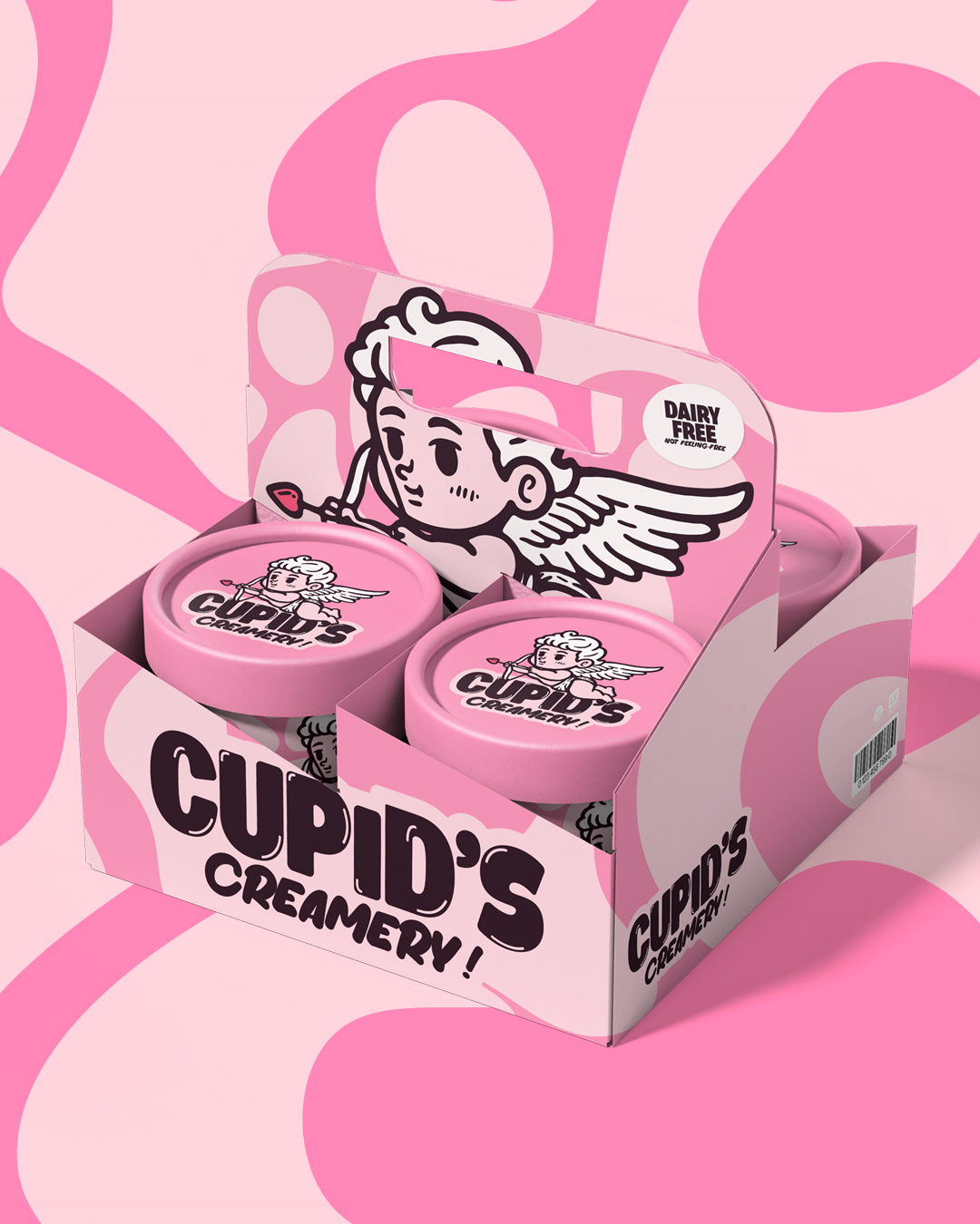
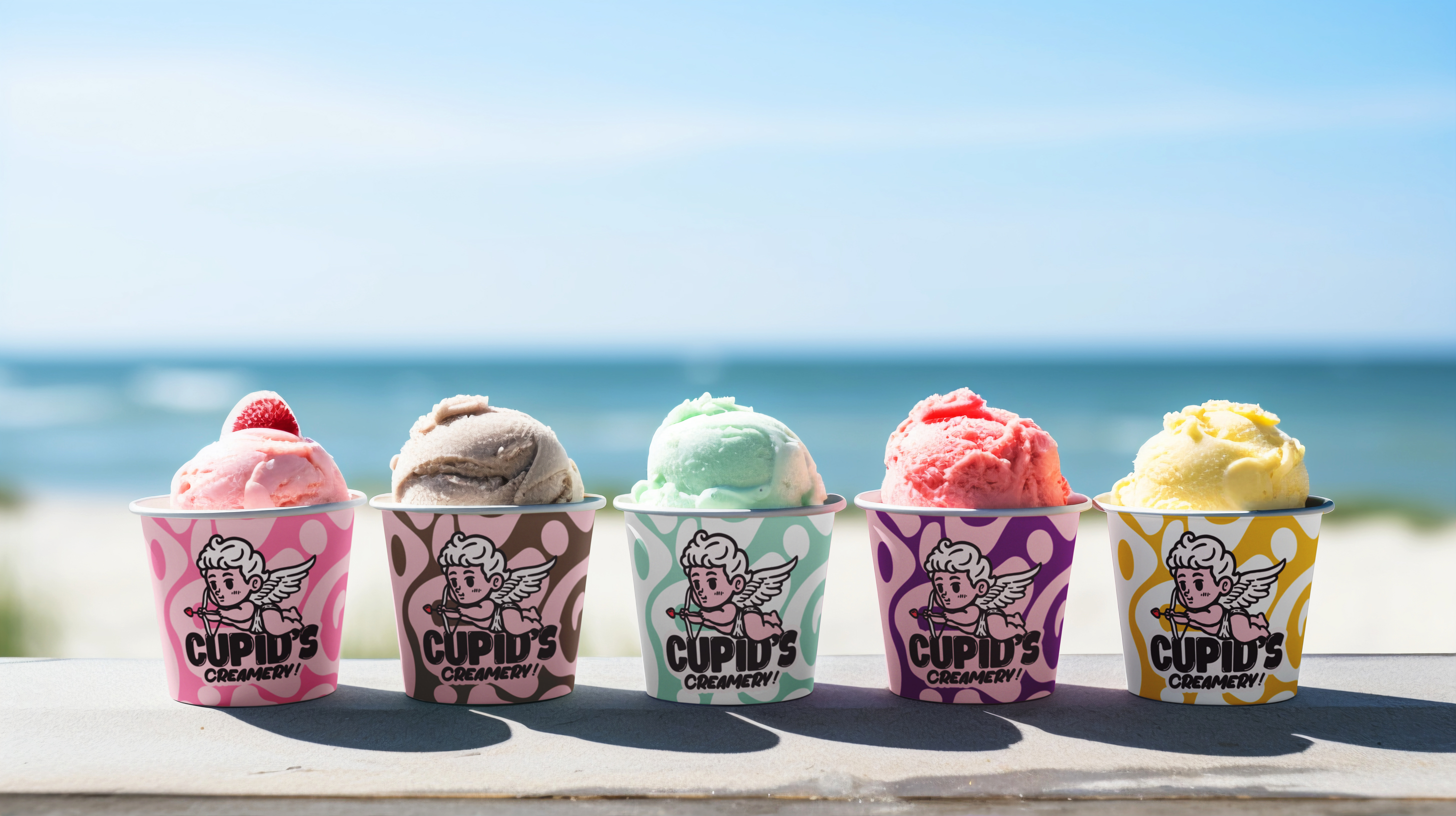
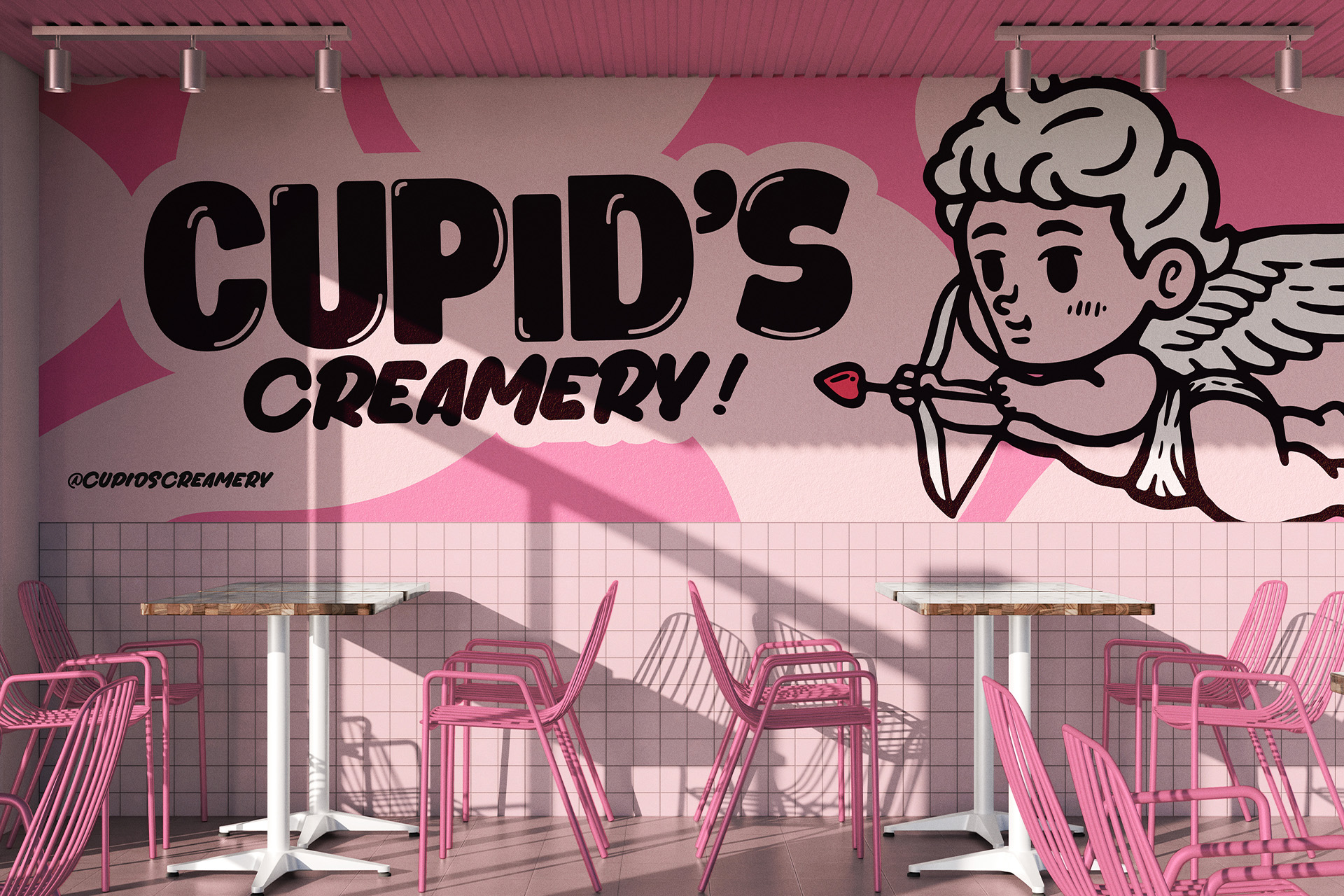
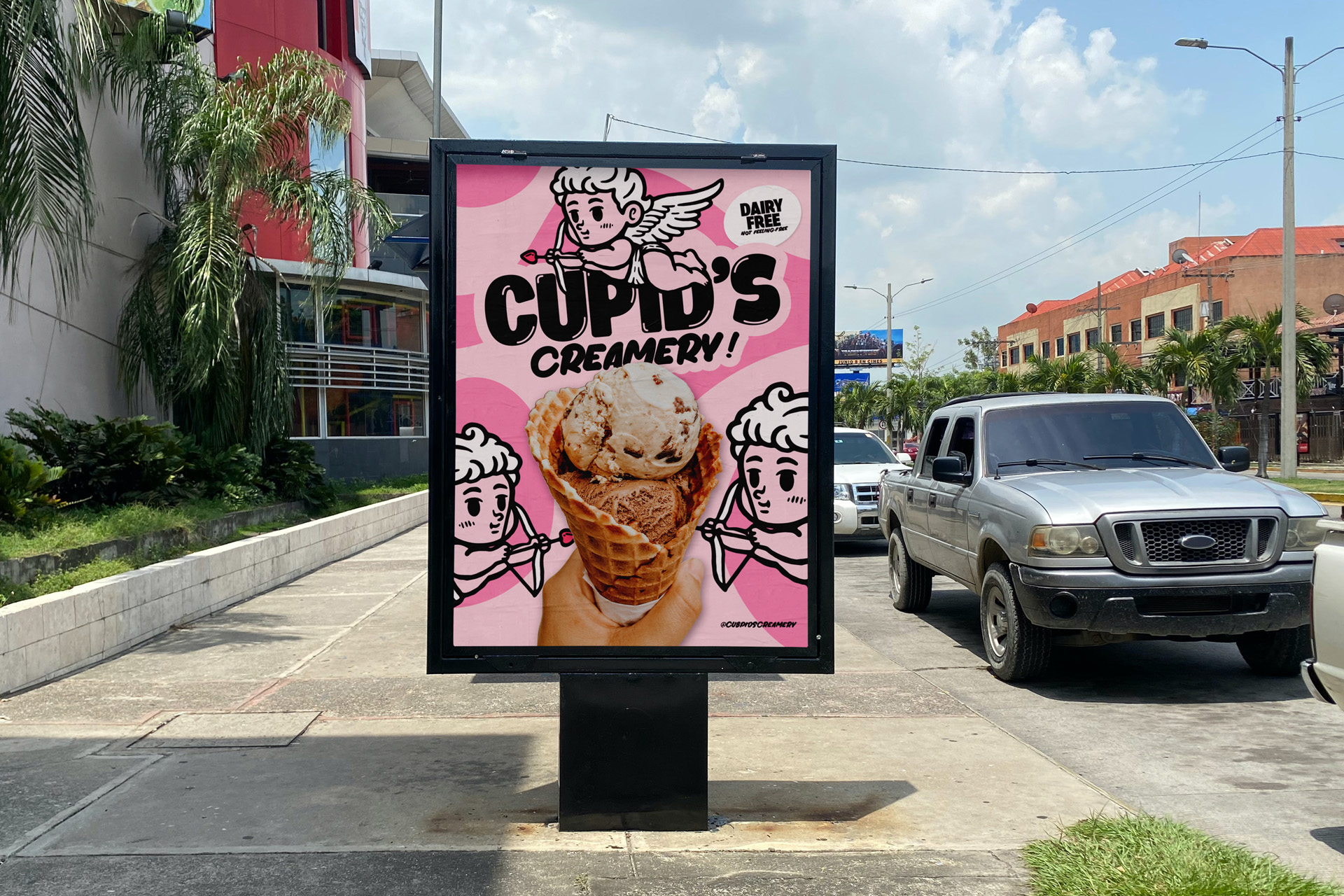
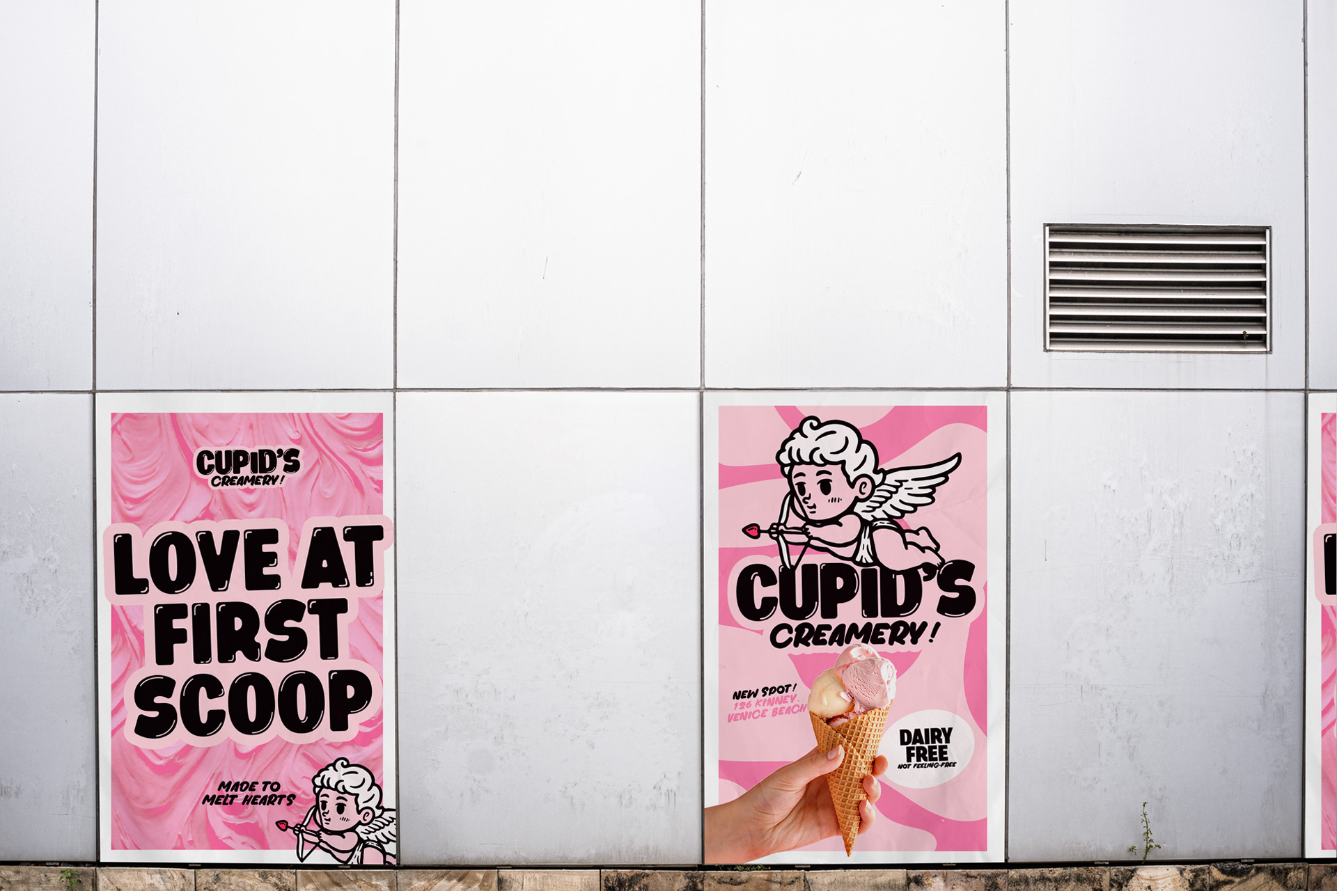
Cupid’s Creamery is to live across every touchpoint, from packaging and digital screens to interiors and signage. Every element is the same playful confidence, a pink, whipped world where nostalgia and fun meet modern design.

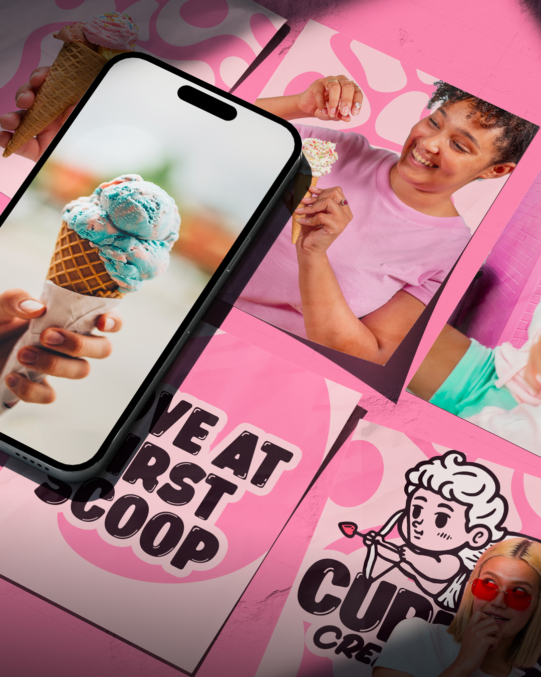
The tone is playful and romantic, with taglines like “Love at first scoop” and “No dairy. No heartbreak.” The mascot and swirled textures are across print, digital and physical spaces, so it’s cohesive and shareable.

The result is a brand that makes plant-based indulgence fun and full of joy. It’s made to stop you in your tracks, make you smile and make every scoop feel like a little love story.

Latest projects