01
October
25
Branding & Identity

Laceys

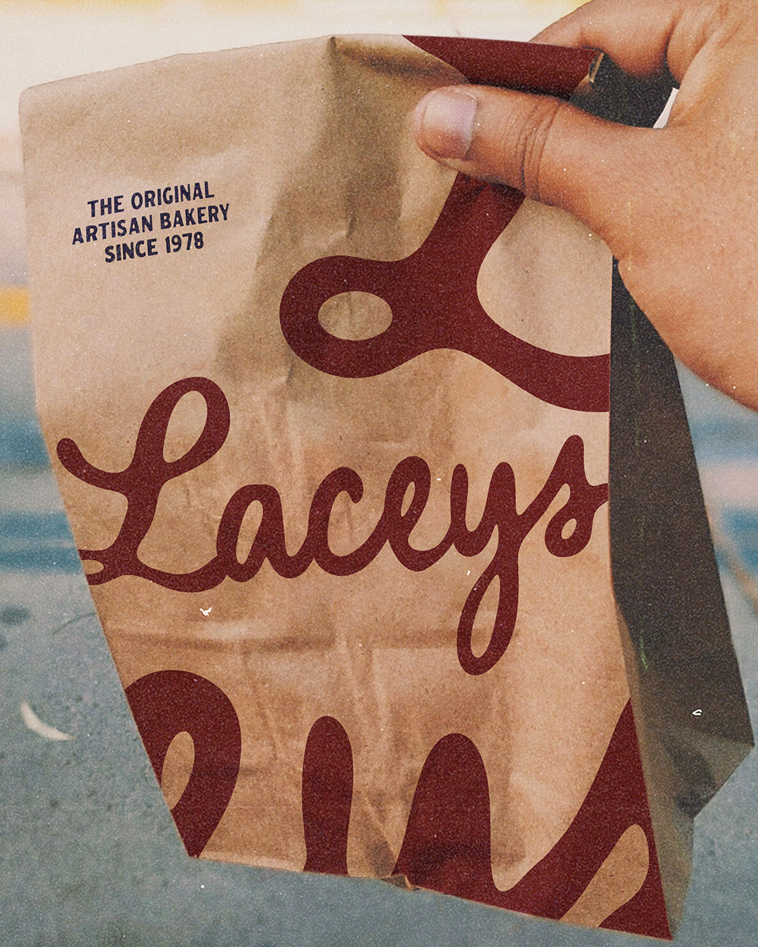
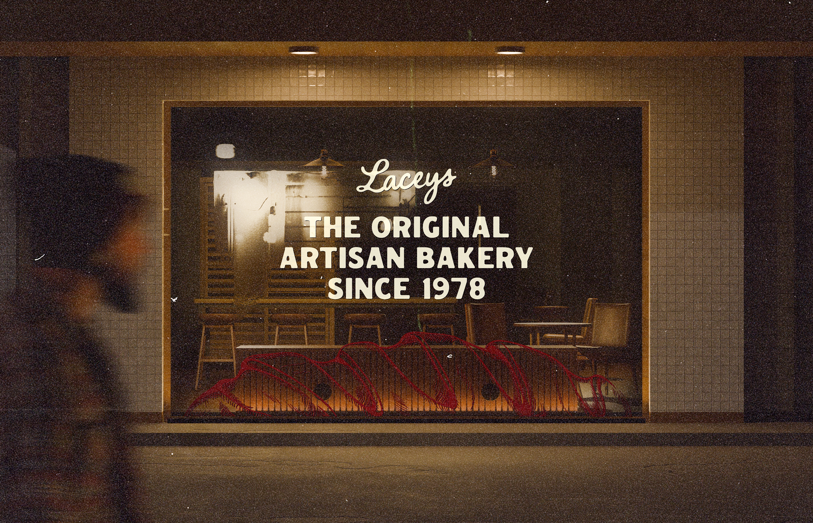
Brand identity and visual system for a family bakery. A heritage script mark, rustic tones, and crafted storytelling anchor a brand built on tradition, community, and daily ritual.

A Timeless Identity for a Family Bakery


Laceys has been baking since 1978, but the brand needed a refreshed identity that celebrated its roots while feeling current. The system is built around a flowing script wordmark and the heritage line “Baked in tradition.” A warm palette of deep red, cream, and kraft paper carries across packaging, signage, and menus, designed to feel lived-in and trusted.

Each loaf is given character through naming and storytelling — from The Rye Loaf to The Coburg — creating a menu that reads like a history of British baking. Paired with simple typography and nostalgic textures, the brand balances refinement with a familiar, everyday warmth.

Project Brief
Client :
Laceys
Project Type :
Timeline :
Designer Role :
Design created by:

A Brand Baked into Community


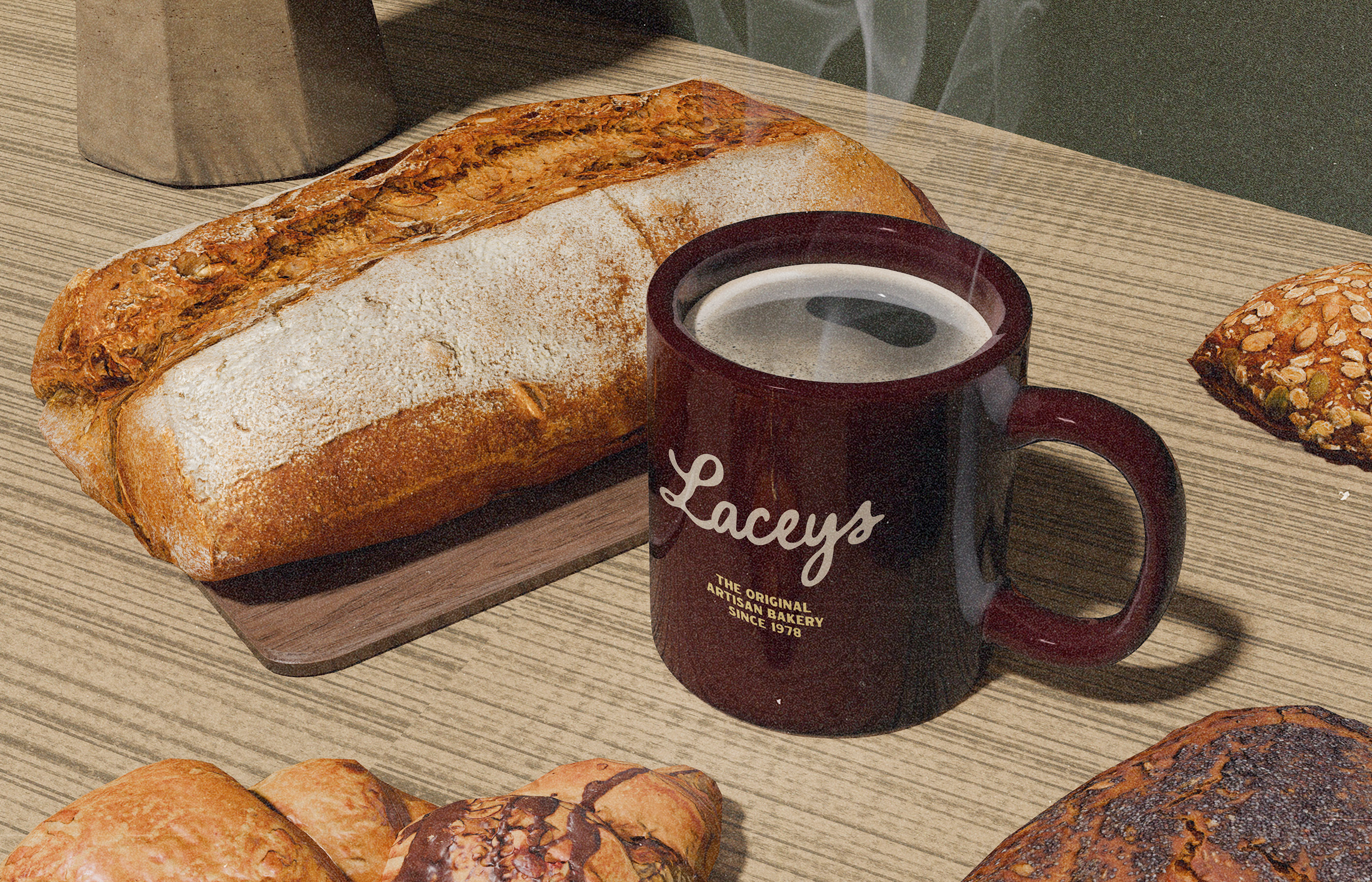
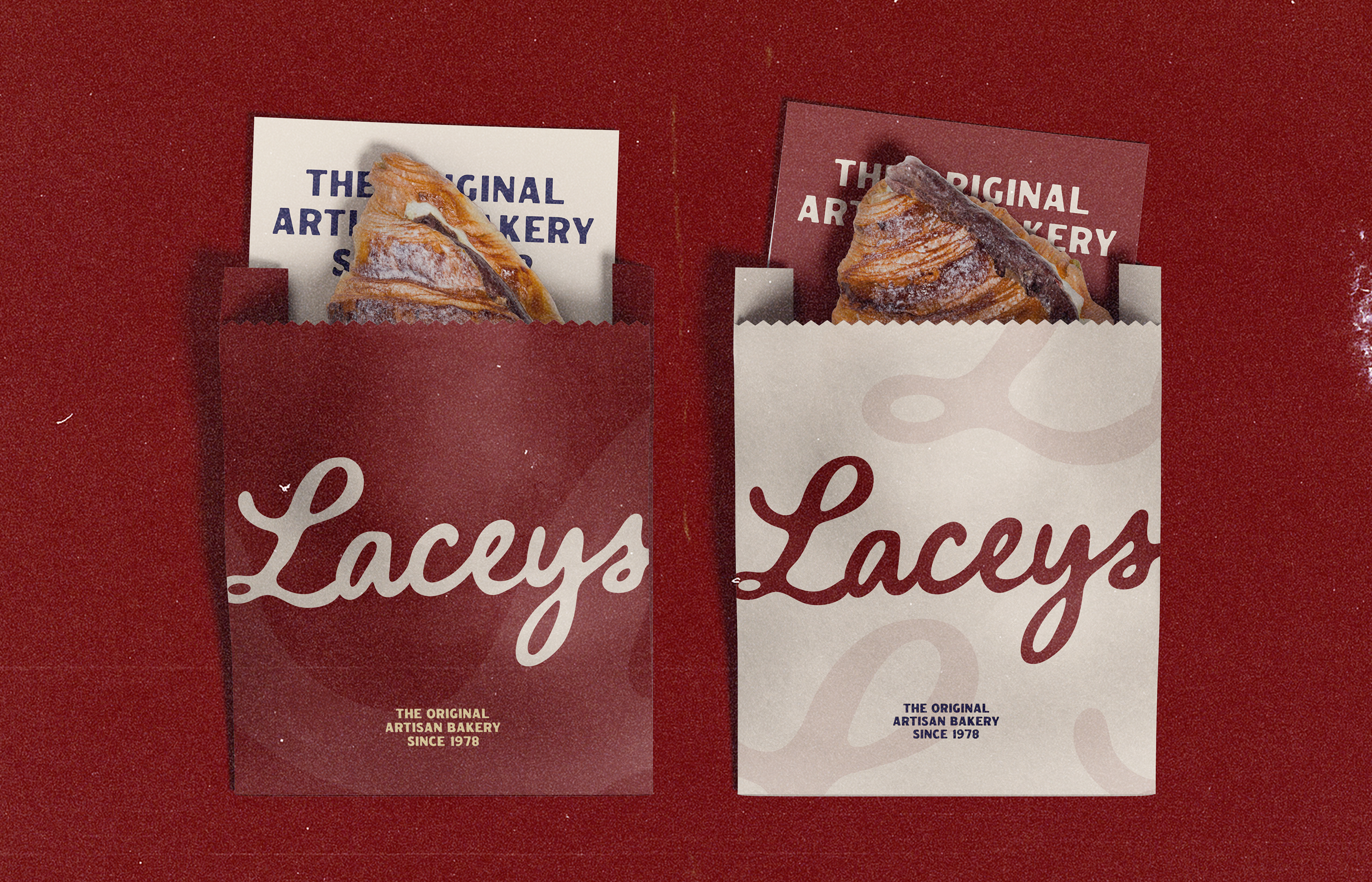
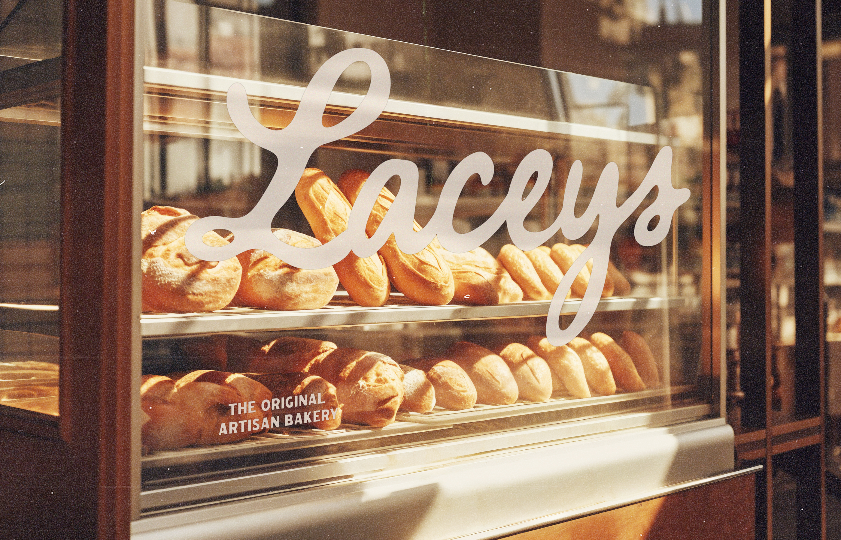
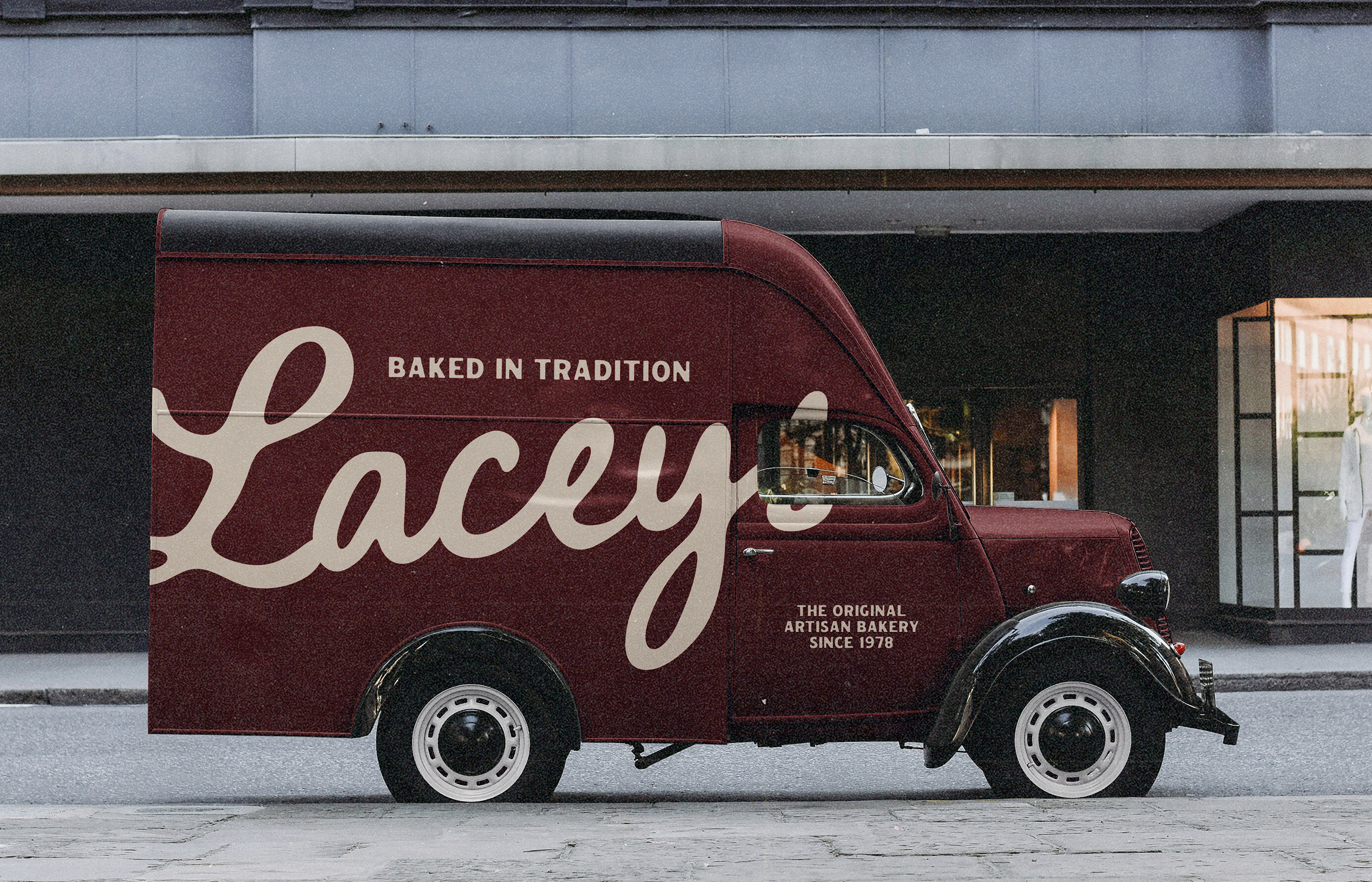
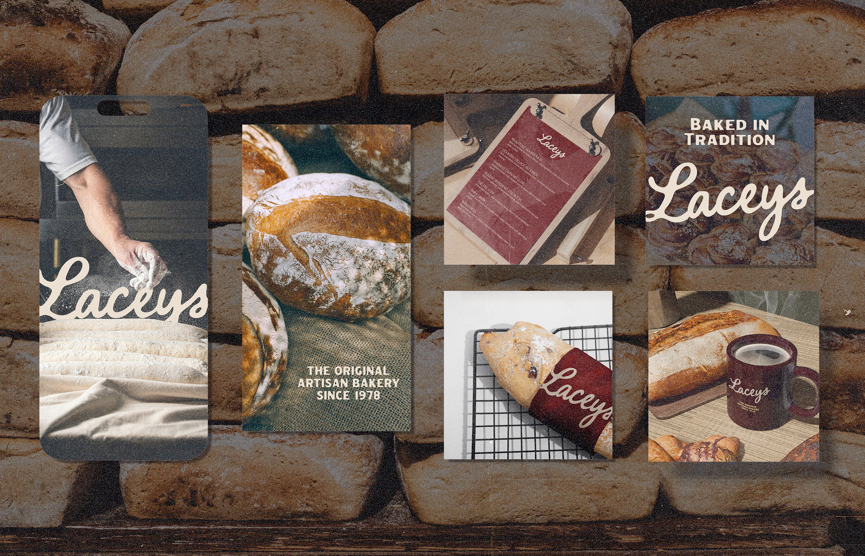
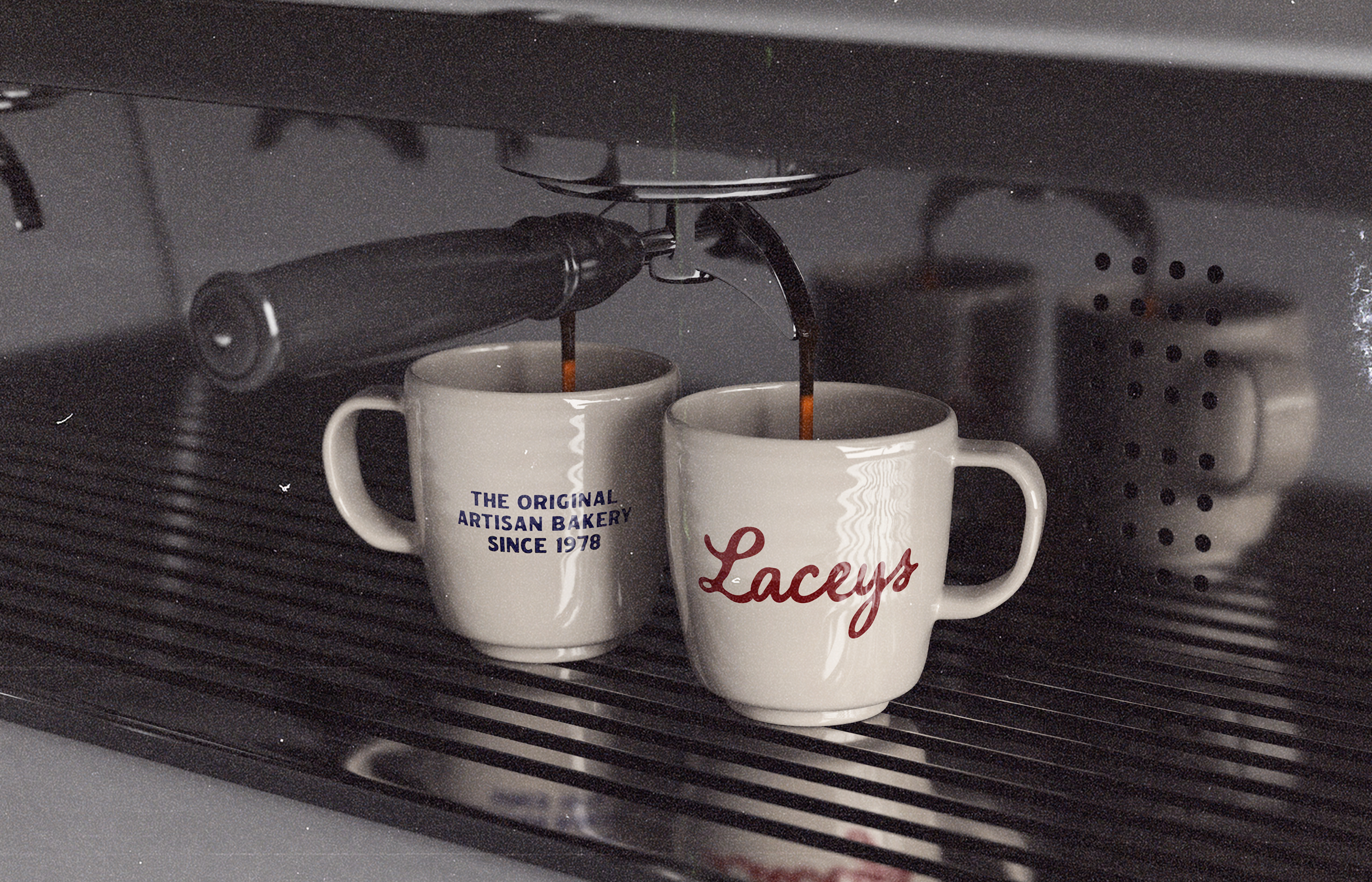
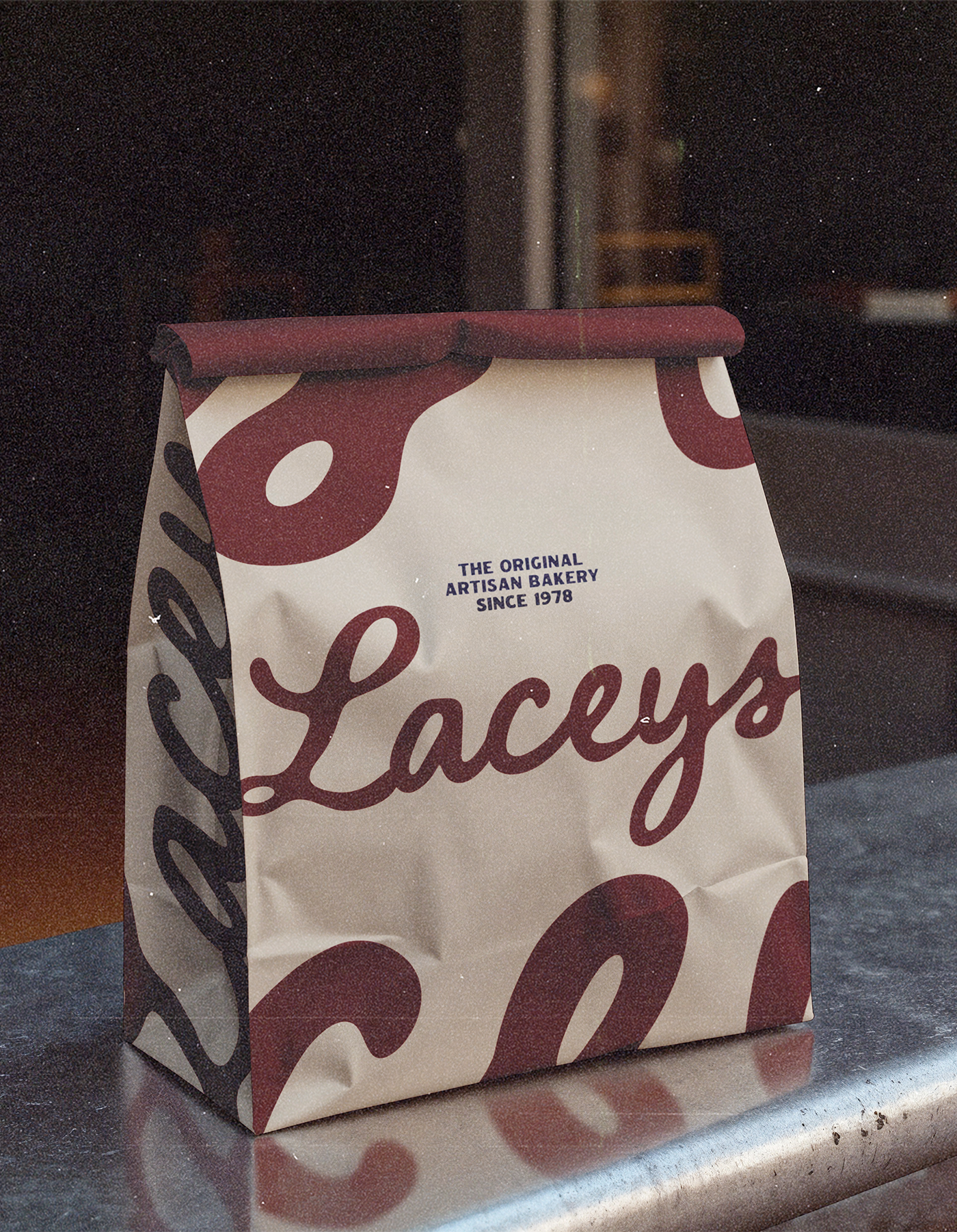
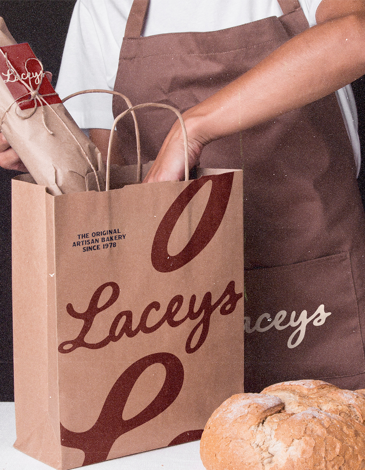
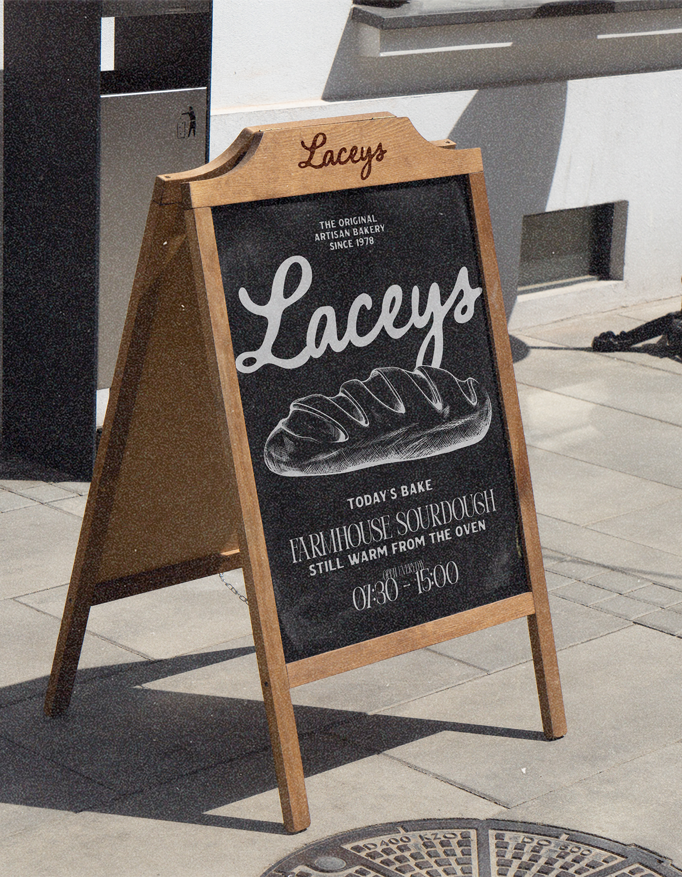
Laceys is more than a bakery, it’s a daily ritual. The system works across every touchpoint, from bread bags and coffee mugs to shopfront signage and delivery vans. Collateral carries rotating lines like “Handmade every day” and “Shared with love” to embed the brand’s voice into small, authentic details.

The result is an identity that feels both classic and fresh: a bakery that wears its heritage with pride, while staying relevant in the modern high street.

Latest projects