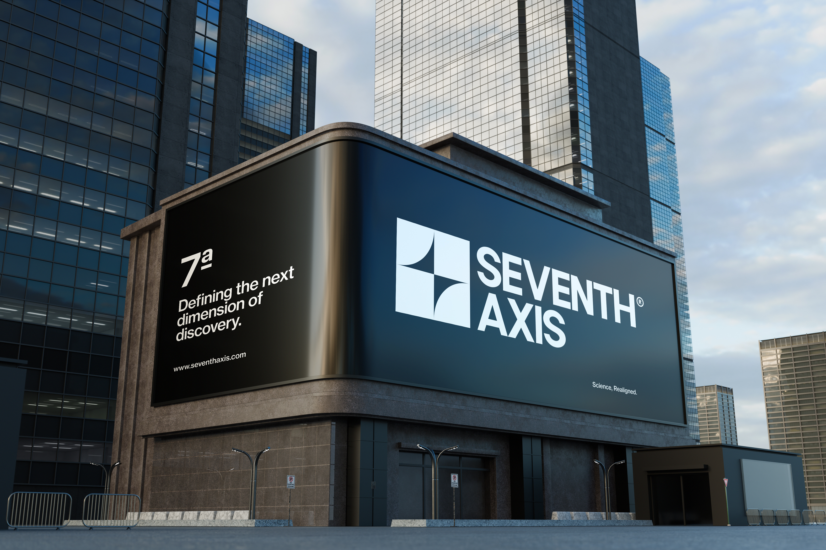
Brand identity, motion direction, and digital experience for a future-focused research centre working at the intersection of science, structure, and speculative design.
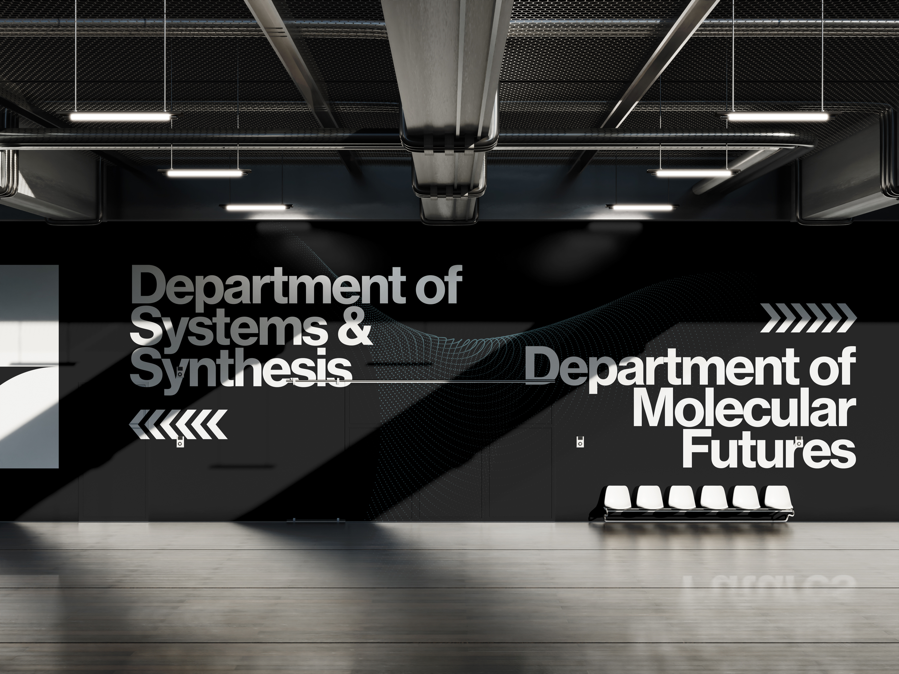
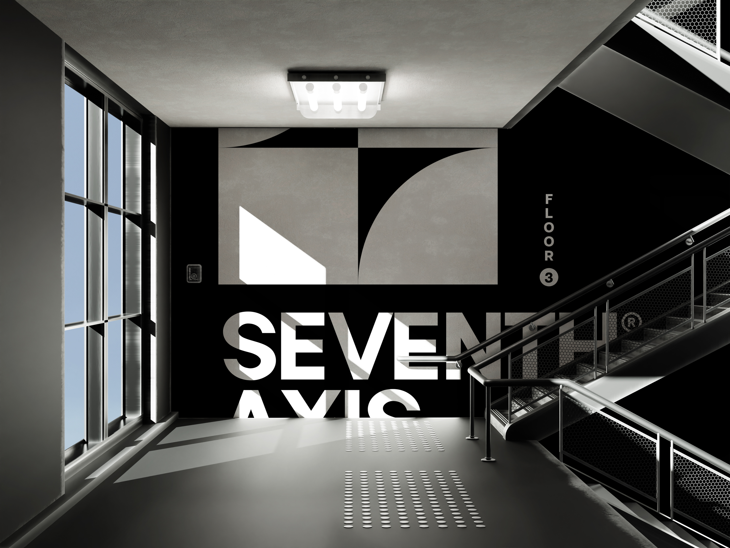

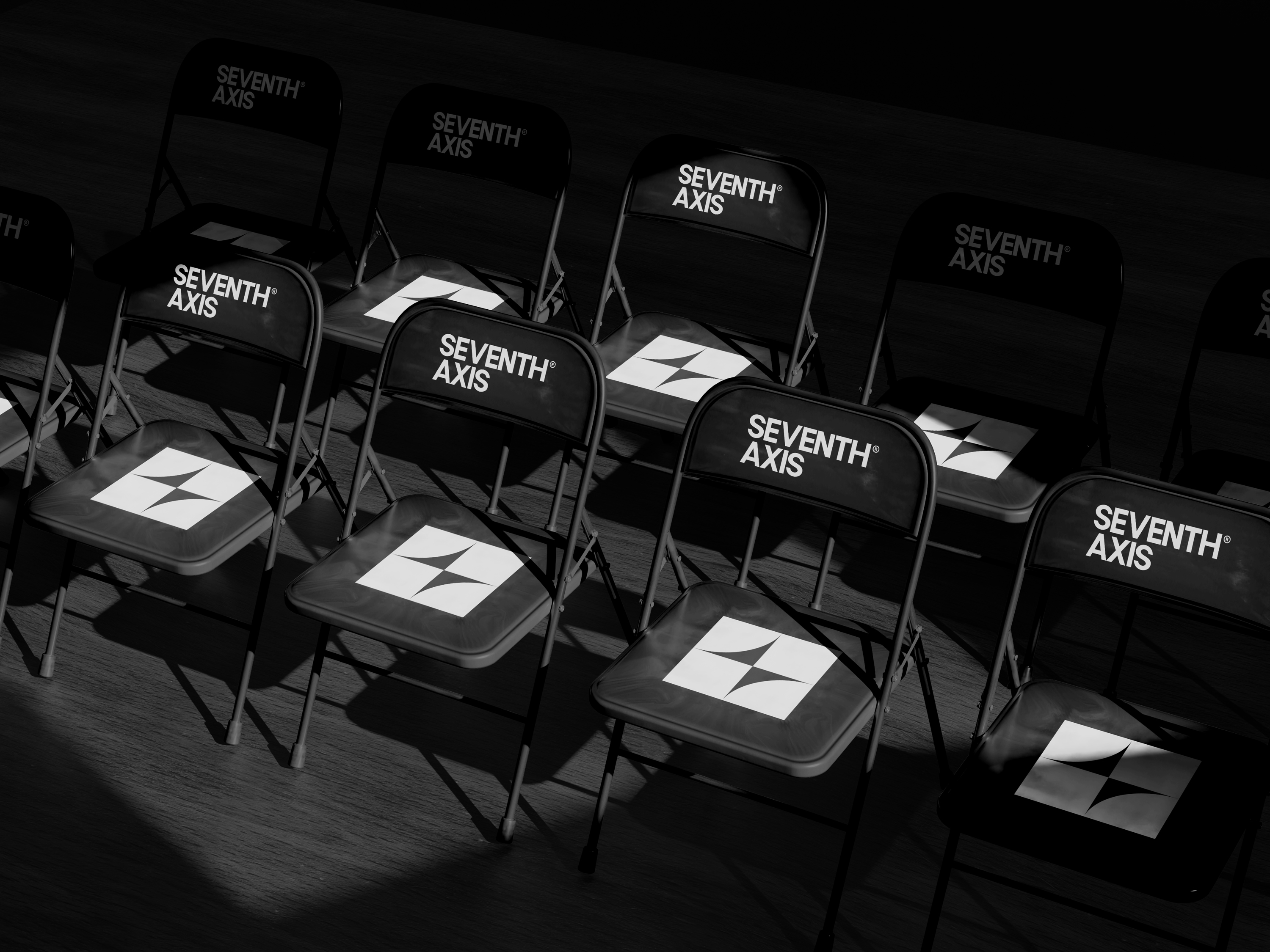
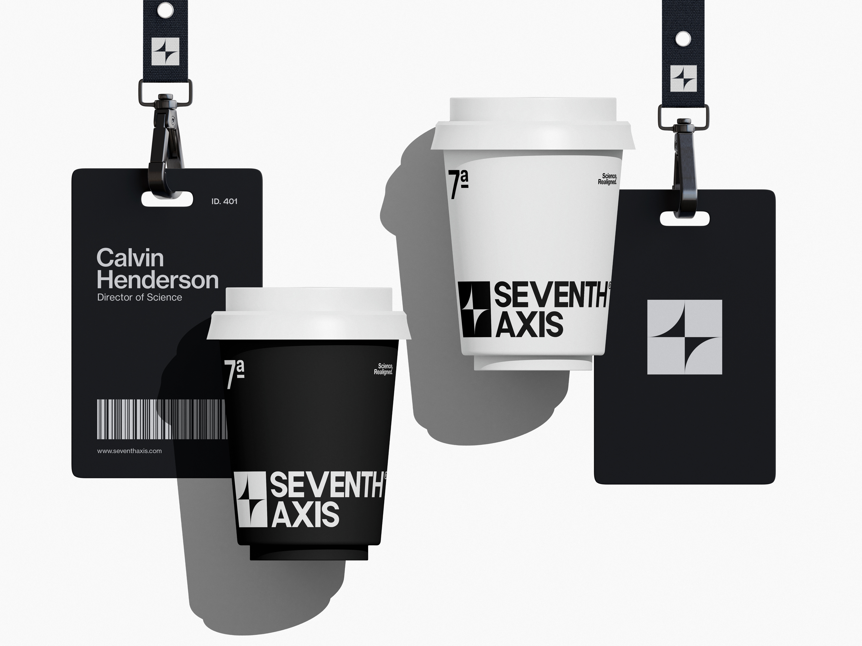
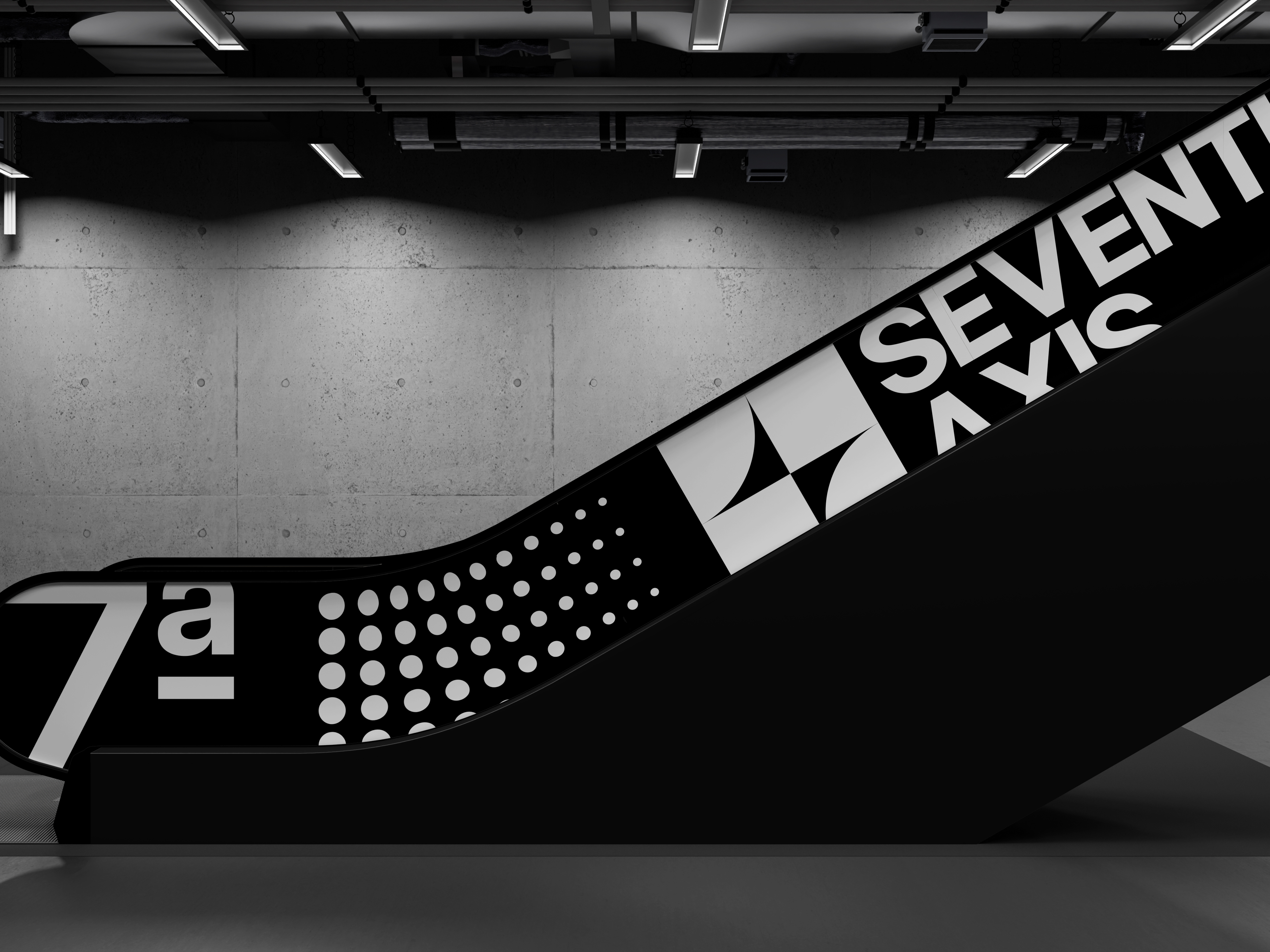
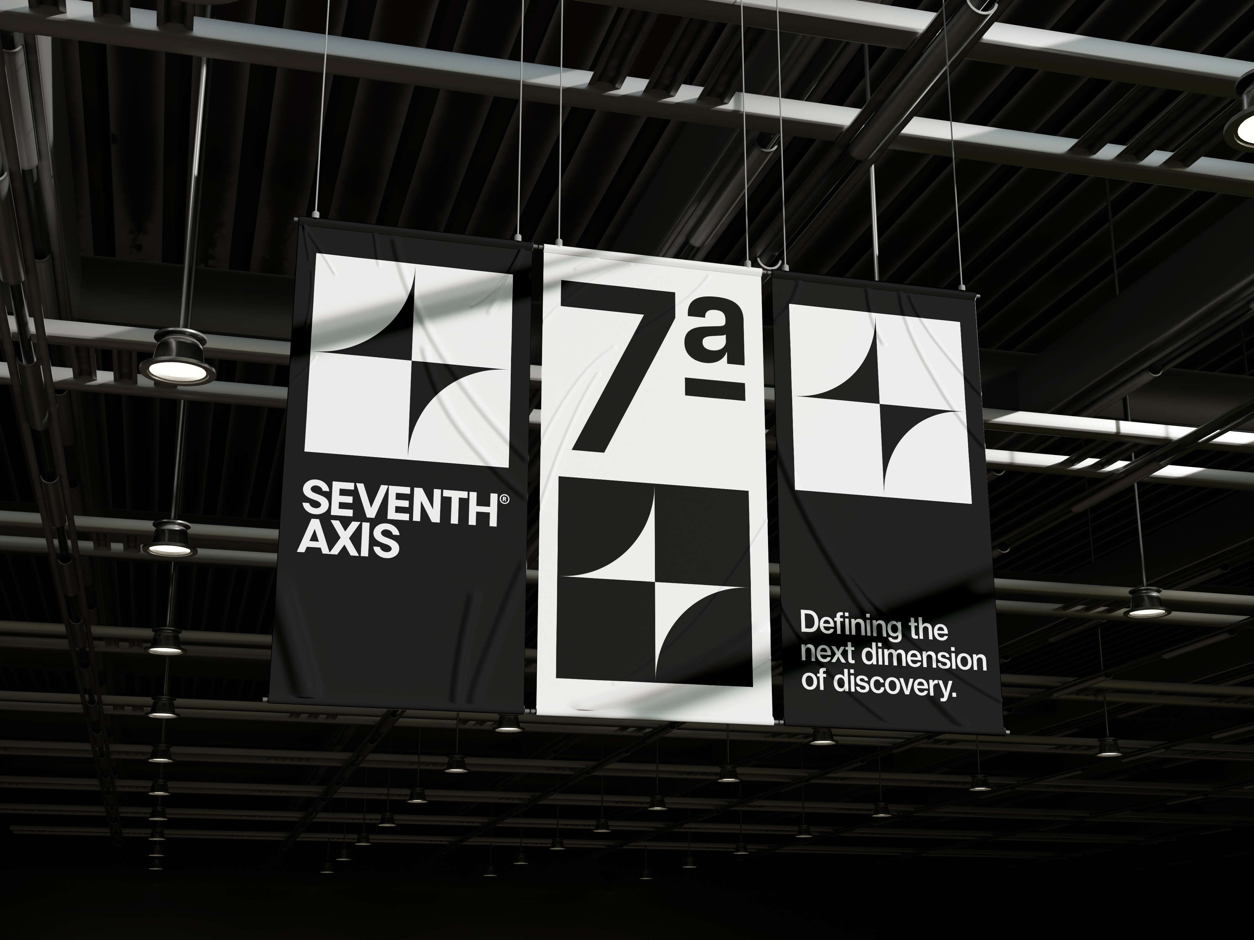
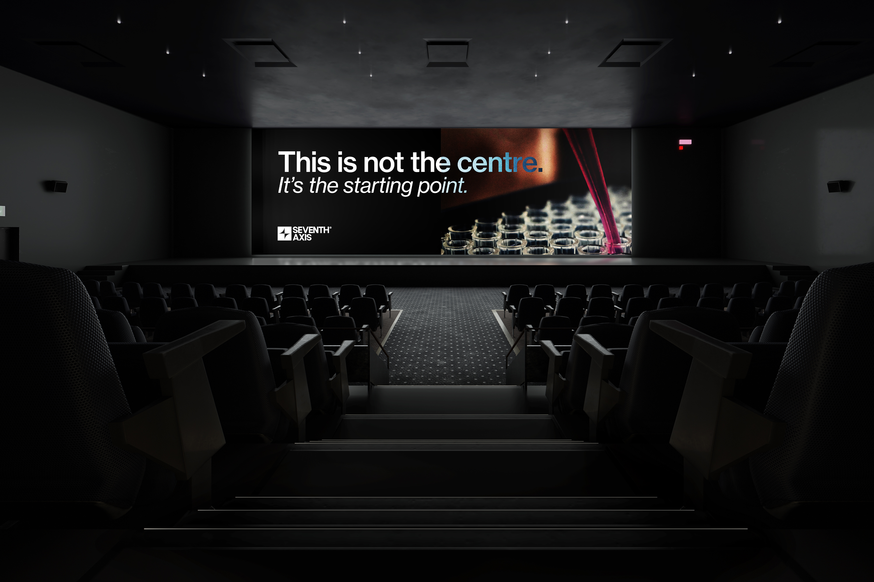
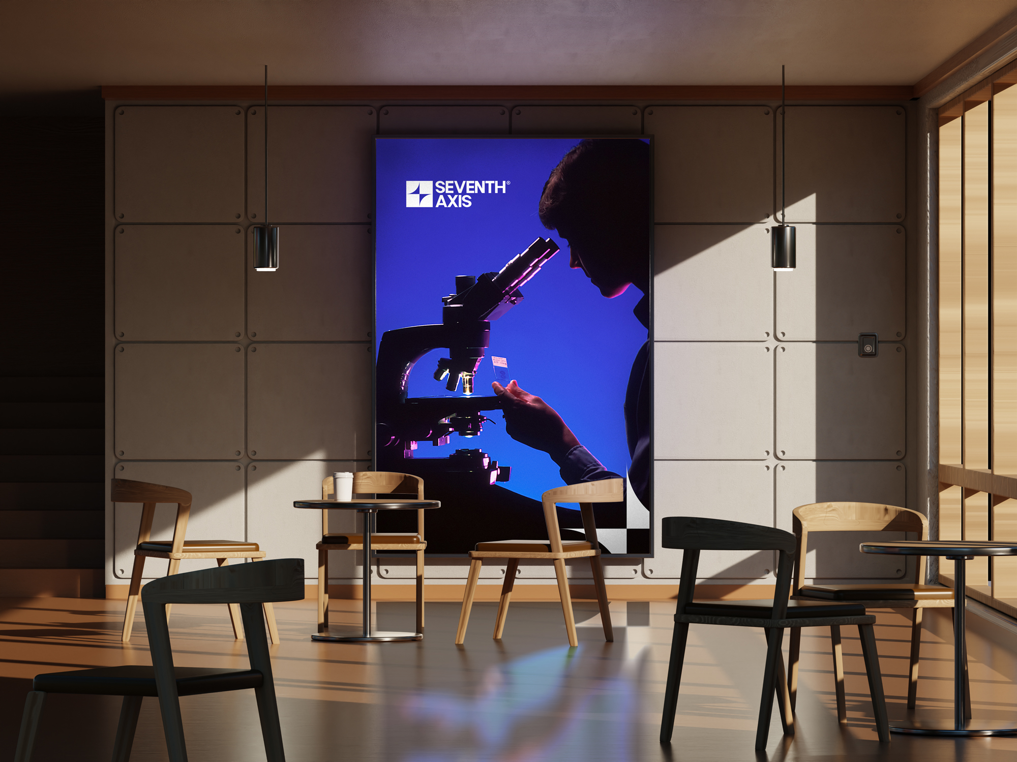
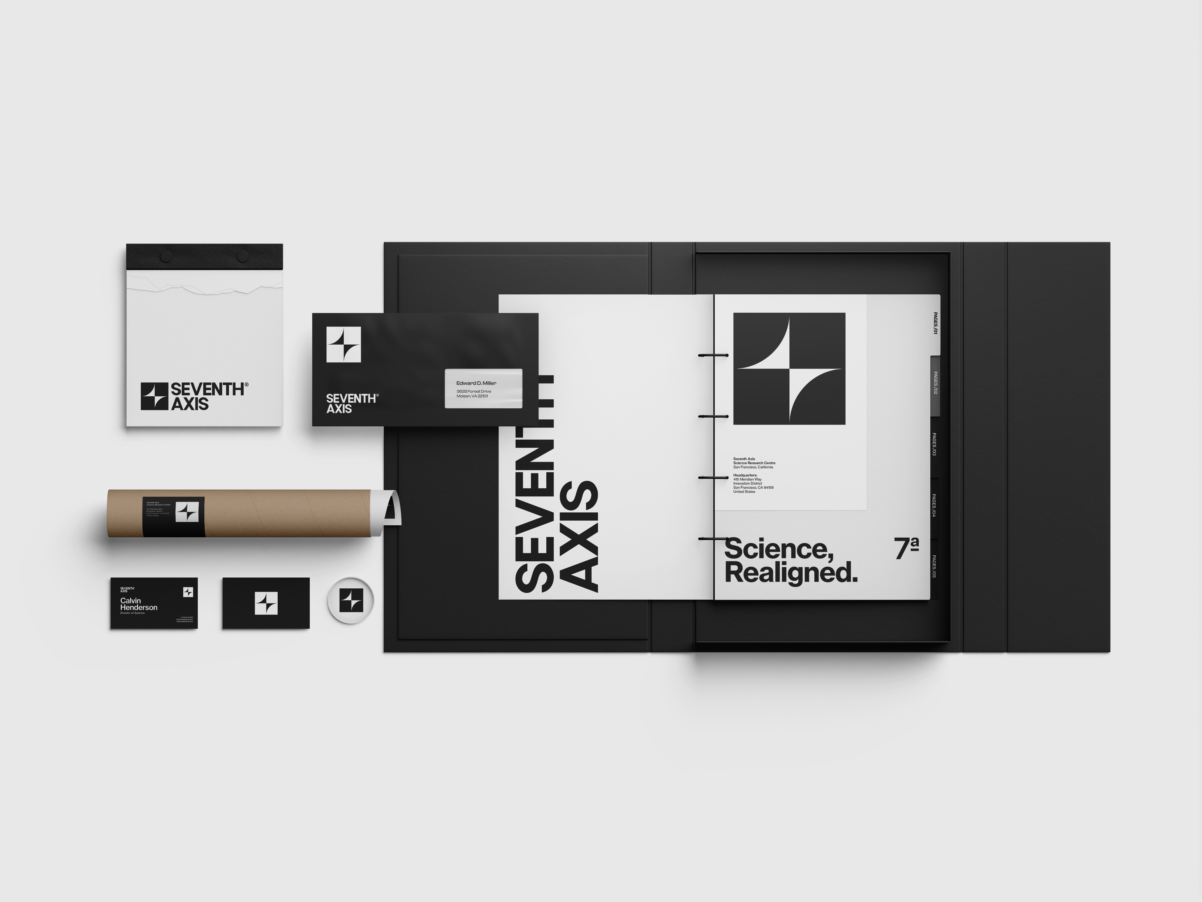
We worked closely with the founding team to develop a full identity system, digital direction, and content framework. The brand is rooted in contrast. Black and white dominate the palette to signal clarity and focus. Typography is structured and deliberate, designed to support content across formats without decoration.
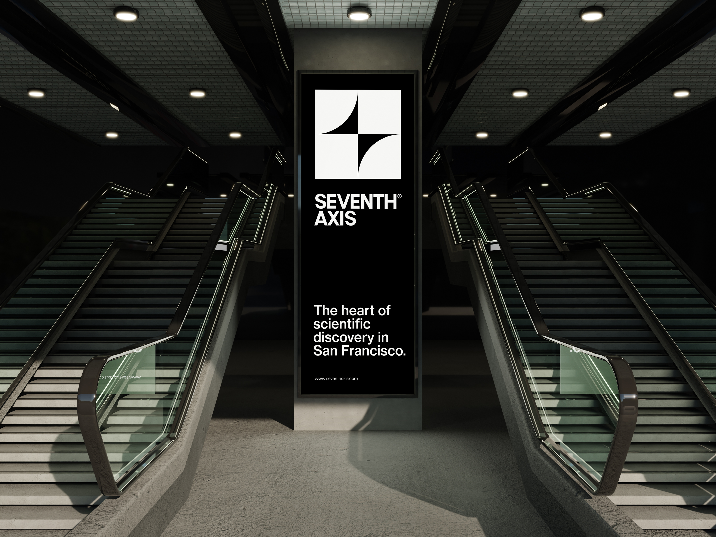
The symbol sits at the centre of the system. It is dimensional and abstract, referencing movement, structure, and alignment without being fixed to a single idea. Layouts are built on a strict grid, giving the brand a sense of rhythm and architecture.
Motion design carries meaning throughout. In digital, elements scale, fold, and reframe to reflect the centre’s focus on layered perspectives and new ways of seeing. This principle shapes the navigation, interface, and even the way information is revealed.
The website is designed for thinkers. Sharp, spacious layouts allow content to lead. Typography is minimal but intentional. The tone is intelligent without becoming academic, and the overall experience is built for clarity and trust.
Seventh Axis now has an identity that reflects how it operates. Clear, structured, and always moving forward.