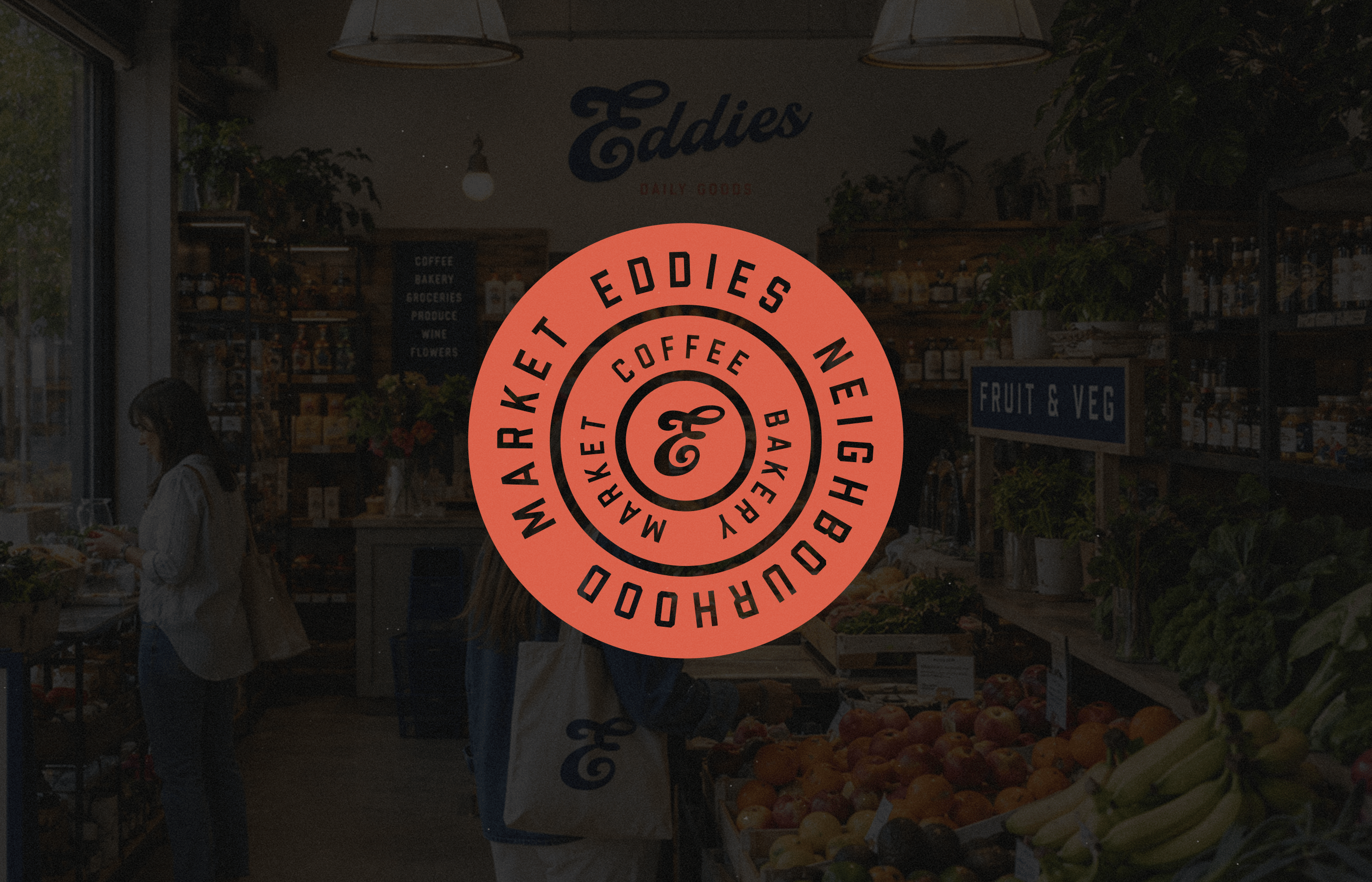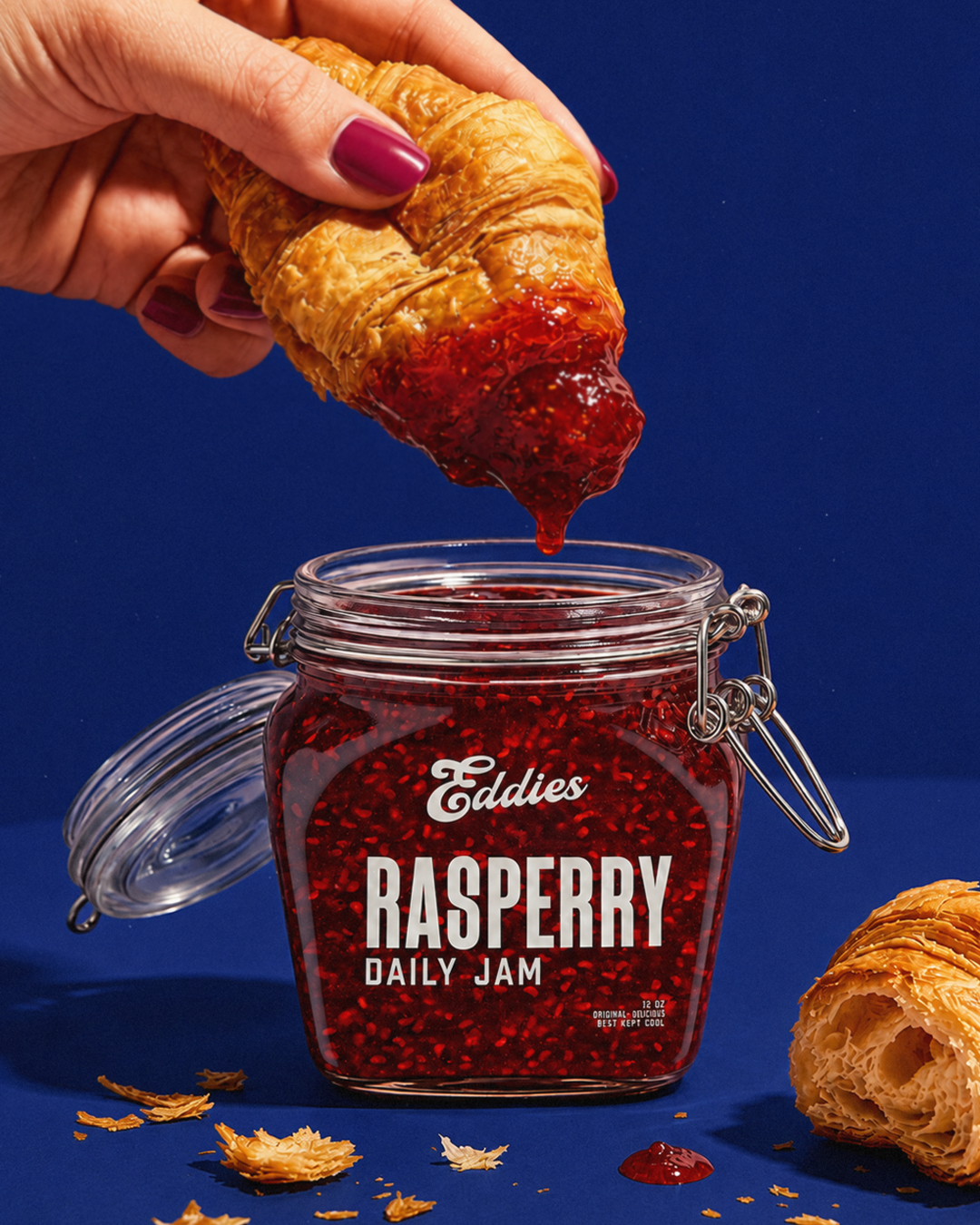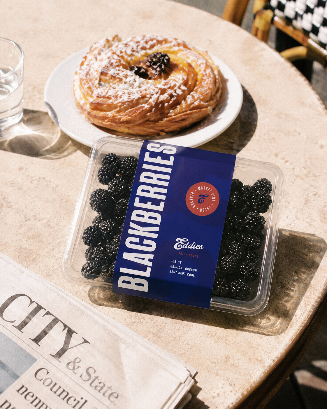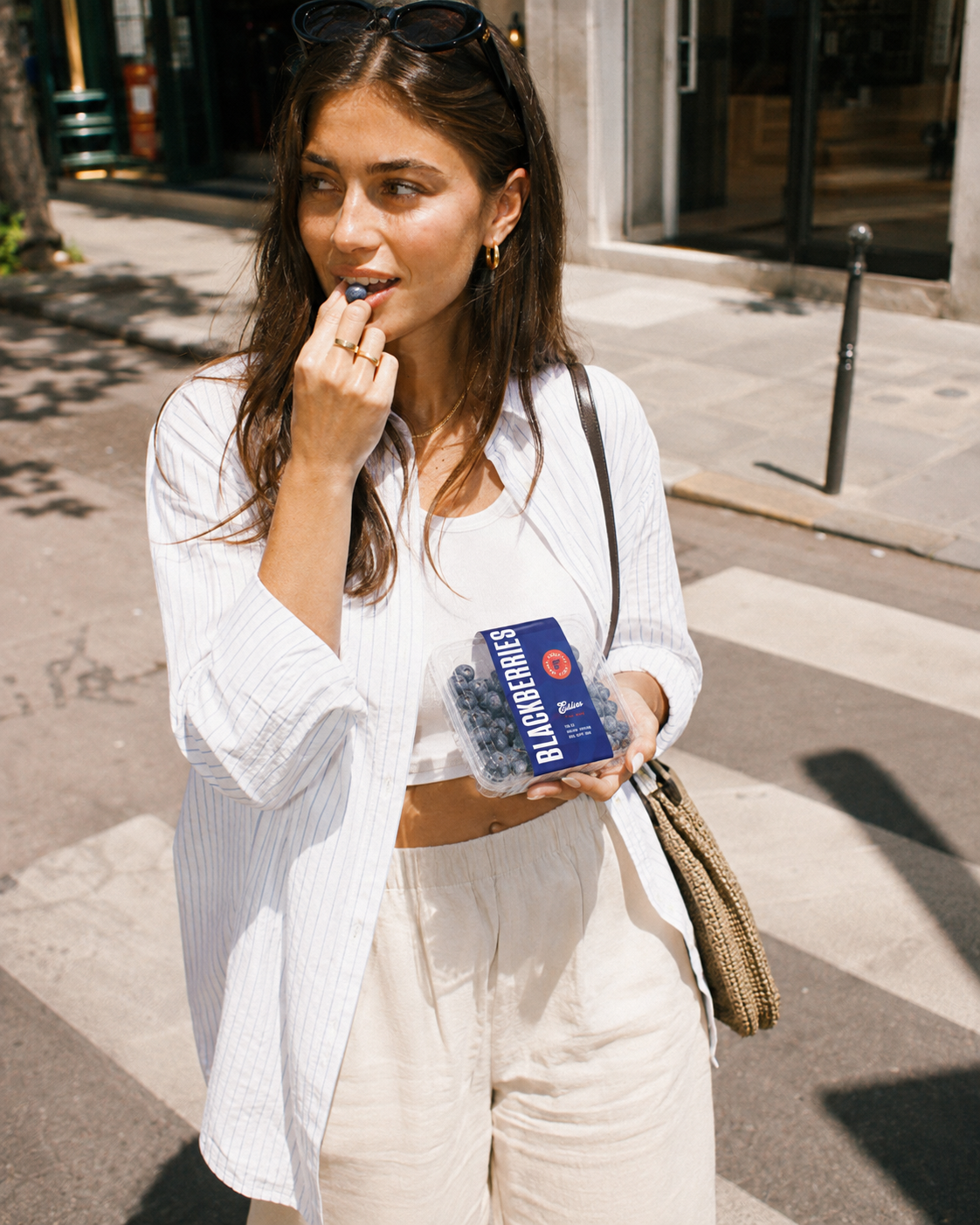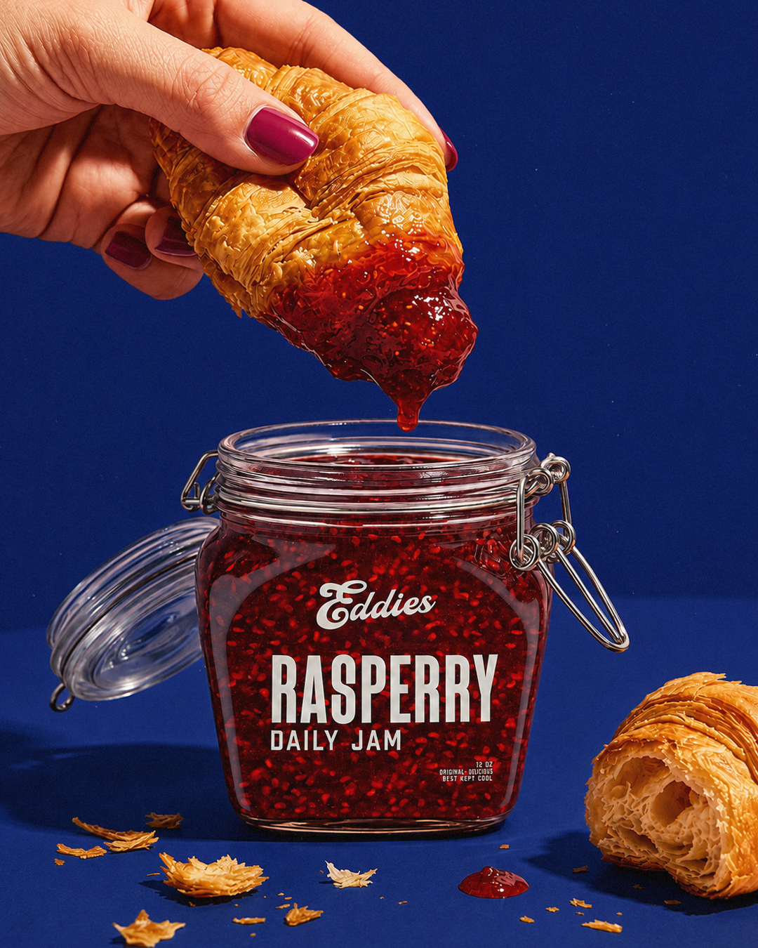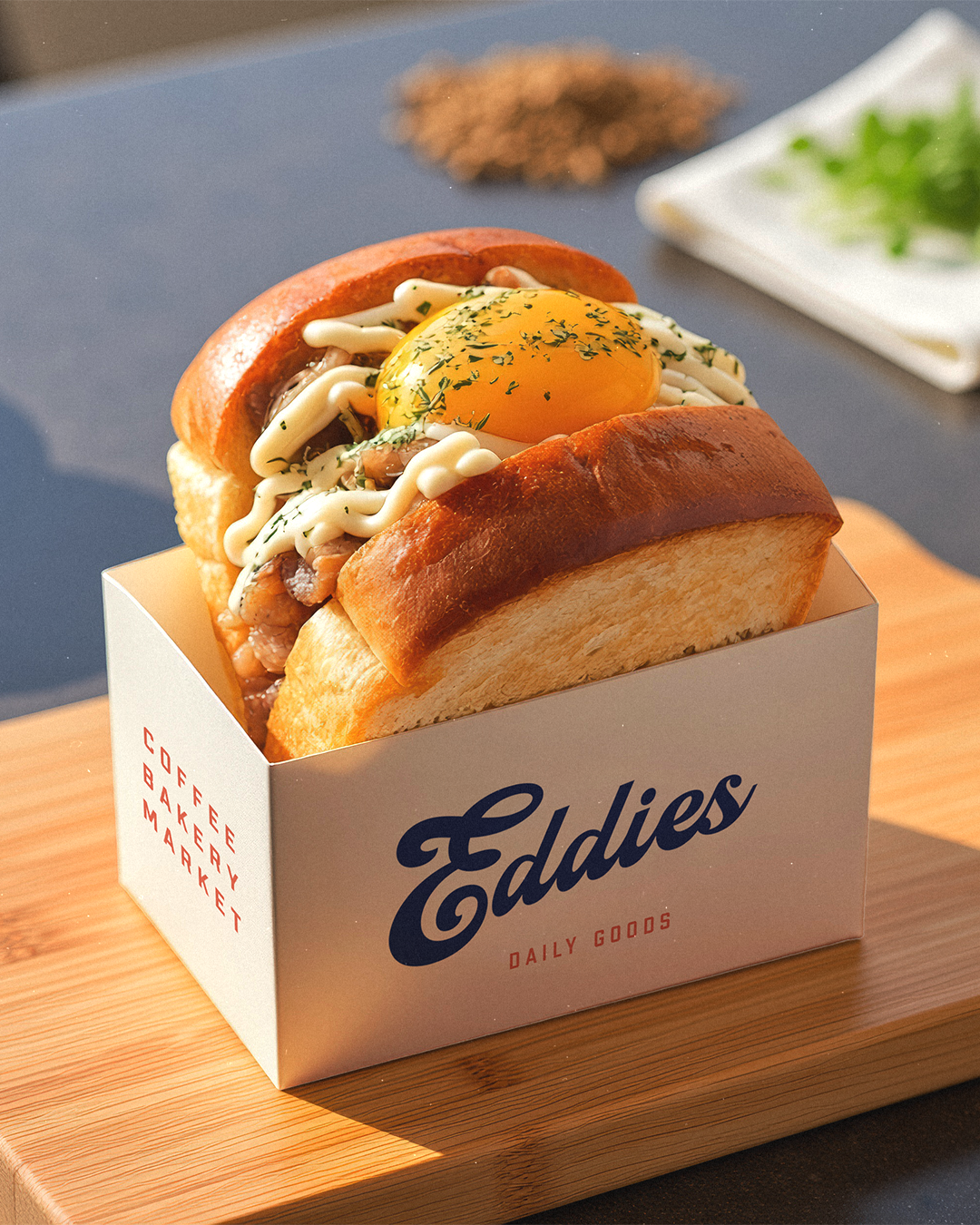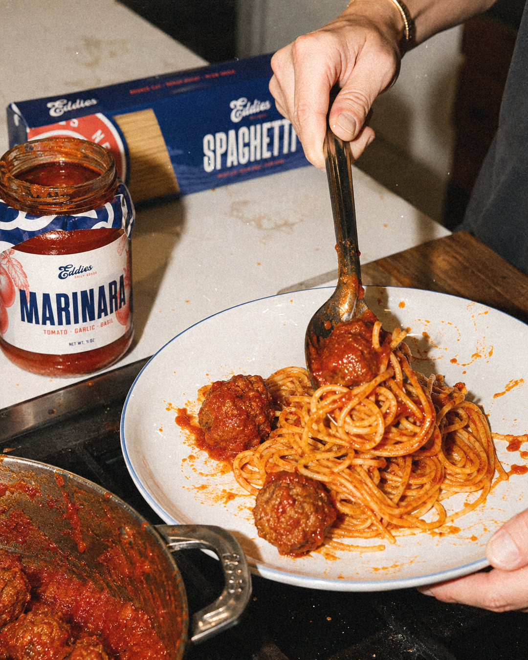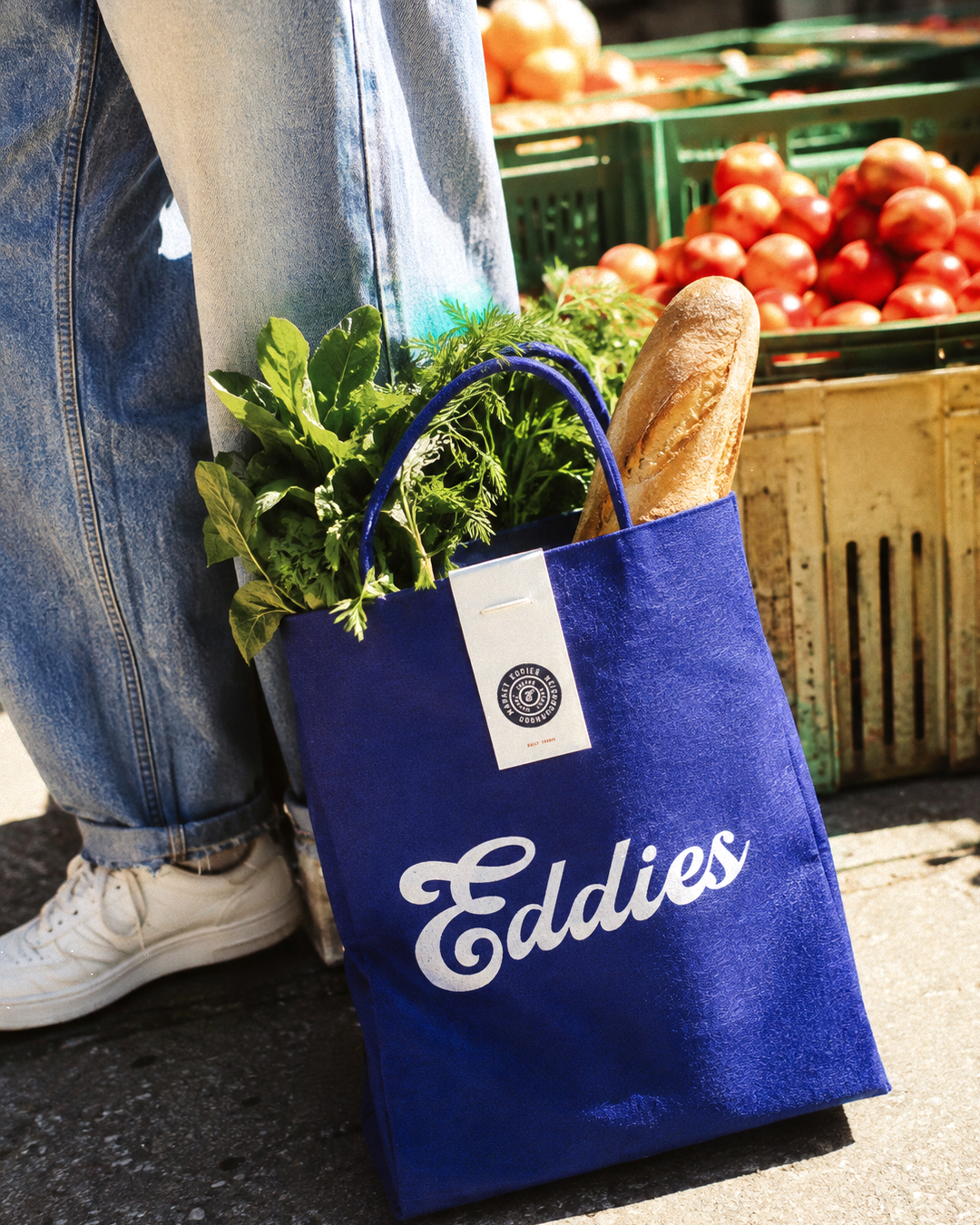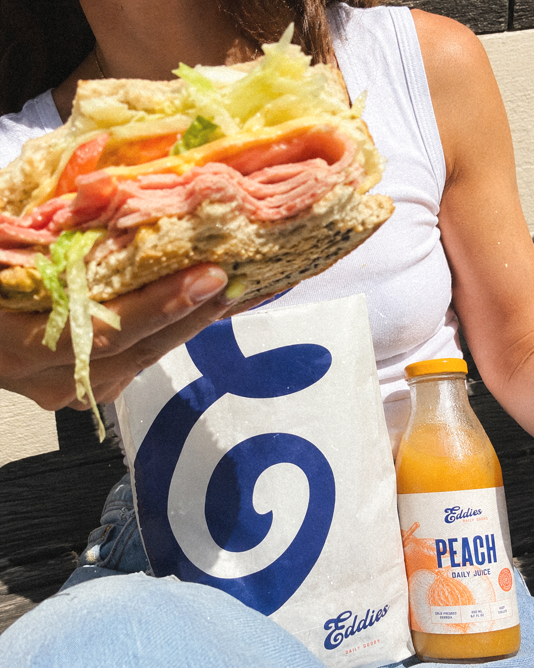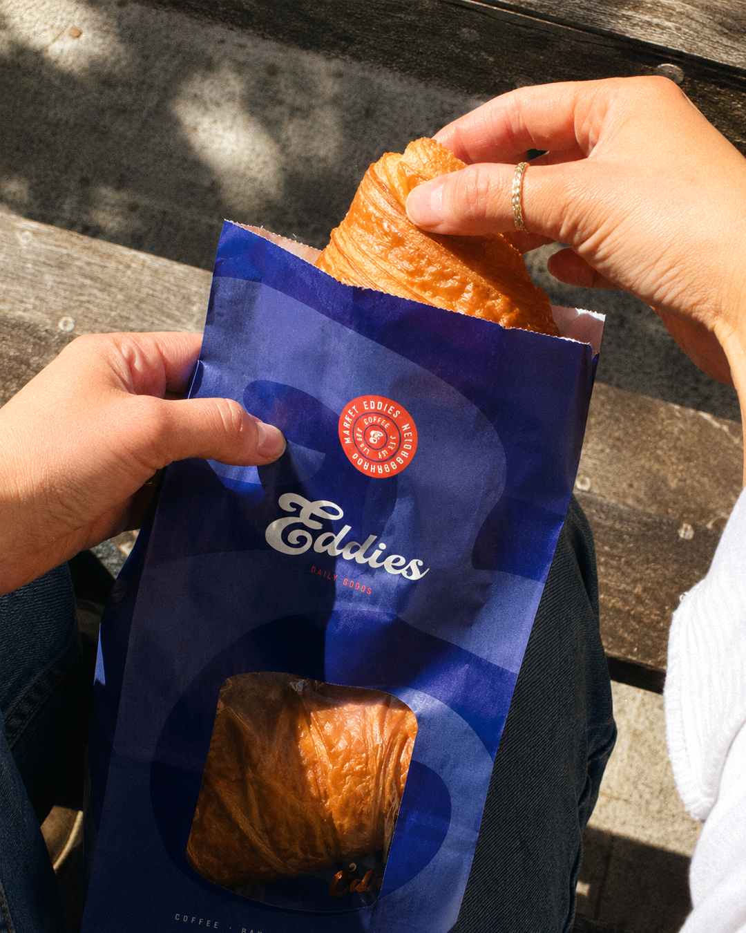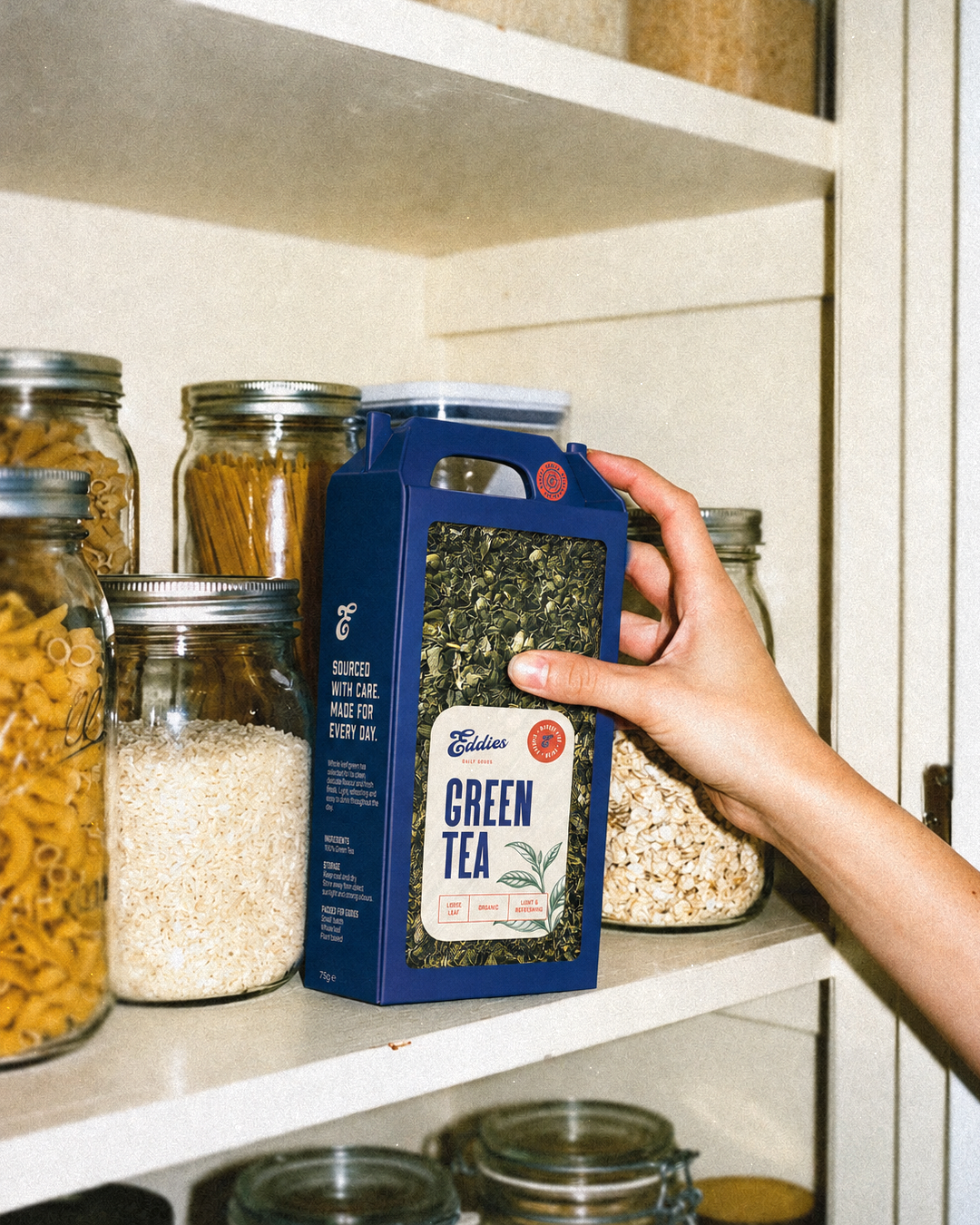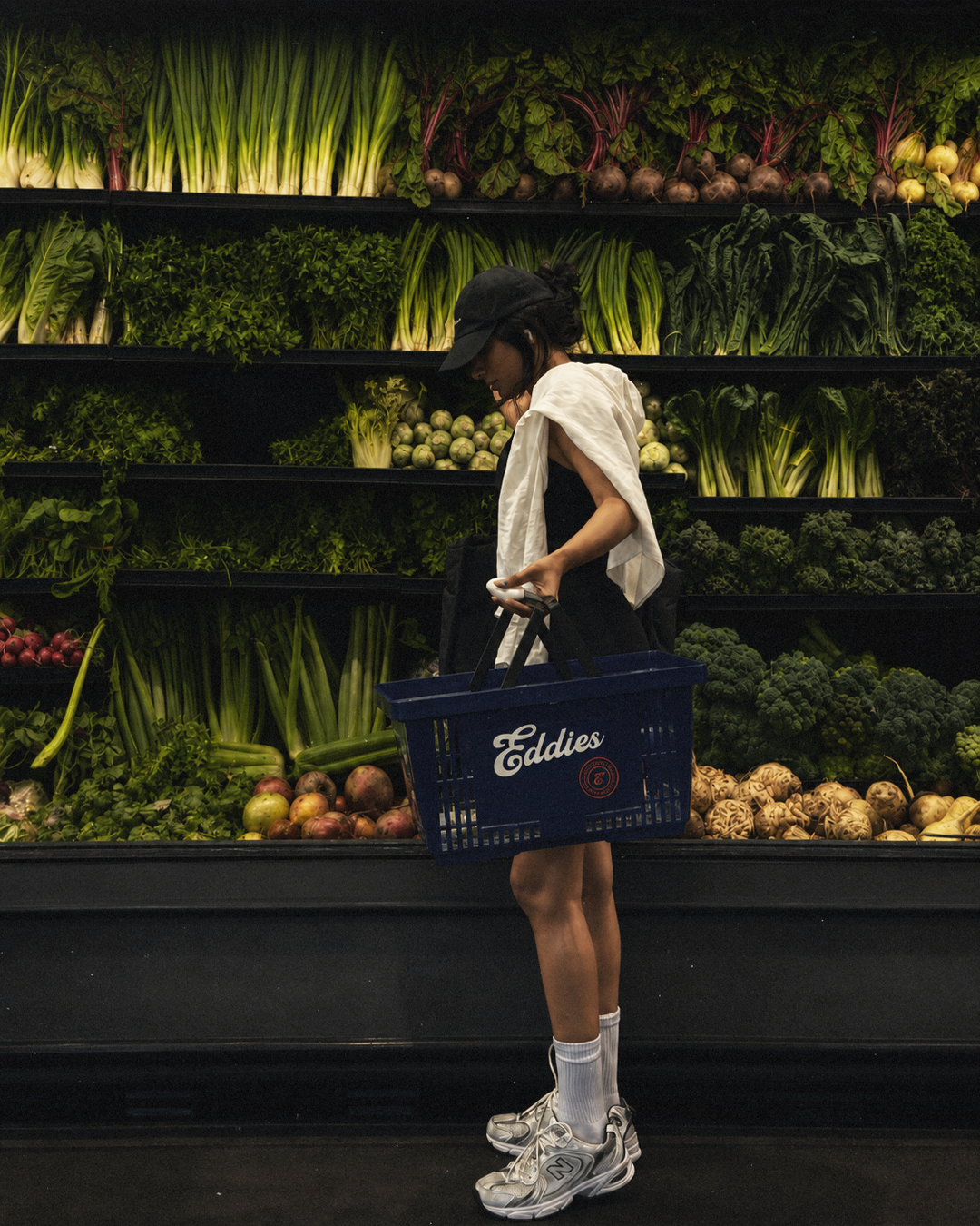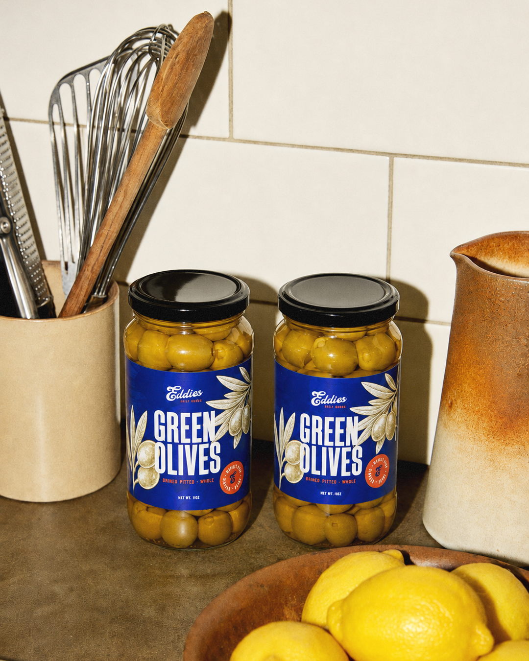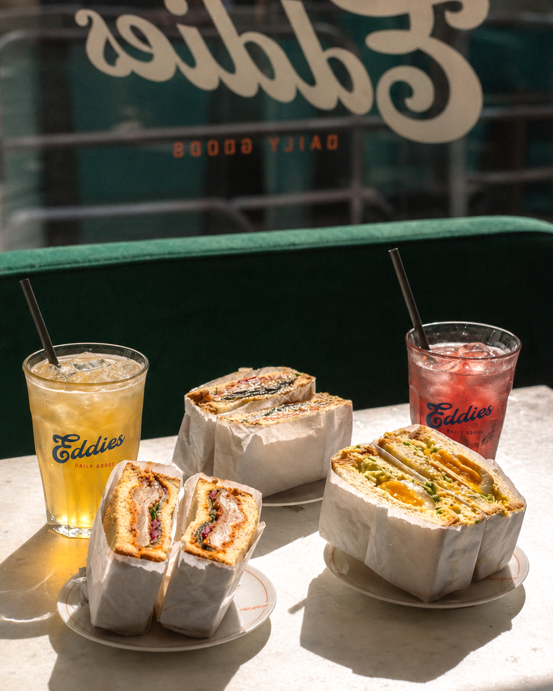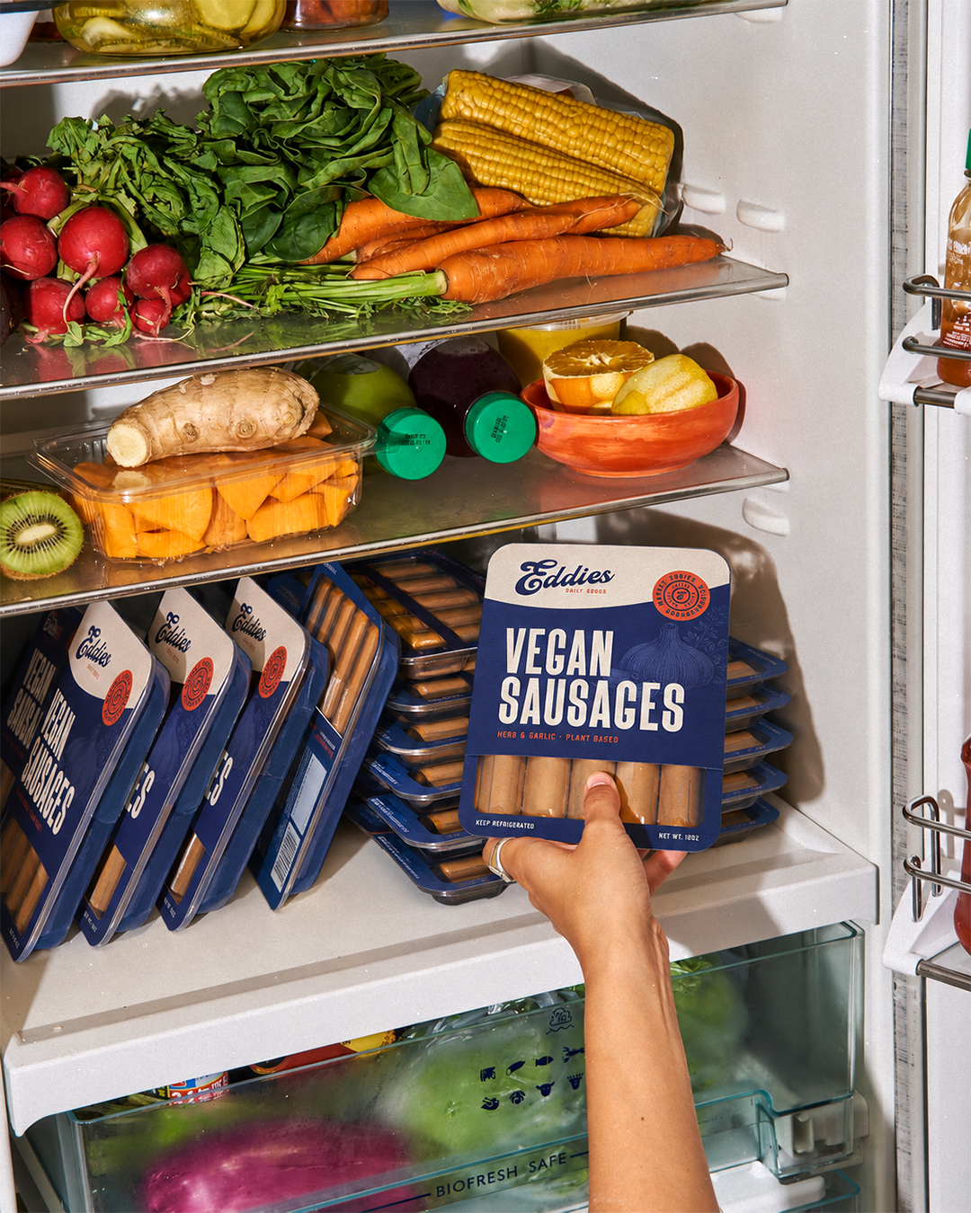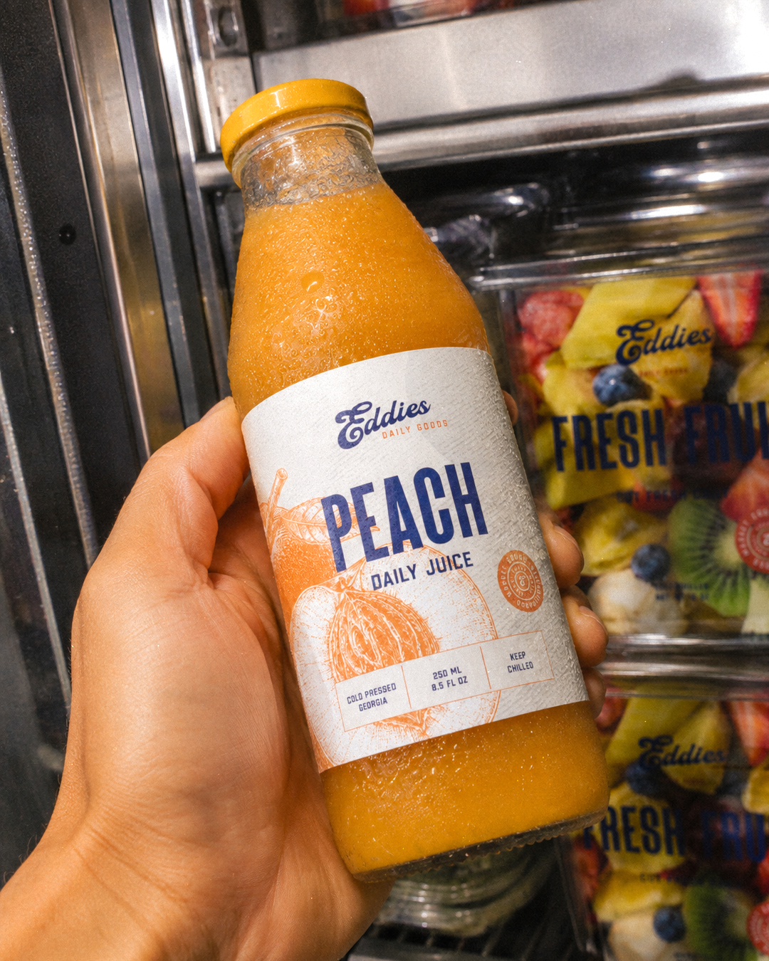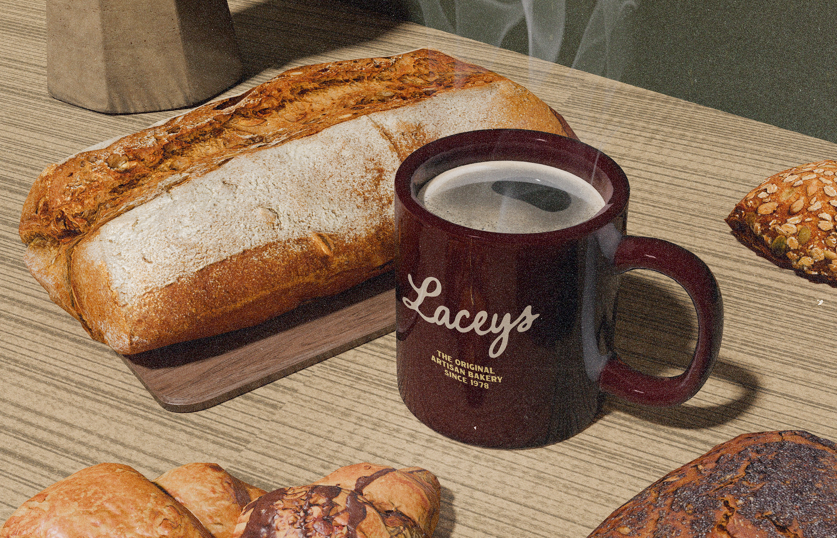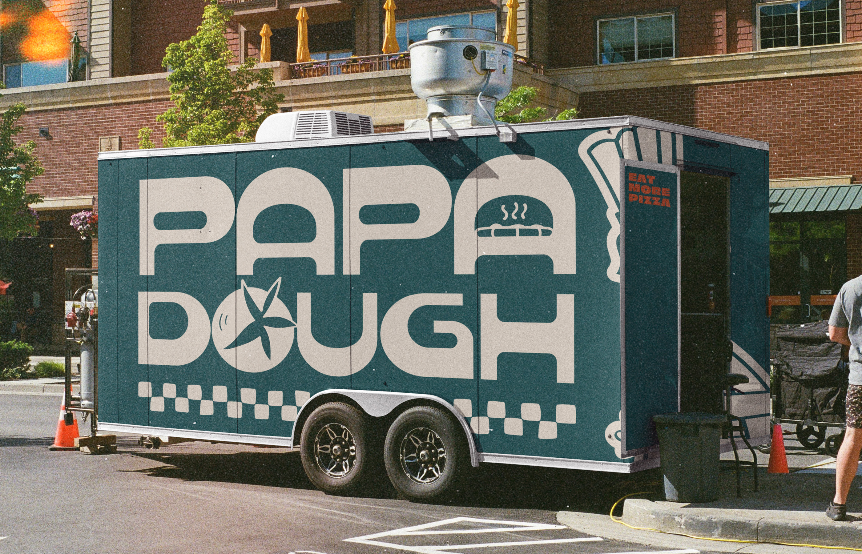
Brand identity and packaging for a neighbourhood grocery bringing together market produce, coffee, bakery and everyday goods.
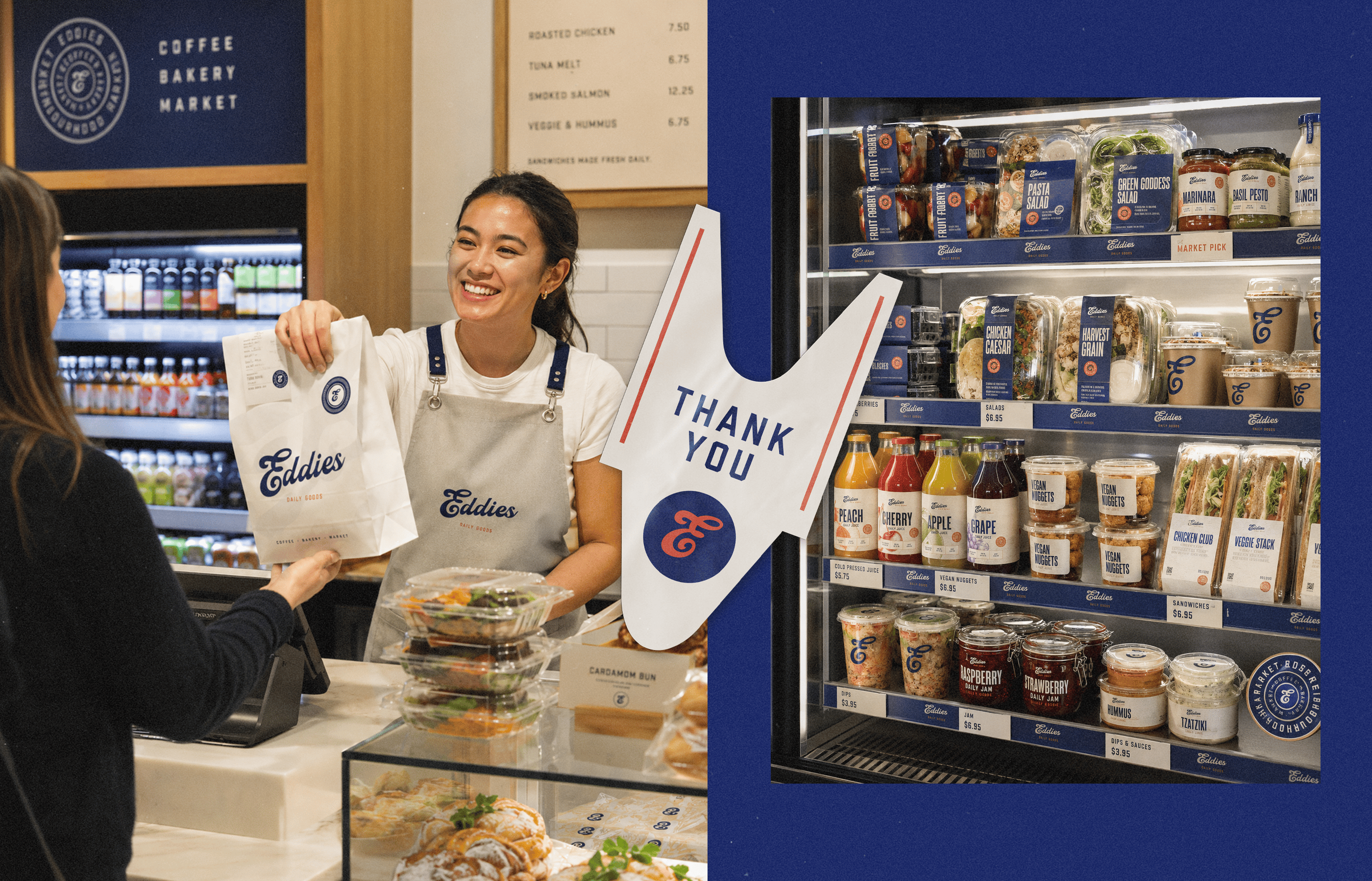

The identity becomes more convincing the further it moves away from the logo.
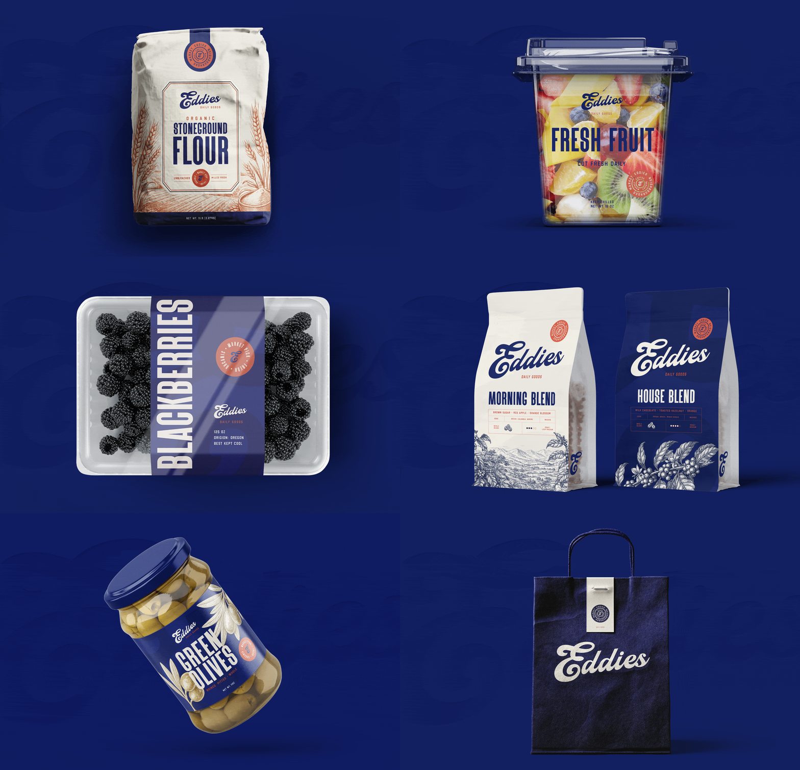
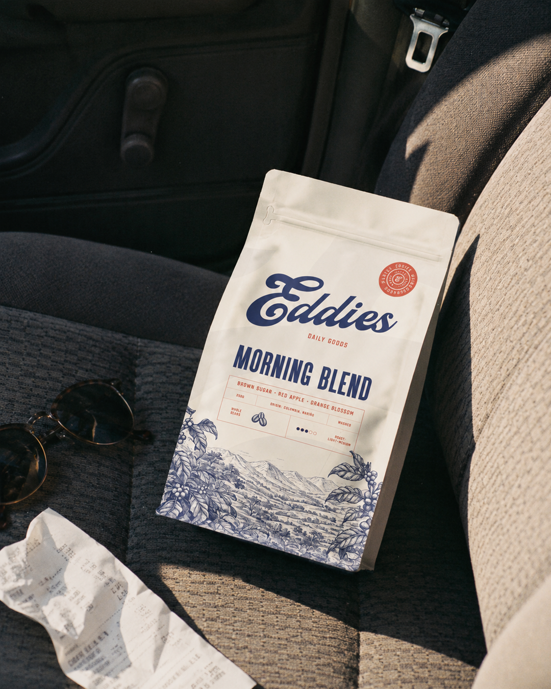
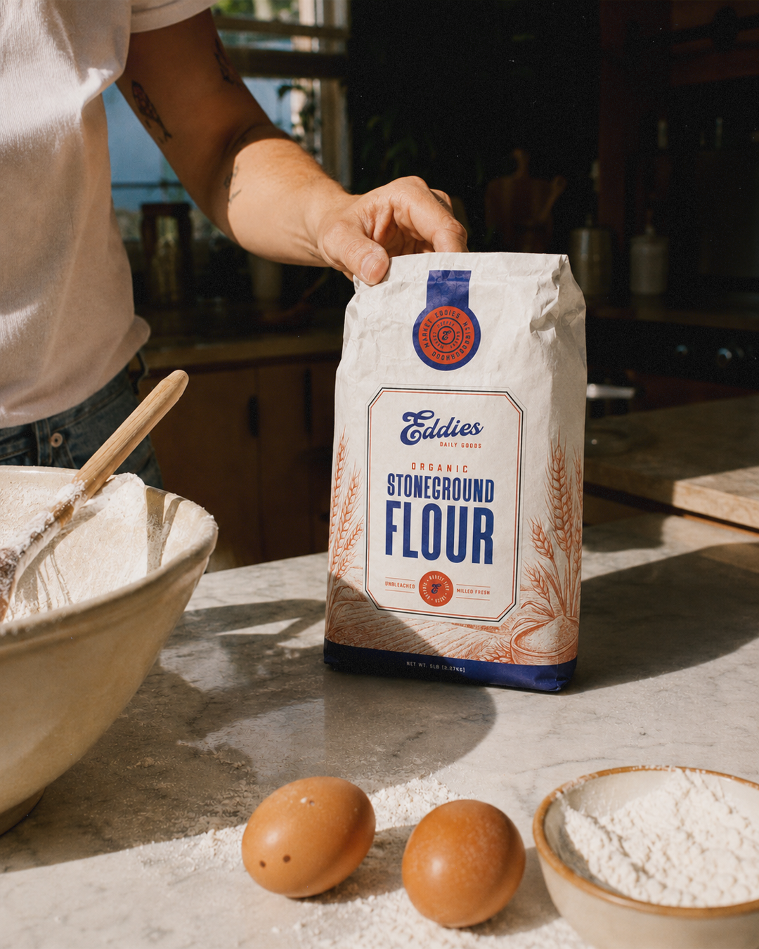
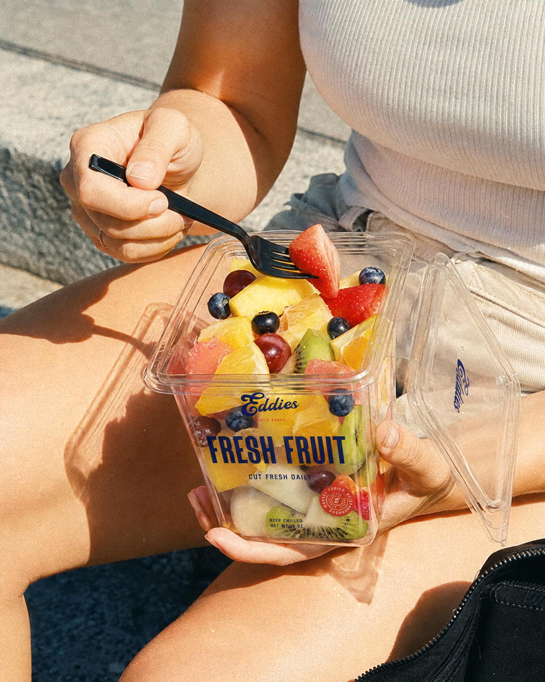
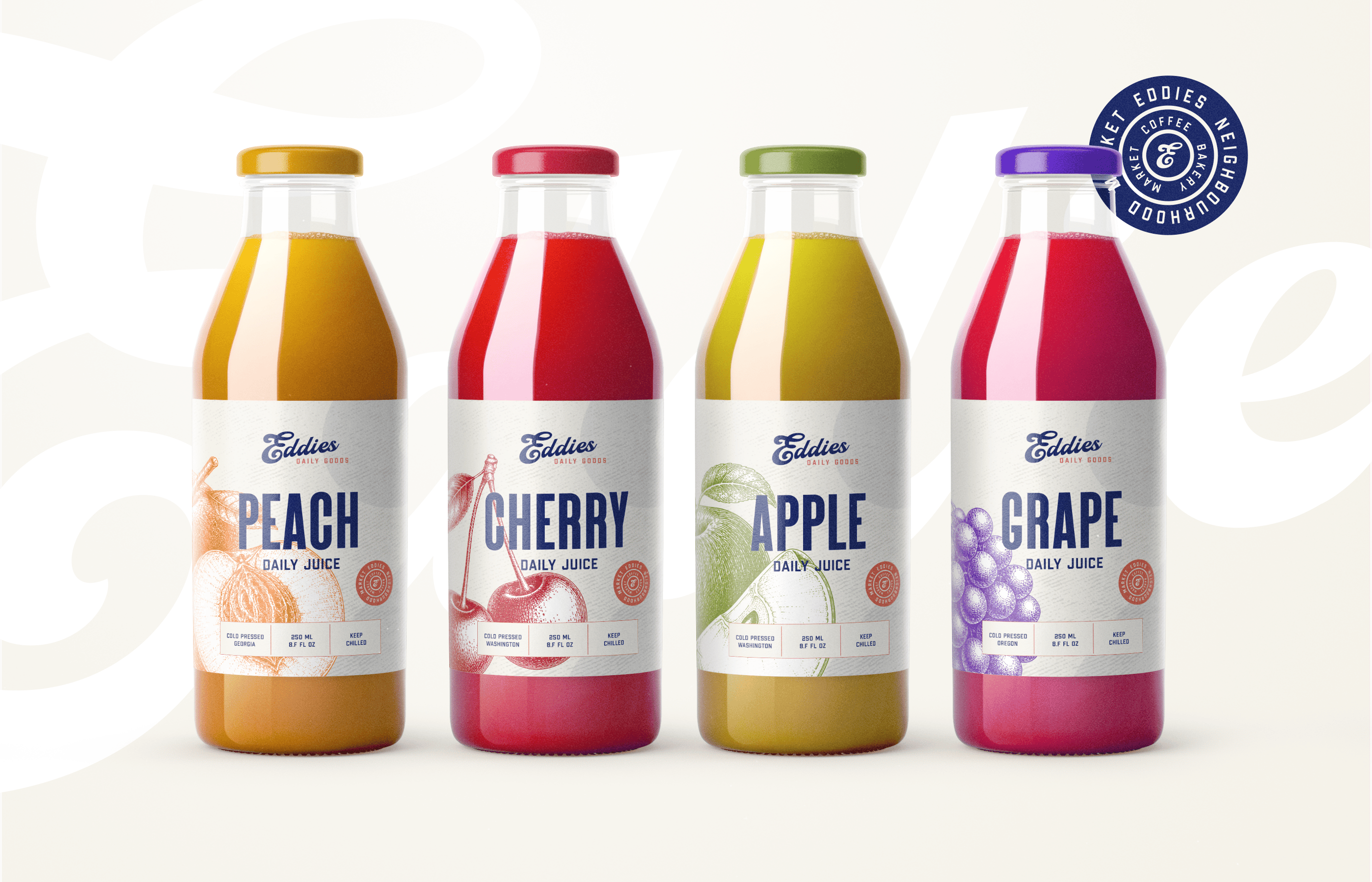
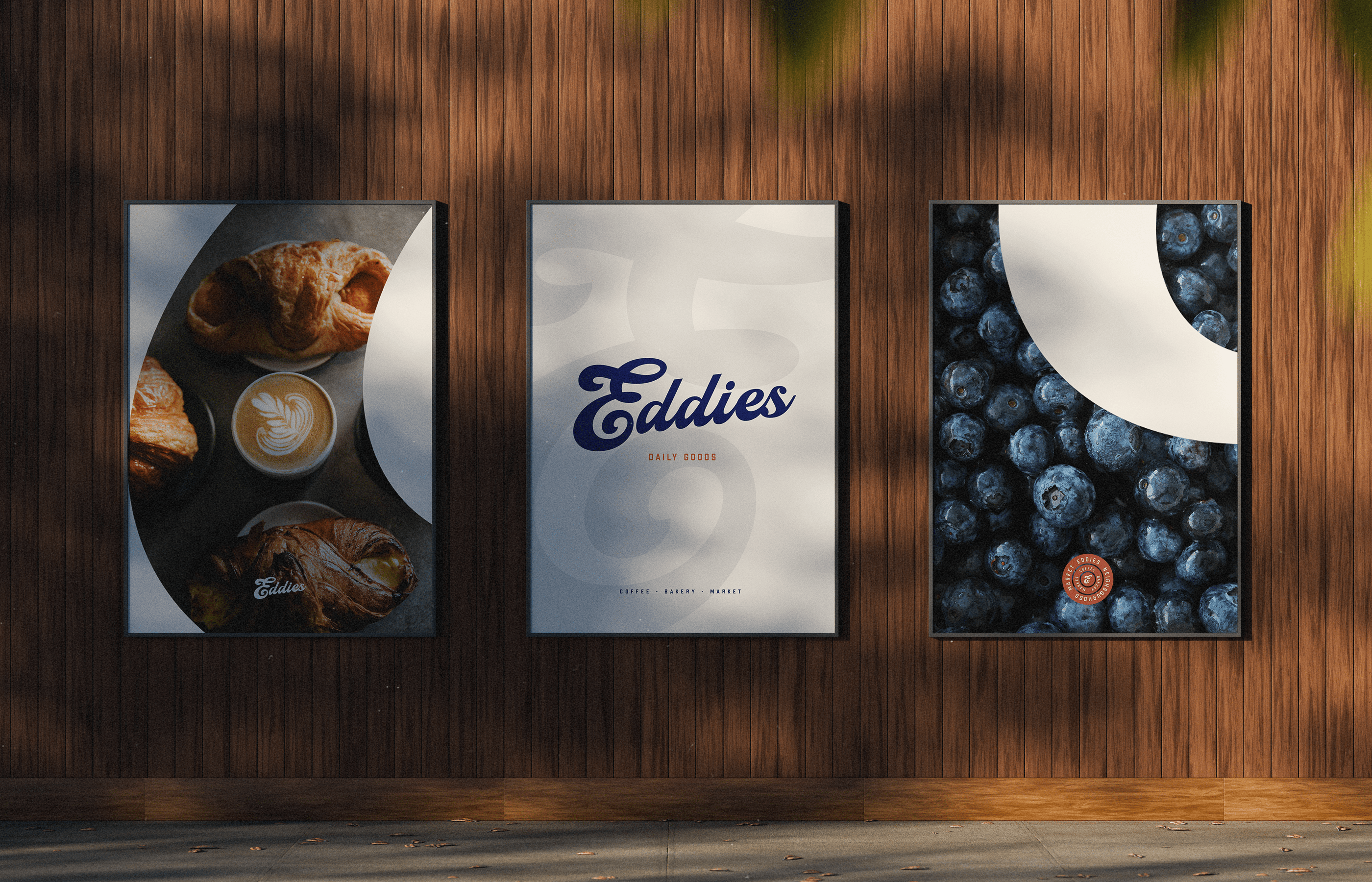
A flour bag can lean into old grocery packaging. Coffee can feel cleaner and more contemporary. Fresh food uses a more functional labelling system. Produce crates, paper bags and store graphics can be much simpler again.
That variation is intentional. Eddies is designed as a working retail identity rather than a collection of matching mockups.
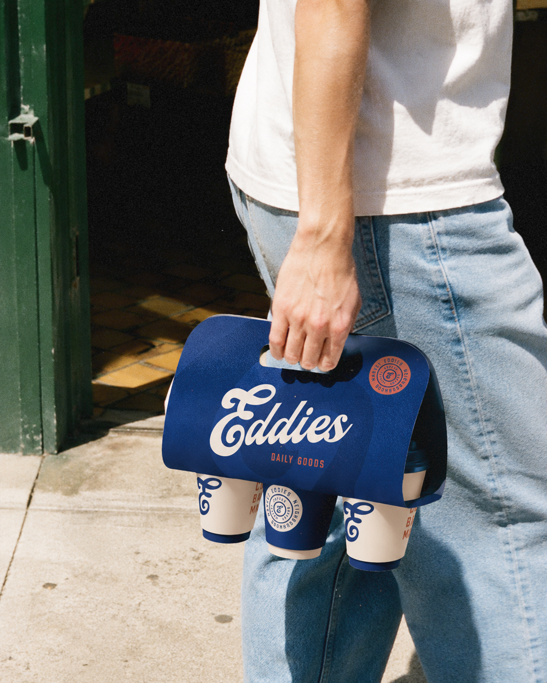
Across each application, the same few ingredients keep returning. Script, utility type, illustration, bold colour and straightforward language.
Enough consistency to make the brand recognisable. Enough freedom for the store itself to have some life.